[ Buy Sonic Riders... at Amazon ] » 2007 Hall of Fame Winner! By sockeymeow 25 on August 25th, 2007 No Printable Available Sonic Riders: Extreme Condition Box Cover Comments Comment on sockeymeow's Sonic Riders: Extreme Condition Box Art / Cover. Cancel Reply sockeymeow 25 [ 1 decade ago ] Yeah I havn't made a box in awhile so i felt like making one. Also my photoshop finally got fixed (it took long enough -.- [ Reply ] MugglesMan111 38 [ 1 decade ago ] ooo its perty i love it i just think its needs more text on the back. 5/5+fav Edited at 1 decade ago [ Reply ] Ratchetcomand 8 [ 1 decade ago ] Awesome job 5/5. [ Reply ] werdney 5 [ 1 decade ago ] The logo's nice, but I don't like the dashes on the back, the back needs some sort of description, and the spine looks too fat. [ Reply ] Brettska99 45 [ 1 decade ago ] wow great idea, and were did you get those amazing pics! you get a well earned 5/5, its great to have you making boxes again [ Reply ] sockeymeow 25 [ 1 decade ago ] well its not my idea this game got announced a few days ago and the front is the ONLY pice of material out [ Reply ] Ranmakuu 15 [ 1 decade ago ] Where did you get that logo? [ Reply ] spongejr_12 7 [ 1 decade ago ] omg! It's beuti....*faints* [ Reply ] jevangod 50 [ 1 decade ago ] Wow tats nice man I love the blueness [ Reply ] finalfantaseer22 43 [ 1 decade ago ] nice job, i like the front but the back is pretty bland. [ Reply ] dmshaposv 47 [ 1 decade ago ] Front is very cool but back could do with some little text/synopsis, though. [ Reply ] TrevOwnz 42 [ 1 decade ago ] looks amazing but to much blue. [ Reply ] VGMaster 42 [ 1 decade ago ] This one's awwwwweeeeeeeeessssssooooooooooommmmmmmmmmeeeeeeeee... [ Reply ] werdney 5 [ 1 decade ago ] BTW, why did you enter it under, Sonic Riders: Extreme Condition? [ Reply ] sockeymeow 25 [ 1 decade ago ] hmm.... i messed up and pasted the wrong thing =/ [ Reply ] Ladykiller 42 [ 1 decade ago ] agreed with dms, but overall I'm loving the blue color scheme, well designed too! [ Reply ] Dustgunner 33 [ 1 decade ago ] very very good although I dont like the dashes on the back and it needs a description - otherwise, it's golden. also 17 favs - should be hall of fame now [ Reply ] IceFox 42 [ 1 decade ago ] Wow. Love it, the blue looks nice and feels like a Sonic Riders box. [ Reply ] andremc 27 [ 1 decade ago ] holy cow ! +favorite [ Reply ] sockeymeow 25 [ 1 decade ago ] so when is this box going to get into the hall of fame? [ Reply ] andremc 27 [ 1 decade ago ] #20, good question [ Reply ] sockeymeow 25 [ 1 decade ago ] yeah HoF i guess its 20 not 17 that it takes to get into the hall now [ Reply ] wippie505 4 [ 1 decade ago ] nice work, but the back isn't to good, where's the info? 5/5. [ Reply ] sonicphoto 1 [ 1 decade ago ] Already an awesome box art for this game?? We are getting better!! [ Reply ] MagicDestiny 1 [ 1 decade ago ] Awesome man! One thing though. I don't like the dashes on the back. Maybe some description? 4.9/5 + Fav [ Reply ] Greenmoon1 3 [ 1 decade ago ] I think it looks perfect. :) I really like the blue shade, make me feel like it really is "Zero Gravity"! :D *Favs it* [ Reply ] zapshadowx 1 [ 1 decade ago ] needs MUCH more text on the back otherwise great, +fav :) [ Reply ] monkeyme 1 [ 1 decade ago ] On the home page why did you call it sonic riders extreme condition but here it's called sonic riders zero gravity? [ Reply ] CengizMan 29 [ 1 decade ago ] #28, Yeah, I don't get that either. [ Reply ]
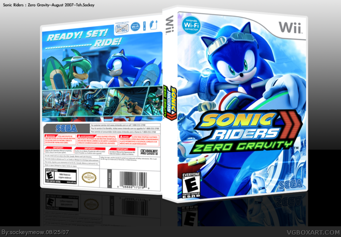
 Sonic Riders: Extreme Condition Box Cover Comments
Yeah I havn't made a box in awhile so i felt like making one. Also my photoshop finally got fixed (it took long enough -.-
[ Reply ]
ooo its perty i love it i just think its needs more text on the back.
5/5+fav
Edited at 1 decade ago
[ Reply ]
Awesome job 5/5.
[ Reply ]
The logo's nice, but I don't like the dashes on the back, the back needs some sort of description, and the spine looks too fat.
[ Reply ]
wow great idea, and were did you get those amazing pics! you get a well earned 5/5, its great to have you making boxes again
[ Reply ]
well its not my idea this game got announced a few days ago and the front is the ONLY pice of material out
[ Reply ]
Where did you get that logo?
[ Reply ]
omg! It's beuti....*faints*
[ Reply ]
Wow tats nice man I love the blueness
[ Reply ]
nice job, i like the front but the back is pretty bland.
[ Reply ]
Front is very cool but back could do with some little text/synopsis, though.
[ Reply ]
looks amazing but to much blue.
[ Reply ]
This one's awwwwweeeeeeeeessssssooooooooooommmmmmmmmmeeeeeeeee...
[ Reply ]
BTW, why did you enter it under, Sonic Riders: Extreme Condition?
[ Reply ]
hmm.... i messed up and pasted the wrong thing =/
[ Reply ]
agreed with dms, but overall I'm loving the blue color scheme, well designed too!
[ Reply ]
very very good although I dont like the dashes on the back and it needs a description - otherwise, it's golden. also 17 favs - should be hall of fame now
[ Reply ]
Wow. Love it, the blue looks nice and feels like a Sonic Riders box.
[ Reply ]
holy cow !
+favorite
[ Reply ]
so when is this box going to get into the hall of fame?
[ Reply ]
#20, good question
[ Reply ]
yeah HoF i guess its 20 not 17 that it takes to get into the hall now
[ Reply ]
nice work, but the back isn't to good, where's the info? 5/5.
[ Reply ]
Already an awesome box art for this game?? We are getting better!!
[ Reply ]
Awesome man! One thing though. I don't like the dashes on the back. Maybe some description? 4.9/5 + Fav
[ Reply ]
I think it looks perfect. :)
I really like the blue shade, make me feel like it really is "Zero Gravity"! :D *Favs it*
[ Reply ]
needs MUCH more text on the back otherwise great, +fav :)
[ Reply ]
On the home page why did you call it sonic riders extreme condition but here it's called sonic riders zero gravity?
[ Reply ]
#28, Yeah, I don't get that either.
[ Reply ]