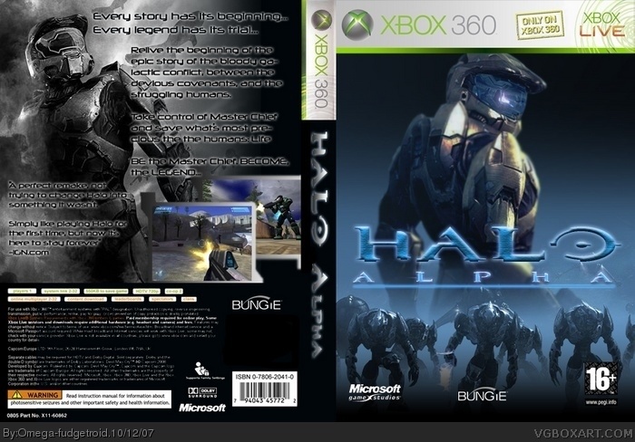
"Omega's jus a big jerk that critizes people" you propably think. Well that might be true, but I still can make a boxart.
I came up with this idea when finding out that even though HALO CE is the best HALO game, that it feels outdated in certain areas due to some lacking features. I felt that since many people think like this, and since also many players out there asks me "Can you buy and play Halo 3 if you haven't played the other games". Well why not just give them Halo CE, as it was meant to be played!
Eh... I was a little off-put by your arrogance in the boobies, which might affect my opinion of this box.
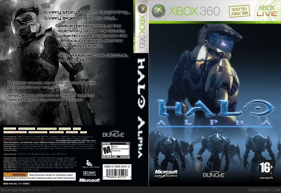
The glow effect on the side hurts my eyes. The front is okay, but the embossing of the Halo logo is a bit unnecessary. And there are several grammatical errors on the back. Couple that with the fact that there are no screenshots, and this is just sort of mediocre. 3/5
#4, I hope you know that that defenition of "mediocre" is below good, and not medium. ;)
#5. Why I have different colourthemes, is so that on the front, the colourtheme Halo is known of comes out, whereas the back has black and white to make the whole legendary feeling, more appealing.
There, I updated it. Much better.
Goddamn, noticed one thing now, that the screen takes over the spine. One moment.
Okay now it's as it's supposed to be. And you might want to complain about the text error on the back, but it's too late to change that. You'll just gonna have to live with it.
-your missing some stuff on the back, like the rating.
-the 16+ on the front should be white, and should be on the left, switched with the MS logo.
-it seems you ripped the back off ELCrazy's DMC4 box. Look at the copyright description, it says "Capcom Europe" and "Devil May Cry(r) 4 is a trademark..." i would know, i typed that all up myself and sent it to him.
-it's not a flaw, but that pic doesn't really look like MC. it looks like a chick... (look at the chest and waist)
Wow, my vagina iz bleeding cuz this iz so bad. Leave now. You didnt even put the rating logo on da rite side!!!You are so bad! You copied my name tooooooooo!
0.9999/5
BTW, you act jus like me 2! I love being a d1ck to evry1, and refuse to do good in dis comunity. Y do u copy me!?
Its MY job to be the napoleoncomplex having homosexical!
 Alpha Halo Box Cover Comments
"Omega's jus a big jerk that critizes people" you propably think. Well that might be true, but I still can make a boxart.
I came up with this idea when finding out that even though HALO CE is the best HALO game, that it feels outdated in certain areas due to some lacking features. I felt that since many people think like this, and since also many players out there asks me "Can you buy and play Halo 3 if you haven't played the other games". Well why not just give them Halo CE, as it was meant to be played!
[ Reply ]
Back's a little plain. But it's pretty nice.
[ Reply ]
#2, Yeah I'll consider putting in some screens or sumtin over the weekend. But now, g'night!
[ Reply ]
Eh... I was a little off-put by your arrogance in the boobies, which might affect my opinion of this box.
The glow effect on the side hurts my eyes. The front is okay, but the embossing of the Halo logo is a bit unnecessary. And there are several grammatical errors on the back. Couple that with the fact that there are no screenshots, and this is just sort of mediocre. 3/5
[ Reply ]
Not too bad, but there are no screenshots, and that's usually a big NO-NO.
The color scheme is out of whack. Blue for front. Black and white for back?
The temp is horrid. I'd suggest getting a better one.
Overall, not too bad but I think you can do better :)
[ Reply ]
#4, I hope you know that that defenition of "mediocre" is below good, and not medium. ;)
#5. Why I have different colourthemes, is so that on the front, the colourtheme Halo is known of comes out, whereas the back has black and white to make the whole legendary feeling, more appealing.
[ Reply ]
There, I updated it. Much better.
Goddamn, noticed one thing now, that the screen takes over the spine. One moment.
Okay now it's as it's supposed to be. And you might want to complain about the text error on the back, but it's too late to change that. You'll just gonna have to live with it.
Edited at 1 decade ago
[ Reply ]
looks decent but...
-your missing some stuff on the back, like the rating.
-the 16+ on the front should be white, and should be on the left, switched with the MS logo.
-it seems you ripped the back off ELCrazy's DMC4 box. Look at the copyright description, it says "Capcom Europe" and "Devil May Cry(r) 4 is a trademark..." i would know, i typed that all up myself and sent it to him.
-it's not a flaw, but that pic doesn't really look like MC. it looks like a chick... (look at the chest and waist)
it's pretty good though 3.5/5
Edited at 1 decade ago
[ Reply ]
#6, Well, if you'd rather I take it down to a 2/5...
[ Reply ]
#9, If you can't judge because of my personality and the way I act, you shouldn't even be allowed to touch any 'submit' button on a community.
[ Reply ]
*presses submit*
[ Reply ]
#11, XIAMHUNTERx if you're going to post spam, you're practically asking for another banning.
[ Reply ]
Wow, my vagina iz bleeding cuz this iz so bad. Leave now. You didnt even put the rating logo on da rite side!!!You are so bad! You copied my name tooooooooo!
0.9999/5
BTW, you act jus like me 2! I love being a d1ck to evry1, and refuse to do good in dis comunity. Y do u copy me!?
Its MY job to be the napoleoncomplex having homosexical!
Edited at 1 decade ago
[ Reply ]
very nice, some people may think youre a bi*** but a good box is a good box! just swap the, microsoft and 16+ logos over
[ Reply ]
Not bad, but Master Chief is wearing a mark VI helmet he sould have mark V or lower.
[ Reply ]
Clears throat, halo combat evolved anniversary, google it
[ Reply ]
Clears throat, halo combat evolved anniversary, google it
[ Reply ]
Clears throat, halo combat evolved anniversary, google it
[ Reply ]
#18, Clears throat, don't be an ass. Btw, good box!
[ Reply ]