Hi, i am so glad i found this site. This is my first ever boxart and I will greatfuly accept any comments. As for credit, I got most of my images off ign.com and as for the logos I simply used google. The template i received from my freind through an email, so if it is yours i will gladly give you credit. Thanks
ps. veiw full size for best view
hey, welcome to the site! im glad you have the right tools, I guess you must have looked at other comments for other boxarts, right? This is an awesome boxart, good job man!
not a bad first at all. some pointers: the front is really good, and I like the unique arrangement, but the esrb and squeanix logo belong on the bottom left and right respectively. Try adding or making a caption bigger on the back, and though stylish the divided pic in the back distorts the image. quote font should be smaller as well. pretty good overall. looking forward to more boxes from you ;)
Hey not bad for your first box art, the only thing im not a fan of is that the square enix logo should be in the proper place as well as the ersb. cool box thougth :P
this is pretty nice, good clean design but like ladykiller said, for it to look official the logos should be placed right and also on back covers it is usually custom to add screenshots with neat borders, it can improve the box significally.
nice first try and welcome to the site.
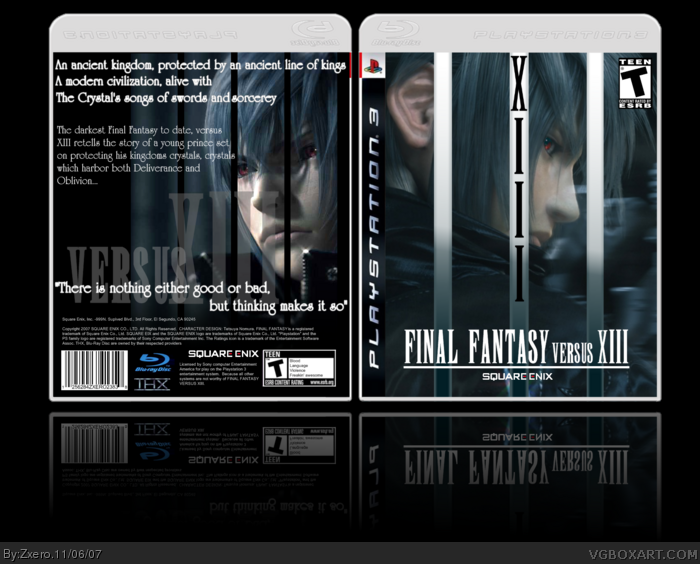
 Final Fantasy Versus XIII Box Cover Comments
Hi, i am so glad i found this site. This is my first ever boxart and I will greatfuly accept any comments. As for credit, I got most of my images off ign.com and as for the logos I simply used google. The template i received from my freind through an email, so if it is yours i will gladly give you credit. Thanks
ps. veiw full size for best view
[ Reply ]
hey, welcome to the site! im glad you have the right tools, I guess you must have looked at other comments for other boxarts, right? This is an awesome boxart, good job man!
10/10
[ Reply ]
not a bad first at all. some pointers: the front is really good, and I like the unique arrangement, but the esrb and squeanix logo belong on the bottom left and right respectively. Try adding or making a caption bigger on the back, and though stylish the divided pic in the back distorts the image. quote font should be smaller as well. pretty good overall. looking forward to more boxes from you ;)
Edited at 1 decade ago
[ Reply ]
Thanx #2 and #3 i will take your advice into cosideration on my next project
[ Reply ]
Hey not bad for your first box art, the only thing im not a fan of is that the square enix logo should be in the proper place as well as the ersb. cool box thougth :P
[ Reply ]
i like how u designed the front with the lines/stripes but the black ones on the back dont look right.
[ Reply ]
pretty good for a first. welcome :)
[ Reply ]
this is pretty nice, good clean design but like ladykiller said, for it to look official the logos should be placed right and also on back covers it is usually custom to add screenshots with neat borders, it can improve the box significally.
nice first try and welcome to the site.
[ Reply ]
not bad at all.
[ Reply ]
Very good. Intersting design. Welcome.
[ Reply ]
I dislike how you used the same person on the front and back and i dislike the lines on the front.
[ Reply ]
#11, well i am glad that you know what you dislike
[ Reply ]