thanks all, was not sure to keep with the theme like i did with the yellowish sky on front cover or have it more blue.
any more comments - i think this is my best so far(apart from my next one which i post up in a day or 2)
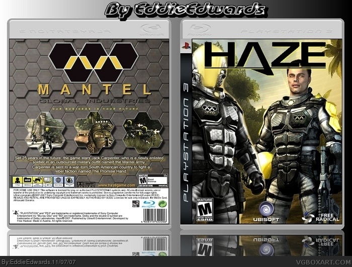
change the colour of haze logo on front to yellow and move it down to just below the middle , imo that would make it much better , like the style of this alot m8 , well done.
 HAZE Box Cover Comments
Not bad :)
[ Reply ]
I was surprised when I saw this. Good job! :)
[ Reply ]
sweet box dude. fav.
[ Reply ]
I recommend that you make the reflections more transparent though.
[ Reply ]
true, but it's still awsome.
[ Reply ]
thanks all, was not sure to keep with the theme like i did with the yellowish sky on front cover or have it more blue.
any more comments - i think this is my best so far(apart from my next one which i post up in a day or 2)
[ Reply ]
change the colour of haze logo on front to yellow and move it down to just below the middle , imo that would make it much better , like the style of this alot m8 , well done.
[ Reply ]
It's good, if not a little plain (at least on the back). Your best yet.
[ Reply ]
very good design
[ Reply ]
I agree with everyone. Its pretty cool.
[ Reply ]
tips
1. Need better picture for front
2. Mature logo is small
3. Title is a little blurry at full zoom
[ Reply ]
3.5/5
[ Reply ]