[ Box updated on November 20th, 2007 ] [ original ]
 Zack & Wiki : Quest for Barbaros' Treasure Box Cover Comments
Comment on frenchboy1's Zack & Wiki : Quest for Barbaros' Treasure Box Art / Cover.
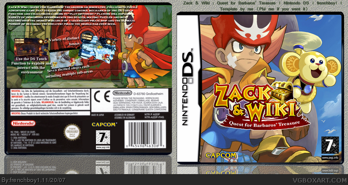
Here's my Zack & Wiki box. When I saw blinko's and finalfantaseer's boxes :D I wanted to make one box for this game too. But me, I made this on Ds. Please VIEW IN FULL. And tell me what's wrong. comments and faving are appreciated.
[ Reply ]
The front is absolutely perfect.
But the back has too much text.
4/5
Great job.
Keep them coming.
[ Reply ]
#2, It was too plain with less text. Thanks for the comments though.
:(
[ Reply ]
#3 it seems the comment shortages are back again...
well about the box, the front just looks like an unedited pic of the one on my box. the logos are all good and well placed. i think you need to think about your text placement and fonts from now on. they kind of make me not want to read them. otherwise it looks pretty good. 4/5
[ Reply ]
#4, apparently, yes. and it make me feeling bad :(
I'll try to change the font. Thanks
[ Reply ]
#5 no problem. heres a really good site for fonts, www.dafont.com
Edited at 1 decade ago
[ Reply ]
#6, lol I know this site. But actually, I have a problem, when I download them and put onto the required file, he doesn't work. and I can't use it. If you got any solution, PM me (that's work for all :p )...
[ Reply ]
UPDATED !!!! Tell me about it please !
[ Reply ]
i think it looks good, but is this some kind of new trend?
[ Reply ]
Lol i agree with Shady
[ Reply ]
#9, lol thanks. I did it when I saw finalfantaseer's and blinko's. Both was awesome and so is the game :D
[ Reply ]
looks good to me too much text but its not your fault 9/10 +FAV
Edited at 1 decade ago
[ Reply ]
I think its great, but there is too much text on the back, and its kinda small imo.
But its still great, 8/10
[ Reply ]