Ok, this is the new version of an old box. I was just going to update my old one but it took so long and is so different that I figured I would just re-post it. It's not like I'm the first person.
Basically this is my first attempt at making a 3D PS3 box actually look like a 3D PS3 box.
there's no real boundary or difference from the spine to the front/back. make the spine a solid color, or a new color scheme and a different pic, then it will look better. also the spine just kind of has a flat bend. I don't know how you would fix it, but yeah, it's too 2D. the box is good though :D the only other problem I see is that the ESRB is squished vertically. but yeah. good job
EDIT: it might also help if you had a larger bit of text at the top of the back there saying, 'save the earth from aliens' or 'this time, we're fighting more than germans' or something like that, the top seems missing something, I think that could solve it :).
it looks alright, definitly not your best. the 3D template looks kinda nasty and doesnt really make sense in its perspective. also would i be right at guessing you took the screenshots by printscreening then from the official website?
I hate when people put 100 freaking spaces in there comments...like #8.
Well anyways i like the realistic approach you went for. The template could use some work with opicity and stuff but other than that i think its really cool.
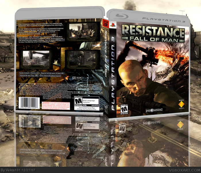
 Resistance: Fall of Man Box Cover Comments
Ok, this is the new version of an old box. I was just going to update my old one but it took so long and is so different that I figured I would just re-post it. It's not like I'm the first person.
Basically this is my first attempt at making a 3D PS3 box actually look like a 3D PS3 box.
[ Reply ]
i'd expect it to be satire, but its pretty cool. the back is too dark on some regions.
[ Reply ]
I love it. However the 3D looks VERY BAD...
Edited at 1 decade ago
[ Reply ]
Could I get some critisism on my 3D effect?
[ Reply ]
#4, well it looks kinda cartoony and the spine just is... er... eh... I still like the box, therfore I favorited it.
[ Reply ]
the 3d is interesting... very interesting.... but the box is great. I think if you just did a bit with that spine, it would look better
[ Reply ]
Can I just ask, what is wrong with the spine? I'm going to attempt to fix all of these problems.
Apart from the hybrid's arm, what should I do to the spine?
About the top bit, I will add a gradient and slightly transpire it to make it look less cartoony.
[ Reply ]
aww damn.. it doesnt look right, but oh well cause its a good box. im just gonna give you a 5/5 so i dont get involved...
wooooooo! 5/5!
[ Reply ]
I want to fix it, but I want to know what's wrong so I can fix it.
[ Reply ]
there's no real boundary or difference from the spine to the front/back. make the spine a solid color, or a new color scheme and a different pic, then it will look better. also the spine just kind of has a flat bend. I don't know how you would fix it, but yeah, it's too 2D. the box is good though :D the only other problem I see is that the ESRB is squished vertically. but yeah. good job
EDIT: it might also help if you had a larger bit of text at the top of the back there saying, 'save the earth from aliens' or 'this time, we're fighting more than germans' or something like that, the top seems missing something, I think that could solve it :).
Edited at 1 decade ago
[ Reply ]
it looks alright, definitly not your best. the 3D template looks kinda nasty and doesnt really make sense in its perspective. also would i be right at guessing you took the screenshots by printscreening then from the official website?
[ Reply ]
No, I took the screenshot template from the official website and put my own screenshot in.
[ Reply ]
I hate when people put 100 freaking spaces in there comments...like #8.
Well anyways i like the realistic approach you went for. The template could use some work with opicity and stuff but other than that i think its really cool.
[ Reply ]