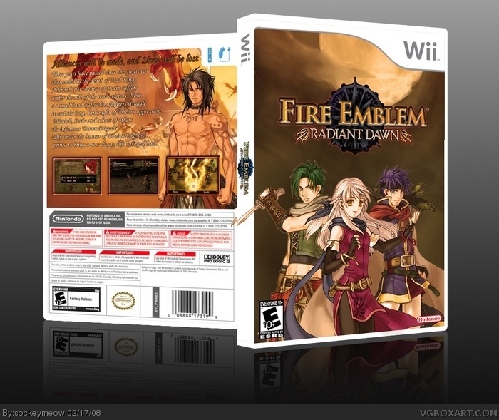
Ive gotten a lot more CC on this one then the last one. and i had to render all of the pictures and logos on here myself (except the dev and ESRB) but credit to koopa for showing me where to find the material
#3, Try and sum up your opinion in one post if you can.
Anyway it's pretty nice although the top of the front is quite empty and could use with a more interesting background. I'd like to add that the text isn't so easy to follow, probably because of the 3D perspective it's in.
 Fire Emblem: Radiant Dawn Box Cover Comments
Ive gotten a lot more CC on this one then the last one. and i had to render all of the pictures and logos on here myself (except the dev and ESRB) but credit to koopa for showing me where to find the material
[ Reply ]
I like it but the front is abit plain.
[ Reply ]
I agree with #2
[ Reply ]
The back is awsome, i dont know wats missing but somethings missing on the front
[ Reply ]
#3, Try and sum up your opinion in one post if you can.
Anyway it's pretty nice although the top of the front is quite empty and could use with a more interesting background. I'd like to add that the text isn't so easy to follow, probably because of the 3D perspective it's in.
[ Reply ]
#5, yeah that and I accidentally rasterized the text before i could fix the coloring
[ Reply ]
i think it looks good, but the front should probably have like a background from the game or some artwork of some sort.
[ Reply ]
I updated it and fixed the things you guys said were wrong
[ Reply ]
looks great dude ;)
[ Reply ]
the guys sword goes through the template
nice i love the back but the front is plain
[ Reply ]
#10, im aware i did do that on purpose its just since i did self 3d it looks kinf of wierd
Edited at 1 decade ago
[ Reply ]
ok
[ Reply ]
Quite luverly I think.
[ Reply ]