Also uploaded this to my deviantART account (link)
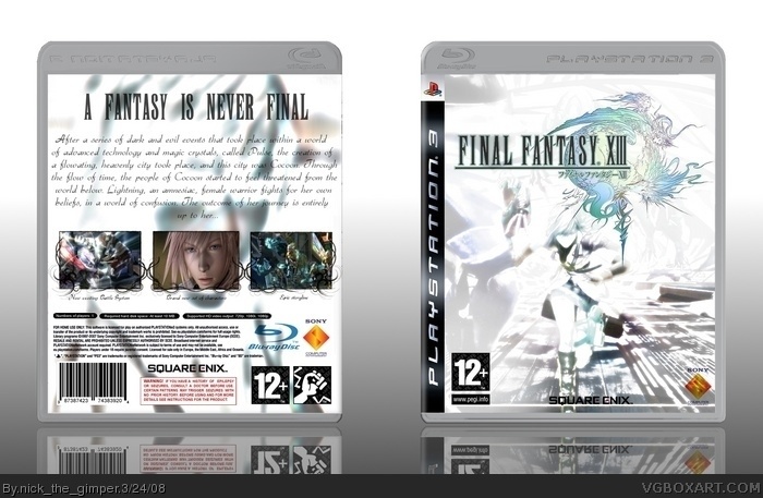
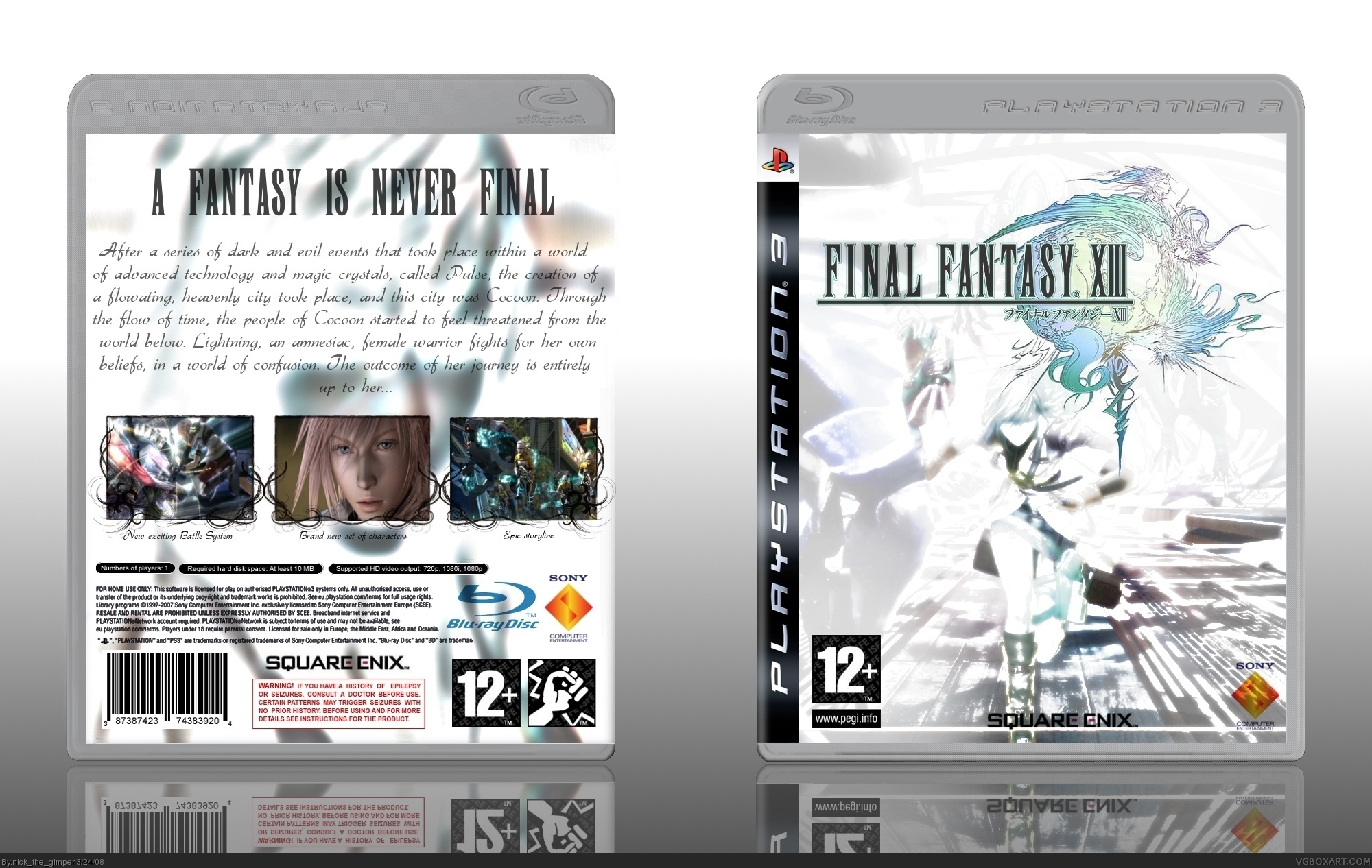
Image used for front cover ----> link (had to edit it a lot... most FFXIII pics have became overused, so I had to come up with a unique one, and keep the "Final Fantasy" character)
Well.. it's quite a long story... I firstly edited the colour curve of the image, then added some bolded outlines, used the edge detect option (difference of gausians I think, cant remember for sure :S), inverted some colour values, made the background more "white", added softglow effects and voila :D (in other words, I "played" quite a lot on the image :p)
the front looks cool but the back is too empty imo.
maybe add a grey bar with low opacity behind the text and add some nice borders to it.
and the white stripe on the bottom of the front is also a bit disturbing.
 Final Fantasy XIII Box Cover Comments
Yay! Second cover...
Please full-view, it's essential :D
Also uploaded this to my deviantART account (link)
Image used for front cover ----> link (had to edit it a lot... most FFXIII pics have became overused, so I had to come up with a unique one, and keep the "Final Fantasy" character)
Image used for back side background ----> link
4.5-5 hours of work for this one...
Edited at 1 decade ago
[ Reply ]
Looks great, it has the simple look of Final Fantasy boxes, but still looks unique. What you did with the images is really good.
[ Reply ]
#2 Thanks for the comment!
Well.. it's quite a long story... I firstly edited the colour curve of the image, then added some bolded outlines, used the edge detect option (difference of gausians I think, cant remember for sure :S), inverted some colour values, made the background more "white", added softglow effects and voila :D (in other words, I "played" quite a lot on the image :p)
Thanks for the fave as well!
Edited at 1 decade ago
[ Reply ]
UPDATE: SECOND VERSION
Just corrected a small mistake under the first (from the left) screenshot (wrote "batlle" instead of "battle")
[ Reply ]
Love the overall scheme of the box!
[ Reply ]
#5 thanks!
[ Reply ]
I love the screenborders ! The only flaw is the summary text. It kinda dosn't fit the style of the overall box. Really nic ejob though.
[ Reply ]
Pretty nice job.. i believe the back could've had more to it,though...
but ah, who am i to say that?? i'm bad at backs myself.xD
[ Reply ]
#7 Heh... thanks! Shall I make the font smaller?
#8 Thanks! (no you're not bad at backs! :D)
Edited at 1 decade ago
[ Reply ]
Extremely nice. I like your style Nick. ;)
[ Reply ]
Thanks Chibi! (and for the fave as well =D)
Edited at 1 decade ago
[ Reply ]
the front looks cool but the back is too empty imo.
maybe add a grey bar with low opacity behind the text and add some nice borders to it.
and the white stripe on the bottom of the front is also a bit disturbing.
anyway it's great +fav
Edited at 1 decade ago
[ Reply ]
#12 thanks for the good comments, the good feedback and the fave!
I will work on the next version later... I'm finishing off a versus xiii cover... when done with it i will work on this as well =]
[ Reply ]