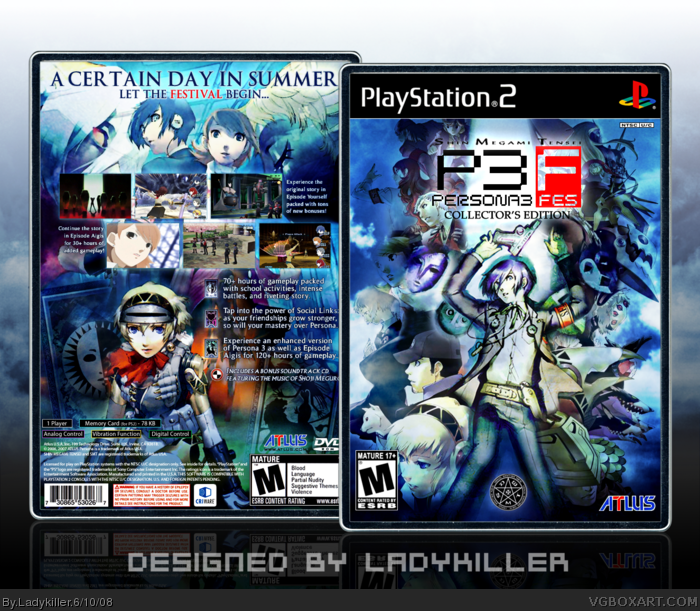
That's my main focus when designing my 20th box. That being said, I wanted to design something that will define me as an artist. And what better game to design for than one of my favorite games of all time.
As previously stated, the FEEL is what I was going for on this one. Ofcourse...the detail and style are prevalent elements I kept in mind as always. However, I also wanted to portray that very cool Persona feel, while also having that dramatic feel I was always passionate about. Once the back and front concepts were finished, I literally still took hours just looking at the box and tweaking both the box and the canvas background to get that perfect feel, as it is my main focus. In the end, I believe I got what I was going for. :)
Fantastic mate, great box. And Great... ermm... FEEL! LOL
The front is totally amazing... bet that took a bit o time ;)
Only thing you could have done to make it better.. legal text in white would be better ;)
OH.. and you beat me to it.. I thought I'll finish my next box before you finished your! LOL
I don't think this is as great as you guys put it, it's very nice but to be honest the image quality seems to have something to be desired for. Not my favorite layout for the back either because of how a ton of screenshots are cramped near the top but I understand why you went with that direction. No offense LK.
#7, Indeed, the front probably took me about 2 hours total finalizing the whole concept and design, not to mention the finishing touches too. XD
#8, None taken at all. As for the quality, I definitely made sure that it had my own unique touch to it that fits the game style and feel, what you see right now is what I ultimately envisioned for it to look like. For the back layout, I decided to switch up my style a bit (which is definitely a good thing) and went for the cool screenshot arrangements which would also make it flow easier into the sypnosis (which is in bullet format) Though I'm glad you understand why I went that way. ;)
Also, I'll be taking a month break to study for the ACT. Though I do plan to start my 2-box project titled "Prohibited Art" soon after that. I'd also like to thank Gunslinger for great advice on this one. Thanks.
@adfd: Let's just say that I really like 'em that way. lol :D
That was wierd, when I went on the computer I was like "Hmm, I wonder if LK posted a box? Nah..." And then I was like "HE DID! <33333L3O3L3O3M3G3B3B3Q3P3S333B3U3Y3A3W3I3I3"
Anyway, I was startin' to wonder when you was gonna do a P3 box. I think you pulled it off ownagely, and I love the feel like #14 said.
*feels*
Um... that didn't come out right. xD
P.S. That pic of the main character looks like it was drawn with pencil crayon... Guess the Atlus' budget ran low... :P
[/random]
#20, He needs a lot more favs overall.
Box is good, but it looks more like your first boxes wich I don't realy like.
Anyway, box is good and has a lot of interesting features :)
+ Fav
Damn mate, you've done it again.Most certainly not what i've expected from you,though.. with double perspectives on the front. [ view from top and front. ]. but you've pulled it off neatly.
Surely a great new addition to the P3 boxes on the site, and certainly the best.[ and that's coming from an artist that also made one.xD [/low self-esteem] ;)]
I decided to update it to the definitive version of this box. Made the bottom signature part clearer to blend better with the canvas background, sharpened some info, tweaked to get that perfect contrast, and added some cool, but subtle lighting effects. :) Enjoy!
On the front is there any chance you can use a different picture of the main character? I think that one looks likes he is dancing which kinda ruins the moment for me.
#29, Haha, nah 'G. I wouldn't want to compromise the design by choosing another picture that wouldn't fit in. This is honestly the best suiting pic of the main character for the background. The pic is also the best part of the box in my opinion. :)
To clarify further, as Ayron said before: it's dual perspective. I decided to go with that style, because that's exactly what the game is all about: "The other self" aka Persona. The perspective would be of the main character laying down - which should clarify that he's not dancing. lol
Its definitely not one of your bests - not because of composition, which is great - but its a tad contrasty for my tastes and some blurry/grainy bits here and there.
However, I like the ideas - the dual perspective is neat and besides you need to be rank 9 anyway. ;P
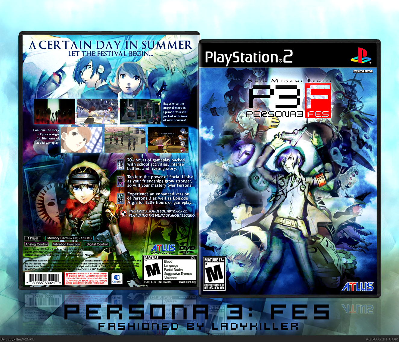
Upgraded to a limited collector's edition to also test my new tin temp. (which I tweaked a bit to match the blue scheme) Pretty much replaced everything for higher quality images which took awhile to redesign. That said, all the quality issues are taken care of and I also added some limited edition changes to it. Canvas has also been changed to a much more fitting one. Enjoy! :)
The whole thing is great but just one thing...
The main character looks a bit weird, maybe something like him shooting himself with the Evoker might look cooler.
But other that that the game cover look spectacular and for some reason it's very hard to make the Persona 3 game cover look cool.
 Persona 3 FES Box Cover Comments
lk you've done it again
Edited at 1 decade ago
[ Reply ]
*knights you*
[ Reply ]
I dont even know what to say.
[ Reply ]
._. Omg. You made this series /better/ then it already was.
[ Reply ]
It's all about the feel. ;)
That's my main focus when designing my 20th box. That being said, I wanted to design something that will define me as an artist. And what better game to design for than one of my favorite games of all time.
As previously stated, the FEEL is what I was going for on this one. Ofcourse...the detail and style are prevalent elements I kept in mind as always. However, I also wanted to portray that very cool Persona feel, while also having that dramatic feel I was always passionate about. Once the back and front concepts were finished, I literally still took hours just looking at the box and tweaking both the box and the canvas background to get that perfect feel, as it is my main focus. In the end, I believe I got what I was going for. :)
As always, best viewed in full and enjoy. Cheers!
-LK
[ Reply ]
*glomps you*
[ Reply ]
Fantastic mate, great box. And Great... ermm... FEEL! LOL
The front is totally amazing... bet that took a bit o time ;)
Only thing you could have done to make it better.. legal text in white would be better ;)
OH.. and you beat me to it.. I thought I'll finish my next box before you finished your! LOL
[ Reply ]
I don't think this is as great as you guys put it, it's very nice but to be honest the image quality seems to have something to be desired for. Not my favorite layout for the back either because of how a ton of screenshots are cramped near the top but I understand why you went with that direction. No offense LK.
Edited at 1 decade ago
[ Reply ]
I just crapped my pants
[ Reply ]
Holy crap, Ladykiller. This is ace. By the way, could you help me with this? I don't want to screw up yet another good box.
link
Edited at 1 decade ago
[ Reply ]
Amazing, words cant explain
[ Reply ]
I agree with E_G, the screens are not it's best feature. Other than that wonderful.
[ Reply ]
Thanks for the comments and favs guys. ;)
#7, Indeed, the front probably took me about 2 hours total finalizing the whole concept and design, not to mention the finishing touches too. XD
#8, None taken at all. As for the quality, I definitely made sure that it had my own unique touch to it that fits the game style and feel, what you see right now is what I ultimately envisioned for it to look like. For the back layout, I decided to switch up my style a bit (which is definitely a good thing) and went for the cool screenshot arrangements which would also make it flow easier into the sypnosis (which is in bullet format) Though I'm glad you understand why I went that way. ;)
Also, I'll be taking a month break to study for the ACT. Though I do plan to start my 2-box project titled "Prohibited Art" soon after that. I'd also like to thank Gunslinger for great advice on this one. Thanks.
@adfd: Let's just say that I really like 'em that way. lol :D
[ Reply ]
I love the feel of this.
It's so feely.
+feel
(I mean +fav. XD)
[ Reply ]
#8, I agree. But I'll still favorite it because it looks so awesome, other than what E_G pointed out.
[ Reply ]
That was wierd, when I went on the computer I was like "Hmm, I wonder if LK posted a box? Nah..." And then I was like "HE DID! <33333L3O3L3O3M3G3B3B3Q3P3S333B3U3Y3A3W3I3I3"
Anyway, I was startin' to wonder when you was gonna do a P3 box. I think you pulled it off ownagely, and I love the feel like #14 said.
*feels*
Um... that didn't come out right. xD
P.S. That pic of the main character looks like it was drawn with pencil crayon... Guess the Atlus' budget ran low... :P
[/random]
Edited at 1 decade ago
[ Reply ]
#16, that pic...
Is so awesome, whee! lol. When I first saw it, I knew I had to use it as the main front focus. :)
[ Reply ]
Yays!
[ Reply ]
I had a feeling you were going to make this box ;) Looks SWEEEEET! +Fav!
[ Reply ]
its in the hall! Wait...........LK is still at rank 8? O_o
[ Reply ]
#20, He needs a lot more favs overall.
Box is good, but it looks more like your first boxes wich I don't realy like.
Anyway, box is good and has a lot of interesting features :)
+ Fav
[ Reply ]
=O
OMGAH!
[ Reply ]
awesome lk!
[ Reply ]
Damn mate, you've done it again.Most certainly not what i've expected from you,though.. with double perspectives on the front. [ view from top and front. ]. but you've pulled it off neatly.
Surely a great new addition to the P3 boxes on the site, and certainly the best.[ and that's coming from an artist that also made one.xD [/low self-esteem] ;)]
Gratz mate!UP TO RANK 9!
[ Reply ]
Damnnnn, sweet box :D
[ Reply ]
You're welcome, LK. I'm glad i could be of some help. The box turned out great btw. b^^d
[ Reply ]
Ew.
[ Reply ]
Thanks for the HoF favs and comments guys. ;)
I decided to update it to the definitive version of this box. Made the bottom signature part clearer to blend better with the canvas background, sharpened some info, tweaked to get that perfect contrast, and added some cool, but subtle lighting effects. :) Enjoy!
[ Reply ]
On the front is there any chance you can use a different picture of the main character? I think that one looks likes he is dancing which kinda ruins the moment for me.
Edited at 1 decade ago
[ Reply ]
#29, Haha, nah 'G. I wouldn't want to compromise the design by choosing another picture that wouldn't fit in. This is honestly the best suiting pic of the main character for the background. The pic is also the best part of the box in my opinion. :)
To clarify further, as Ayron said before: it's dual perspective. I decided to go with that style, because that's exactly what the game is all about: "The other self" aka Persona. The perspective would be of the main character laying down - which should clarify that he's not dancing. lol
[ Reply ]
You make me sad that I can't make something this perfect... 6/5 :)
[ Reply ]
the only thing that could make it better is....uuummmm.....*sigh*......yeah.......i guess nothing!
1,000,000,000/1,000,000,000+fav+hall o' fame
Edited at 1 decade ago
[ Reply ]
Its definitely not one of your bests - not because of composition, which is great - but its a tad contrasty for my tastes and some blurry/grainy bits here and there.
However, I like the ideas - the dual perspective is neat and besides you need to be rank 9 anyway. ;P
+fav.
[ Reply ]
#33, Thanks DMS. :)
But I think it's impossible to get rank 9 without having atleast 30 boxes like you and MARKER. Time to make more...
P.S. Check your pm's :D
[ Reply ]
Your Rank nine!!
[ Reply ]
#35, WEEE! Oh, wait, you mean LK...
Congrats still.
[ Reply ]
Rank 9! :)
[ Reply ]
Woohoo! Thanks guys. ;)
[ Reply ]
Awsome Ladykiller! You're spittin out amazing boxes like.... uhh... uuhhhhh.... babies? Really really cool babies?
[ Reply ]
Great box, but there's something about it that I personally don't like...
[ Reply ]
#40, lol...it's, because I'm brown isn't it? :P
[ Reply ]
Final update on my 20th box special.
Upgraded to a limited collector's edition to also test my new tin temp. (which I tweaked a bit to match the blue scheme) Pretty much replaced everything for higher quality images which took awhile to redesign. That said, all the quality issues are taken care of and I also added some limited edition changes to it. Canvas has also been changed to a much more fitting one. Enjoy! :)
[ Reply ]
#42, Dude, that update is epic. Fav removed, then re-added.
[ Reply ]
#43- Indeed.
Now, with the image quality issues fixed, this box is perfect-o.
BTW, the temp looks even better in use! :D
[ Reply ]
nice update
[ Reply ]
#42, Oh.....my.......god, this is perfect.
[ Reply ]
Glad you guys like it. :)
The redesigning took almost as long as the first time around. Now I'm done, yays! *relaxes on my couch* :D
[ Reply ]
Ha, you put an "M" rating on it. Very nice.
[ Reply ]
#48, Thanks.
And it's an "M" game. I have the game myself.
[ Reply ]
It is? I thought it was T? Is it really M for the reasons it says on the box?
[ Reply ]
#50, I model my back game info after the official ones, so yes.
[ Reply ]
I see, that's interesting. I suppose you can't judge a game by its cover either.
[ Reply ]
The whole thing is great but just one thing...
The main character looks a bit weird, maybe something like him shooting himself with the Evoker might look cooler.
But other that that the game cover look spectacular and for some reason it's very hard to make the Persona 3 game cover look cool.
[ Reply ]
my eyes exploded with total epicness. 124464 out of 5
[ Reply ]