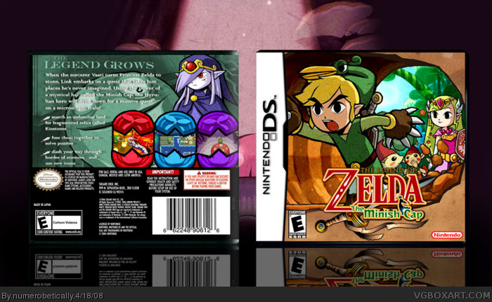
i'd like to draw your attention to a couple things. firstly, the front. the original image of link had a very creepy/suggestive smile link and i changed that, luckily cerium pointed it out to me. then there's zelda and the little minish dude in front of the promotional art for the game.
second thing is the back. the screen borders are kinstones and the screenshots match their respective kinstones. i wanted the back to contrast with the front (less saturation) because of vaati - i wanted the colors to match his (or her?) character.
please comment, im interested to know what you all think.
nice, but come on, has this site lost all originality? every other box is either Zelda, mario, or sonic...how about something good, but less publicized..come on... [/rant]
Looks really great,
#12 Whatever people are happy in making, I try to do more original titles, but Mario/Zelda/Sonic can be easier to do since there are more materials.
#12 not fair. i've done other stuff. plus i refuse to do sonic, and im not so in to doing mario boxes, if you've noticed. i would love to do something less known, and i'd really appreciate if you'd PM me a list of things you would like to see. that goes for everyone :)
#14 i think so too, but this box is different from the other minish cap ones :D
#12, yeah i try being more origional. because before i joined this site to NEVER make a SMG or SSBB box and to try and keep origional and do scarce subbmitted boxes...
but anyway this box is sick 4/5 but i dislike the back.
Im so glad you changed Links face! It looks so much better now!
One of your best boxes yet in my opinion! 5/5 +fav
and congrats on another fully deserved HoF!
Theres just no stopping you Nikki ^_^
 The Legend of Zelda: The Minish Cap Box Cover Comments
gfnodrgh nsdfh +fav
[ Reply ]
The front makes me....
...happy...
The editing on Link is great and the screenshots matchin the Kinstones look awesome.
Edited at 1 decade ago
[ Reply ]
#2 a little too happy...
[ Reply ]
*slow whistle*
i'd like to draw your attention to a couple things. firstly, the front. the original image of link had a very creepy/suggestive smile link and i changed that, luckily cerium pointed it out to me. then there's zelda and the little minish dude in front of the promotional art for the game.
second thing is the back. the screen borders are kinstones and the screenshots match their respective kinstones. i wanted the back to contrast with the front (less saturation) because of vaati - i wanted the colors to match his (or her?) character.
please comment, im interested to know what you all think.
[ Reply ]
hey could you PM me the logo but without "the minish cap" part ;) !
[ Reply ]
Vet/5
I mean +fav
[ Reply ]
#6, vet?
[ Reply ]
#7 check your PM's
thanks everyone
[ Reply ]
I preffered his evil grin. Still great though.
[ Reply ]
Awesome game. Awesome box. Nuff said.
Edited at 1 decade ago
[ Reply ]
#9 lol. it was epic. but perhaps a tad scary for the little ones haha.
[ Reply ]
nice, but come on, has this site lost all originality? every other box is either Zelda, mario, or sonic...how about something good, but less publicized..come on... [/rant]
[ Reply ]
Could you PM me the grinning Link? I didn't get to see :D
EDIT: Nevermind, I found it xD
Edited at 1 decade ago
[ Reply ]
Looks really great,
#12 Whatever people are happy in making, I try to do more original titles, but Mario/Zelda/Sonic can be easier to do since there are more materials.
Edited at 1 decade ago
[ Reply ]
Great job!
5/5
[ Reply ]
#12 not fair. i've done other stuff. plus i refuse to do sonic, and im not so in to doing mario boxes, if you've noticed. i would love to do something less known, and i'd really appreciate if you'd PM me a list of things you would like to see. that goes for everyone :)
#14 i think so too, but this box is different from the other minish cap ones :D
[ Reply ]
great job this is awsome!!
[ Reply ]
The description could do with a good stroke/shadow. I like the scene created on the front and the Kinstones work well. Faved.
[ Reply ]
#12, yeah i try being more origional. because before i joined this site to NEVER make a SMG or SSBB box and to try and keep origional and do scarce subbmitted boxes...
but anyway this box is sick 4/5 but i dislike the back.
[ Reply ]
You have a mismatching temp, but the art looks good. I think the screen shots are a little small and hard to see. Over all it looks good.
[ Reply ]
#19 haha there are quite a few boxes i have vowed not to make (since february, i believe): sonic games, ssbb, loz tp, and a few others.
#20 mismatching meaning the color of the plastic, right?
[ Reply ]
Awesome, I love this and congrats. :)
[ Reply ]
I think you've done a great job with it. Very well done, and very clean (Something that always scores big points with me.)
[ Reply ]
It's... It's beautiful... *wipes tear* Nice job 5/5 +fave
[ Reply ]
It is wonderful, love the editing you made and the screenshots borders.
[ Reply ]
Very well done. Congrats on yet another HoF:) I guess at this point they're just gonna keep coming in.
[ Reply ]
Im so glad you changed Links face! It looks so much better now!
One of your best boxes yet in my opinion! 5/5 +fav
and congrats on another fully deserved HoF!
Theres just no stopping you Nikki ^_^
[ Reply ]