The logo's choppy and blurry, the render on the front is blurry, the text on the back is too big, blurry and the font doesn't fit the game, Travis' sword is coming off the template, the reflection is messed up and overall it's not very good.
It's good that you know what to do and that you've easily adopted GIMP :D
Whats that border/texture thing you used on the screenshots and logo? (that looks like it's falling apart)
 No More Heroes Box Cover Comments
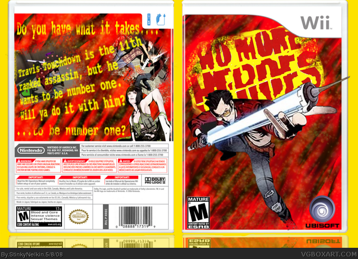
Well, here it is!!!!
Credit to koopa for the temp, planet renders for the renders and the recouce thread for the logos....
I loved marker's no more heroes box, so I took inspiration from it. Also, I wanted it to look fairly gritty, hence all the fading..
Comments are welcome
Edit: Oops! I noticed that it says touchdow, instead of touchdown...I'll fix it later......
Edited at 1 decade ago
[ Reply ]
Very nice =)
[ Reply ]
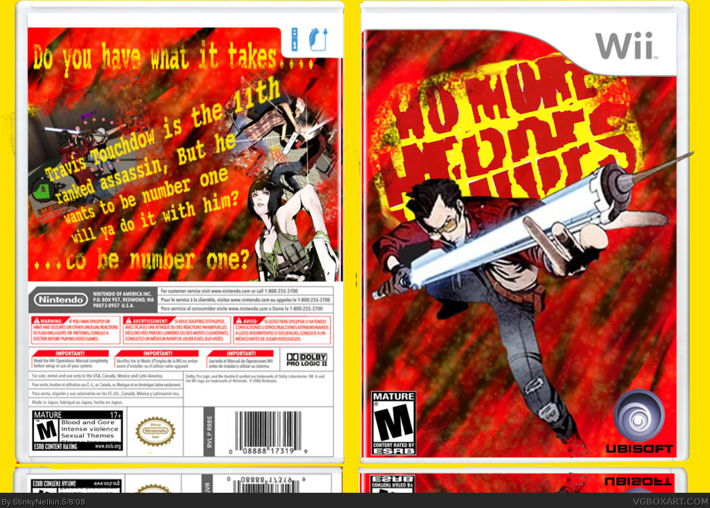
Updated!!
[ Reply ]
The logo's choppy and blurry, the render on the front is blurry, the text on the back is too big, blurry and the font doesn't fit the game, Travis' sword is coming off the template, the reflection is messed up and overall it's not very good.
[ Reply ]
#4, well, I'll take it as is, thanks for the advice though...
I forgot to mention....this is my first
Edited at 1 decade ago
[ Reply ]
It's good that you know what to do and that you've easily adopted GIMP :D
Whats that border/texture thing you used on the screenshots and logo? (that looks like it's falling apart)
[ Reply ]
OMG GREAT GAME AND BOX!! FAVV
[ Reply ]
its a good box except the logo is to hard to read and the dudes sowrd thingy is going off the page
[ Reply ]
the discription on the back is really not very good and if its the actual descriptin then i will take it back
[ Reply ]