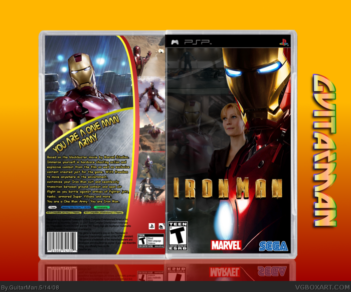
I was a bit sceptiable about posting this now but well here it is. For the Font i expriamented and i found this was the best result. So let me know what you guys think.
Excellent. I would suggest a better font for the back. The one you used just doesn't work with the movie. Also, the bottom screenshot should be fading out, instead of cutting off. Oh, and you used the same screenshot twice. ;)
The font you used is ok on the one man army part but i think you should use a more basic font for the description. I would fix the double image and the border around it. Its very pixelated. I would ask someone that is good to cut your logo out. Its a little choppy. Over all its pretty cool. There is a lot of images on it and i see the effort.
Just a quick little fix up on the back and a little on the front.
-Screenshots Fixed
-Different Font
-Not As Pixelated Border
-Pepper moved over to the right more
 Iron Man Box Cover Comments
I was a bit sceptiable about posting this now but well here it is. For the Font i expriamented and i found this was the best result. So let me know what you guys think.
Credit:
Template: Jevangod/Star
Logo: Myself
EDIT: My first PSP Box
Edited at 1 decade ago
[ Reply ]
can i take this box into a dark closet and bang the iron out of it? :D
+Fav
EDIT: #3 & #5, xD
Second EDIT: #6 is right, i didn't notice but you DID use the same pic twice =P its still good though :D
Edited at 1 decade ago
[ Reply ]
#2, that would be Marvel's job. Lol, just kiddin' with ya man.
GuitarMan, nice job with the box!
[ Reply ]
Nice one...
[ Reply ]
#2, now i never want to leave my room for three years. jk
[ Reply ]
Excellent. I would suggest a better font for the back. The one you used just doesn't work with the movie. Also, the bottom screenshot should be fading out, instead of cutting off. Oh, and you used the same screenshot twice. ;)
Edited at 1 decade ago
[ Reply ]
#6, whoops, that's embarassing. lol
i'll fix the screen stuff.
the font i felt was different, very technonogical.
[ Reply ]
The font you used is ok on the one man army part but i think you should use a more basic font for the description. I would fix the double image and the border around it. Its very pixelated. I would ask someone that is good to cut your logo out. Its a little choppy. Over all its pretty cool. There is a lot of images on it and i see the effort.
[ Reply ]
#8, I agree. The description font should be more clear. But it's an awsome box. 5/5 +Fav
[ Reply ]
I like it but the girl on the front is just random.
[ Reply ]
#10, that's Pepper Potts. She's a big character.
[ Reply ]
Cool, I especially like the back concept. ;)
[ Reply ]
Just a quick little fix up on the back and a little on the front.
-Screenshots Fixed
-Different Font
-Not As Pixelated Border
-Pepper moved over to the right more
Edited at 1 decade ago
[ Reply ]
#11, YEa so is my boy from hustle and flow and hes not on the front cover.
[ Reply ]
#14, who James Rhodes? I had him in there when i started but i just looked extremely crowded
[ Reply ]