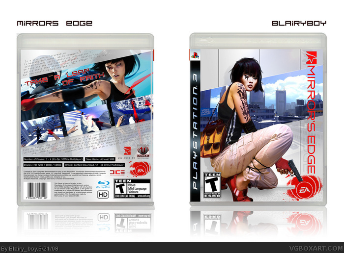
this is kind of my return box as i havent reli made any for a while!
been workin on this for the past few days after marker posted his and reli like how its turned out!
obviously taken some inspiration off markers and codemasters versions!
credit to madspike for the hi-res logo!
comments pls!
I think all Mirror's Edge boxes looks a bit the same now days. I don't realy like both arts and don't realy like this white diagonal lines (in MARKER's box too). But, this one looks good, so I guess, I don't have a reason not to fav it.
So, + Fav
#10, What? Has the media honestly corrupted you so much that you believe that all videogame characters should have big tits and be hot? Come on Greg, I expected you at least to have more sense than that. People aren't born perfect---you know that. Making a big deal out of the MC being ugly is extremely childish. Hell, it's just as bad as drooling over those that droll over the ones that ARE good looking. It's bad enough that you said it once, but to repeatedly say it on other Mirror's Edge boxes? Come on, man.
BTW, if you're kidding, then just ignore than I ever said anything about this subject. It's hard to tell on the internet.
As for the box, pretty solid work on this one, but I feel that it's missing some color. Still, nicely composed, and well done.
Nice box mate... I guess it has a few similarities to my box (ie. the OCR font ;)) but nicely put together ;) --- we now wait for Spike's version to blitz us with something different! LOL
#11, no, that wasn't what i was saying. i'm just stating that i think the main character is really ugly, so I hate all the artwork to it. My first impression of a game from a trailer is usually the lead character, the setting, the music, etc. None of which I liked very much.
 Mirror's Edge Box Cover Comments
this is kind of my return box as i havent reli made any for a while!
been workin on this for the past few days after marker posted his and reli like how its turned out!
obviously taken some inspiration off markers and codemasters versions!
credit to madspike for the hi-res logo!
comments pls!
[ Reply ]
I think all Mirror's Edge boxes looks a bit the same now days. I don't realy like both arts and don't realy like this white diagonal lines (in MARKER's box too). But, this one looks good, so I guess, I don't have a reason not to fav it.
So, + Fav
[ Reply ]
agree with mad spike but this is aswome! nicely done
[ Reply ]
This is history in the making!
[ Reply ]
You make some of the sleekest boxes on the site, this is no exception.
[ Reply ]
Great box!
[ Reply ]
#6, I have to agree this is very well done. I really do love this
[ Reply ]
Not my favorite of yours, but great nonetheless
[ Reply ]
Srry, double post
Edited at 1 decade ago
[ Reply ]
I would be super hyped for this game if the main character wasn't so shit ugly. =(
nice box btw
[ Reply ]
#10, What? Has the media honestly corrupted you so much that you believe that all videogame characters should have big tits and be hot? Come on Greg, I expected you at least to have more sense than that. People aren't born perfect---you know that. Making a big deal out of the MC being ugly is extremely childish. Hell, it's just as bad as drooling over those that droll over the ones that ARE good looking. It's bad enough that you said it once, but to repeatedly say it on other Mirror's Edge boxes? Come on, man.
BTW, if you're kidding, then just ignore than I ever said anything about this subject. It's hard to tell on the internet.
As for the box, pretty solid work on this one, but I feel that it's missing some color. Still, nicely composed, and well done.
[ Reply ]
#10, WTF... you dont hardly see her face in the game anyway so i believe...
And wow, Who gives a crap...
[ Reply ]
Faith (Mirror's Edge) = Nariko (Heavenly Sword) = Lucy Liu (Actress) = Stereotype Asian Girl :) And even = Chell (Portal) a bit :D LOL :D
[ Reply ]
1 word, fav :)
Edited at 1 decade ago
[ Reply ]
#11, yeah, or it could just be a guy.
Great job. It looks too similar to all the others, though. I think people should wait until more material comes out.
[ Reply ]
Nice box mate... I guess it has a few similarities to my box (ie. the OCR font ;)) but nicely put together ;) --- we now wait for Spike's version to blitz us with something different! LOL
[ Reply ]
#16, Yes, it will be totaly different.
*Hidden Advertisment*
[ Reply ]
Very stylish indeed, though I think there's a bit too much text on the back.
haha @ Spike. lol XD
[ Reply ]
Woah.
[ Reply ]
#11, no, that wasn't what i was saying. i'm just stating that i think the main character is really ugly, so I hate all the artwork to it. My first impression of a game from a trailer is usually the lead character, the setting, the music, etc. None of which I liked very much.
[ Reply ]
4.9/5 i love it.
Fav
[ Reply ]
great cover !!
I really like it !
[ Reply ]
It looks great, but I don't really like that she has a hun on the front.
but I'll fav
[ Reply ]
5/5, awesome
[ Reply ]