I hope on my life that this is my out of the slump box. Ok, here I go.
This I think is my best box so far. It was really fun to make, too. As usual, I posted in the critiques forums, but barley anyone responds. Vivi and Nikki, thank you for replying. I like this, and I hope you guys do too. Enjoy^^
MAJOR CREDIT TO- Indexenos for his beastly KICKASS psp temp
FB1 for screenshot borders, creative uncut for artwork, and google for capcom logos. Also credit to Nikki, Cerium, and Oxol for finding me the pegi logo.
With that said, enjoy. Oh, yeah Inspiration from all the people who made excellent RE4 boxes.
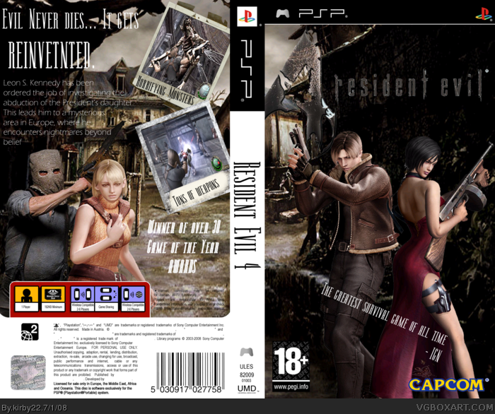
Well... you didn't cut out the 18+ logo, the font is bad, the logo on the front is cutting off, the renders are choppy and don't blend, bad background, there are no font effects, you spelled "reinvented" wrong, and the text is hard to read. 1.5/5
Sorry.
EDIT: Also, no need to credit those people for finding something that can be found in 5 seconds on Google.
#4 Check out what I said on you're WIP thread, this is where it comes into play.
TTT honestly, you are over exaggerating this a bit. 1.5? This gets a 2.7/5 for me. The text isn't great and the quote is meh. The only other things that are noticeably horrid are the renders.
I agree with TTT about everything. 1.9/5 Oh yea, and Dr.Salvador's a freaking action figure, in case the brightness of your computer is messed up or something. Plus, the text is hard to read. You REEEEEALLY need to look at some tutorials or something, no offense, but lately your boxes have been absolutely crap, Lemme give you some advice that'll help in the long run: if you stop spending 2-3 days on a single box and make about 10 in one month, try and spend ALL that time on one SINGLE box. That's what people like qwerty, DMS, and MadSpike, among others do, and all of their boxes are smash hits. If you're not happy with it, DON'T POST IT.
#10, Eh? Are you trying to say I'M asking for a ban? How, by providing kirby with criticism? Lemme tell you, I was one of the first people to critique him, and after almost 6 months, the only way he's gonna be better is if people lay down the facts, straight and true. Sugar-coating it ain't gonna cut it. But seriously, who are you to tell me how to give advice? I don't see you contributing, so either give him some adivce, or don't comment.
 Resident Evil 4 Box Cover Comments
I hope on my life that this is my out of the slump box. Ok, here I go.
This I think is my best box so far. It was really fun to make, too. As usual, I posted in the critiques forums, but barley anyone responds. Vivi and Nikki, thank you for replying. I like this, and I hope you guys do too. Enjoy^^
MAJOR CREDIT TO- Indexenos for his beastly KICKASS psp temp
FB1 for screenshot borders, creative uncut for artwork, and google for capcom logos. Also credit to Nikki, Cerium, and Oxol for finding me the pegi logo.
With that said, enjoy. Oh, yeah Inspiration from all the people who made excellent RE4 boxes.
[ Reply ]
Well... you didn't cut out the 18+ logo, the font is bad, the logo on the front is cutting off, the renders are choppy and don't blend, bad background, there are no font effects, you spelled "reinvented" wrong, and the text is hard to read. 1.5/5
Sorry.
EDIT: Also, no need to credit those people for finding something that can be found in 5 seconds on Google.
Edited at 1 decade ago
[ Reply ]
#2, Also, the quote on the front looks terrible.
[ Reply ]
Well how come no one ever tells me this in the forums?!?
[ Reply ]
#4 Check out what I said on you're WIP thread, this is where it comes into play.
TTT honestly, you are over exaggerating this a bit. 1.5? This gets a 2.7/5 for me. The text isn't great and the quote is meh. The only other things that are noticeably horrid are the renders.
[ Reply ]
#5 you didn't say anything on my wip thread...
[ Reply ]
#6 I meant you're VGBA shop.
[ Reply ]
#5, you say I'm too harsh about everything. Seriously, cut it out.
[ Reply ]
I agree with TTT about everything. 1.9/5 Oh yea, and Dr.Salvador's a freaking action figure, in case the brightness of your computer is messed up or something. Plus, the text is hard to read. You REEEEEALLY need to look at some tutorials or something, no offense, but lately your boxes have been absolutely crap, Lemme give you some advice that'll help in the long run: if you stop spending 2-3 days on a single box and make about 10 in one month, try and spend ALL that time on one SINGLE box. That's what people like qwerty, DMS, and MadSpike, among others do, and all of their boxes are smash hits. If you're not happy with it, DON'T POST IT.
[ Reply ]
#9, quit asking for bans, seriously.
[ Reply ]
#10 that was criticism Redhedd. Sure, he's very aggressive, but it's criticism.
Edited at 1 decade ago
[ Reply ]
#10, Eh? Are you trying to say I'M asking for a ban? How, by providing kirby with criticism? Lemme tell you, I was one of the first people to critique him, and after almost 6 months, the only way he's gonna be better is if people lay down the facts, straight and true. Sugar-coating it ain't gonna cut it. But seriously, who are you to tell me how to give advice? I don't see you contributing, so either give him some adivce, or don't comment.
[ Reply ]
Look like my box art...
[ Reply ]