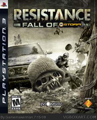
I first looked at the 2 comments, and then at the logo. It looked like a crappy box.. I didn't get it. Finally, I got to the picture, I burst out laughing.. that pictures just really funny..
Pretty funny when you think about it, only one thing maybe you should let the Storm part in the logo blend in a bit more with the rest of the title text.
#1, dude, just shut up and give it a rest already! And while you're at it, be more constructive as well! This box is very well made, and pretty funny at the same time if you think about it.
 Resistance: Fall of Storm Box Cover Comments
These aren't funny/clever in any way.
#2, erm what?
Edited at 1 decade ago
[ Reply ]
#1, Erm...
[ Reply ]
I first looked at the 2 comments, and then at the logo. It looked like a crappy box.. I didn't get it. Finally, I got to the picture, I burst out laughing.. that pictures just really funny..
[ Reply ]
Pretty funny when you think about it, only one thing maybe you should let the Storm part in the logo blend in a bit more with the rest of the title text.
[ Reply ]
i'll admit the editing is nice, but the idea is stupid
[ Reply ]
#1, You said "these are" before...
[ Reply ]
#1, dude, just shut up and give it a rest already! And while you're at it, be more constructive as well! This box is very well made, and pretty funny at the same time if you think about it.
Edited at 1 decade ago
[ Reply ]