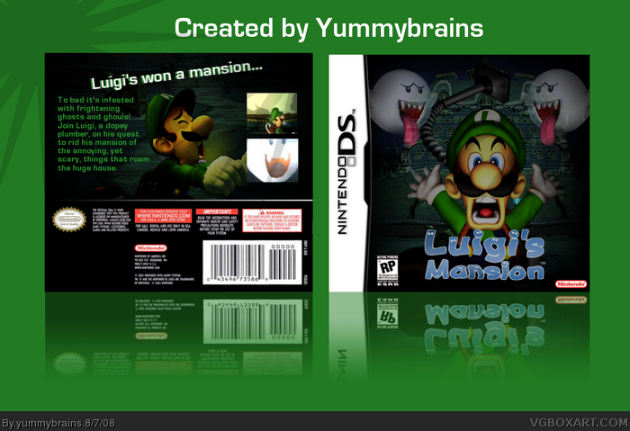
Luigi's Mansion DS:
Made this during the creation of a secret box. *Silence*
Credit to Xcore for doing an inner shadow on Luigi, and
Planetrenders for that Luigi render. So, yeah, comments
and favs are appreciated, as is constructive criticism.
Thanks again, Yummybrains!
I pretty much agree with all that's been said. The back text is too large, and sticks out, and clashes with the Tagline, which is on an angle. ESRB is wrong, screens could be presented a little better, and overall it's pretty plain. I know you can do better than this dude ;)
 Luigi's Mansion DS Box Cover Comments
Luigi's Mansion DS:
Made this during the creation of a secret box. *Silence*
Credit to Xcore for doing an inner shadow on Luigi, and
Planetrenders for that Luigi render. So, yeah, comments
and favs are appreciated, as is constructive criticism.
Thanks again, Yummybrains!
[ Reply ]
Ah! You fixed the borders! Nice job
Though back feels a tiny bit empty
Edited at 1 decade ago
[ Reply ]
+fav
Edited at 1 decade ago
[ Reply ]
#2, Yeah, not much really to put on it.
#3, Thanks.
[ Reply ]
Nice job mate.
Agreed with #2.
Also, i really dislike the bright-green presentation..sorry..
[ Reply ]
#5, Why thank you young man.
Don't be sorry about ze presentation. I won't change because I can't be assed. lol.
[ Reply ]
Replace the RP with E on front and back.
[ Reply ]
#7, Oh yea. Will do if I get the time.
[ Reply ]
All this work and this is how you repay me?
*Dies*
[ Reply ]
I pretty much agree with all that's been said. The back text is too large, and sticks out, and clashes with the Tagline, which is on an angle. ESRB is wrong, screens could be presented a little better, and overall it's pretty plain. I know you can do better than this dude ;)
[ Reply ]
#10, Well that was an unexpected comment!
Thanks for the c&c dude, i know i'll do better next time.
[ Reply ]