#9, It's because there's too much text on the back, some of it is too small and it's blurry, the screen shots are too small as well. StinkyNelkin I suggest you spend more time on the backs of your boxes.
#10, Thanks for the advice. I agree though. I find that, that's usually the same with my boxes, Except for Viewtiful Joe. I really find it quite difficult to make the back both functional...and not cluttered. Advice?
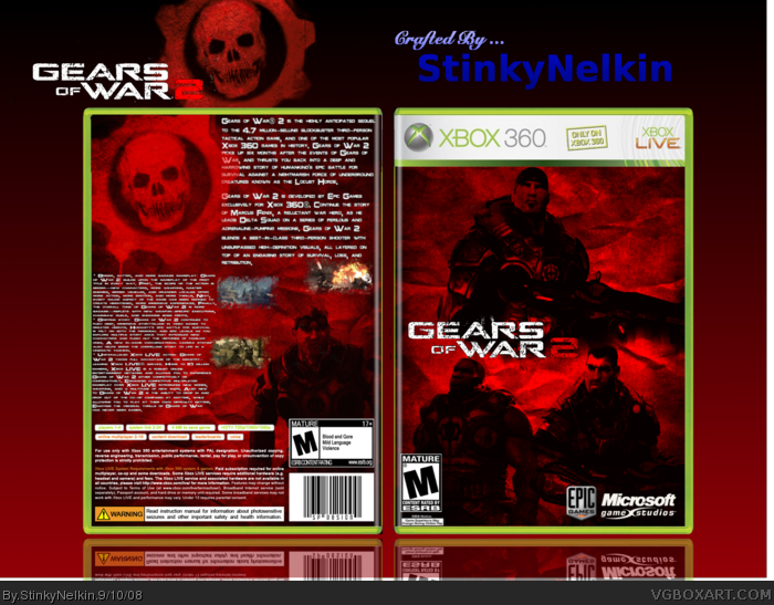
 Gears of War 2 Box Cover Comments
I am very proud of this one. Credit to:
-Icefox for back info
-Planetrenders for the renders
-El Crazy for template
-Recource thread for logos.
-Enjoy!
Edited at 1 decade ago
[ Reply ]
I forgot to mention..Please VIew in full.
[ Reply ]
The fronts kool but you should fix up the back a little.
[ Reply ]
#2 bumper... :p
Looks great, I love this!
[ Reply ]
#3, #4, Thanks.
[ Reply ]
Ack/
Too much text >___<
[ Reply ]
I like what you did with the front, but the back has too much text and the screenshots are too small.
[ Reply ]
get rid of the bottom half of the text, and make the screenshots bigger.
[ Reply ]
front is ace. back...err, not so much. [not payed to bump]
[ Reply ]
#9, It's because there's too much text on the back, some of it is too small and it's blurry, the screen shots are too small as well. StinkyNelkin I suggest you spend more time on the backs of your boxes.
[ Reply ]
#10, Thanks for the advice. I agree though. I find that, that's usually the same with my boxes, Except for Viewtiful Joe. I really find it quite difficult to make the back both functional...and not cluttered. Advice?
Edited at 1 decade ago
[ Reply ]