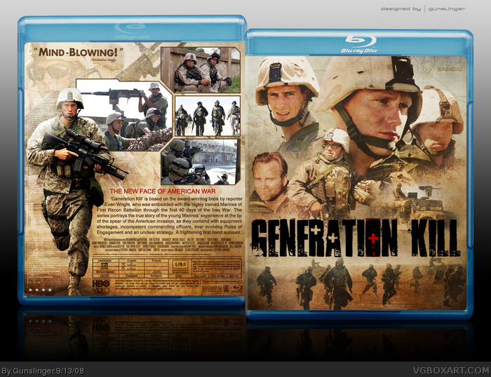
Generation Kill is a great read and an equally great mini-series that recently aired on HBO. I felt the design of the box art had to reflect the grittiness of the combat zone and the high tech nature of the war and I think I was able to pull it off.
As always, your crits and comments are appreciated. Enjoy. ^_^
 Generation Kill Box Cover Comments
Generation Kill is a great read and an equally great mini-series that recently aired on HBO. I felt the design of the box art had to reflect the grittiness of the combat zone and the high tech nature of the war and I think I was able to pull it off.
As always, your crits and comments are appreciated. Enjoy. ^_^
[ Reply ]
Very nice. looks genuine.
[ Reply ]
Awesome dude.
[ Reply ]
My dad watches this show. The guy on the back looks like he's gotta drop a load.
[ Reply ]
Awesome, the grunge's a bit overworked, and I still dislike that template, but the lasting appeal and excellent composition on this box is top notch!
[ Reply ]
Mind-blowingly awesome! :D Fantastic job Gunslinga! :P 6/5 +fave
[ Reply ]
i dont like the logo, but this looks great i love montages.
[ Reply ]
Seriously, marry me.
[ Reply ]
Great work as always!
[ Reply ]
#5, What's wrong with the template?
Anyway Slinger, it's awesome, but is the red square supposed to be all the way behind the O?
[ Reply ]
Oh baby! Stunning composition as always, sweet work. :)
[ Reply ]
Looks lovely! great work.
[ Reply ]
Not heard of the series... but real nice design there mate :)
[ Reply ]
that looks real good
[ Reply ]
Thanks for the favs and comments. To answer your question Hunter, yes, that red square behind the O is part of the logo.
[ Reply ]
Ace, it's so legit!
[ Reply ]
mind-blowing, indeed :D
gratz for HOF
Edited at 1 decade ago
[ Reply ]
Love the series, love the box.
[ Reply ]
thanks.
[ Reply ]