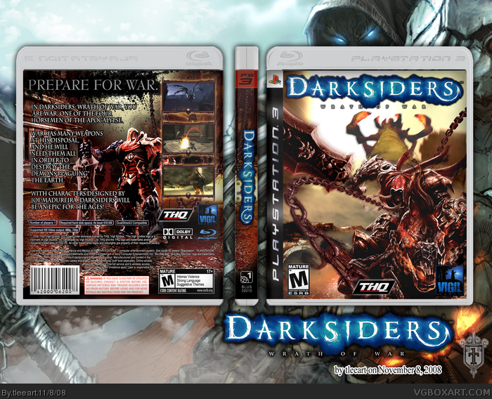
This is my newest box. I have wanted to do this for about 3 boxes now, since God of War III. But it was another challenge for me to do well, so I backed off.
Credits:
-Techne for the plastic of my template
-Lumberjack42 @ the Cover Project www.thecoverproject.net for the PS3 template
-Darksiders official website link for most of the artwork and GameTrailers(.com) and G4TV(.com) for additional footage.
-The War render on the front is from PlanetRenders, I edited it to have a better sword.
I created the render of War on the back from one of the official wallpapers.
Before I had Ladykiller have a look at this, it was much more frantic of a design. I'm glad I toned it down some. The hardest thing to find was a good shot of that sand worm like enemy used on the front.
I tried to occupy space as much as possible without it looking crowded. I hope you guys like it!
BTW, here's an official notice of my next boxes.
I have two collabs to complete, then my next actual box of my own will be...Sonic Unleashed. I think I need to do that to force myself to do something creative on something that's been done a million times already.
Okay, here's an addressing to all that's been said. I'm glad that this has a bit of a following, thanks for the comments and favs!
I first heard about Darksiders from Game Informer magazine. I've seen it in action and in person, it looks like it could be good.
Now, regarding the logo. I realize what you guys are saying. Here's a reference to an official comic book cover you can view by registering on the official Darksiders site that I linked on my first comment. Also, the logo used in the official trailer displays similarly. link
I didn't think it was too bad, given what they did here.That's if I'm assuming correctly and you're talking about the blue glow, if you're refering to something else, I guess I just suck. Maybe I'll see about cutting it out better? We'll see.
Anyway, regarding my template, this is the exact location I found the plastic (Techne's temp)http://vgboxart.com/forums/showthread.php?t=4708&page=5 I then deleted all the extra because I use a PSD template from my favorite resource, The Cover Project and their template page link If you mean my compiled version PSD PM me and ask for it, I'll think about releasing it, though I don't really have any say, because I just pieced stuff together, lol.
 Darksiders: Wrath of War Box Cover Comments
Awesome
[ Reply ]
This is my newest box. I have wanted to do this for about 3 boxes now, since God of War III. But it was another challenge for me to do well, so I backed off.
Credits:
-Techne for the plastic of my template
-Lumberjack42 @ the Cover Project www.thecoverproject.net for the PS3 template
-Darksiders official website link for most of the artwork and GameTrailers(.com) and G4TV(.com) for additional footage.
-The War render on the front is from PlanetRenders, I edited it to have a better sword.
I created the render of War on the back from one of the official wallpapers.
Before I had Ladykiller have a look at this, it was much more frantic of a design. I'm glad I toned it down some. The hardest thing to find was a good shot of that sand worm like enemy used on the front.
I tried to occupy space as much as possible without it looking crowded. I hope you guys like it!
BTW, here's an official notice of my next boxes.
I have two collabs to complete, then my next actual box of my own will be...Sonic Unleashed. I think I need to do that to force myself to do something creative on something that's been done a million times already.
Thanks #1!
Edited at 1 decade ago
[ Reply ]
Awe-Some.
Really nice tleeart. :D Only thing is the template is choppy.
+Fav though!
[ Reply ]
Perfect render choice for the front sir. The symmetry pulls me right in!
An excellent piece throughout!
[ Reply ]
#3, Crap, I'll fix that, it's not supposed to be choppy.
#4, Thanks a lot, I'm not sure how strong my back is, but my front was where I put the most thought into making appealing to the eye.
EDIT: Better? ^_^
Edited at 1 decade ago
[ Reply ]
Slick.
[ Reply ]
niiice.
[ Reply ]
I really love the back but i dont like how the logo is cut out^^
[ Reply ]
quick question, temp please? :) the one you used here
[ Reply ]
Really nice, but agreed with goku, the logo doesn't seem like it was cut out properly at all.
[ Reply ]
never heard of the game, but the boxart is amazing!
[ Reply ]
same as # 11, but WZOW. great box
[ Reply ]
Okay, here's an addressing to all that's been said. I'm glad that this has a bit of a following, thanks for the comments and favs!
I first heard about Darksiders from Game Informer magazine. I've seen it in action and in person, it looks like it could be good.
Now, regarding the logo. I realize what you guys are saying. Here's a reference to an official comic book cover you can view by registering on the official Darksiders site that I linked on my first comment. Also, the logo used in the official trailer displays similarly.
link
I didn't think it was too bad, given what they did here.That's if I'm assuming correctly and you're talking about the blue glow, if you're refering to something else, I guess I just suck. Maybe I'll see about cutting it out better? We'll see.
Anyway, regarding my template, this is the exact location I found the plastic (Techne's temp)http://vgboxart.com/forums/showthread.php?t=4708&page=5 I then deleted all the extra because I use a PSD template from my favorite resource, The Cover Project and their template page link If you mean my compiled version PSD PM me and ask for it, I'll think about releasing it, though I don't really have any say, because I just pieced stuff together, lol.
Edited at 1 decade ago
[ Reply ]
yet again, another awesome box from tleeart. great job man. :D
[ Reply ]
Good job Tleeart, I really like this one.
[ Reply ]
Thanks, guys!
[ Reply ]