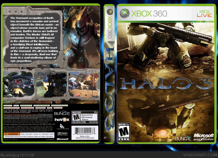
Well, I think you really fit this box into the competition's category, creativity. The front is pretty cool, I like it a lot, but the back would look a bit better if it had the sandish and darker feel to it to go along with the front.
I think the back could use a bluray logo somewhere to match PS3's format of displaying the disc type on their packaging, but this looks pretty nice. I agree with HalfSwiss on how blocky the format is, but it doesn't look bad. I like the borders.
 Halo 3 Box Cover Comments
Front = R2/Fable 2/ Crisis Core mix? looks nice overall.
[ Reply ]
HOLY 0_0
[ Reply ]
My box for the Master Aspects competition. Comments and criticism are welcome :)
[ Reply ]
Well, I think you really fit this box into the competition's category, creativity. The front is pretty cool, I like it a lot, but the back would look a bit better if it had the sandish and darker feel to it to go along with the front.
4/5
[ Reply ]
I like how the front looks, but the back seems kind blocky, if you know what I mean...
[ Reply ]
If you cleaned this up it would look cool. You have a lot of sloppy areas.
[ Reply ]
Take me to your art source.
[ Reply ]
#7, IGN.com
[ Reply ]
The template actually looks really cool (although a bit choppy)
[ Reply ]
I uploaded a less choppy version
Edited at 1 decade ago
[ Reply ]
I think the back could use a bluray logo somewhere to match PS3's format of displaying the disc type on their packaging, but this looks pretty nice. I agree with HalfSwiss on how blocky the format is, but it doesn't look bad. I like the borders.
[ Reply ]
I like this. If it was on the actual 360 template and a little better quality wise I think this would have gotten you a lot more +Favs and comments.
[ Reply ]
-Double Post of Comment-
Edited at 1 decade ago
[ Reply ]
Sergant Johnson, I listened to you and put a regular Xbox 360 template. :)
[ Reply ]
Something about the back just kills it for me....I love the front though
[ Reply ]
that logo is horrible. Otherwise pretty good though
[ Reply ]