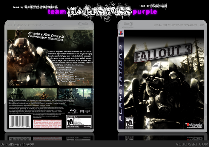
This looks pretty sweet, I like the darker look to it. My only problem is the "America's First Choice in Post-Nuclear Simulation".. it doesnt really fit in on my opinion, but the box is still awesome.
Looking pretty sharp man. I like the alternative background you used on the front, and the back layout is very slick. I agree with #2 though, maybe straighten the tagline out, and make it just a bit bigger. terrific work though.
 Fallout 3 Box Cover Comments
WOOHOO! I finally came up with a new box. I'm happy with how it came out.
Yeah, for Yummy... er... Master Aspects! Duel against M_G.
Good luck, M_G!
[ Reply ]
This looks pretty sweet, I like the darker look to it. My only problem is the "America's First Choice in Post-Nuclear Simulation".. it doesnt really fit in on my opinion, but the box is still awesome.
+fav
[ Reply ]
nice.
[ Reply ]
This is kewl but I dont really like the temp. I just really hate the font on the temp for the Playstation 3 and the Blue Ray logo.
[ Reply ]
#2, yeah, I wasn't feeling the look on the tagline, but I couldn't think of anything else. Adding grunge brushes was the best I could think of.
#4, well, it's what a PS3 box looks like, so nothing I can do.
EDIT: Vote now! link
Edited at 1 decade ago
[ Reply ]
Looking pretty sharp man. I like the alternative background you used on the front, and the back layout is very slick. I agree with #2 though, maybe straighten the tagline out, and make it just a bit bigger. terrific work though.
[ Reply ]
#6, thanks a bunch. I would straighten the tagline, but that would just make it look more plain IMO.
[ Reply ]
verah ice, though i think it'll be hard to find the winner of our match
[ Reply ]
you got really excited with those scanlines dont you :P?
[ Reply ]
#9, scanlines save my life every time when my box doesn't have a big feel. I <3 them.
Edited at 1 decade ago
[ Reply ]
Agreed with Joel. Aside from the awkward black part on the top of the front, it's great. Nice job, man. ^^
[ Reply ]
#11, thanks a bunch, LK. =)
[ Reply ]