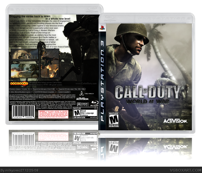
It's pretty ok, I think. This is my box for the FPS BoxArt Competition.
Credit to ElectricDynamite for the logo, IceFox for the text on the back, and.. Sentry I think it war for the template. Google Images for all the rest I suppose.
Please rate and comment, and favorites are always appreciated.
I agree with #4 and #7 and the Activision logo should be lower down.
Other than that, a really decent effort and it shows you are improving.
Nice going 3.5/5
Okay, I have updated this box.. The front logo now has a little drop shadow, and the back has a tagline. As for the Activision logo, it looks fine to me..
 Call of Duty: World at War Box Cover Comments
Great job man! I really like it.
#2, No, I like it because it's very well put together.
Edited at 1 decade ago
[ Reply ]
It's pretty ok, I think. This is my box for the FPS BoxArt Competition.
Credit to ElectricDynamite for the logo, IceFox for the text on the back, and.. Sentry I think it war for the template. Google Images for all the rest I suppose.
Please rate and comment, and favorites are always appreciated.
[ Reply ]
Now thats rather depressing.. post it at a bad time or something? Thanks for the fav Sentry..
[ Reply ]
I like it :) the front logo could do with a hard drop shadow and a nice tagline on the back, but other than that it look quite good.
[ Reply ]
Nice, I like it. But I agree with hsoldier, it needs a tagline. Also the text on the back is a little hard to read. Other than that *thumbs up*
[ Reply ]
pretty cool. ;)
[ Reply ]
Its really nice milky... but you should move the logo up... 4.5/5!!
[ Reply ]
I agree with #4 and #7 and the Activision logo should be lower down.
Other than that, a really decent effort and it shows you are improving.
Nice going 3.5/5
[ Reply ]
Okay, I have updated this box.. The front logo now has a little drop shadow, and the back has a tagline. As for the Activision logo, it looks fine to me..
[ Reply ]