This is my entry for Round 1 of The New Year's Rocking Competition. The theme is "Games of 2009", as some of you should know.
My opponent in round 1 is master_general, who is also running the comp. Since I had to send him my submission anyways, I figured I go ahead and upload this to my gallery now.
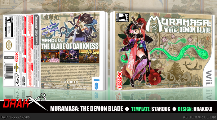
Muramasa: The Demon Blade is due out this year from the developers of Odin Sphere. After the inevitable Resident Evil 5, I'm looking forward to this game the most so far based on the line up for 09'.
I decided to go with the horizontal alignment as I wanted to base the design with a very strong Feudal Era Japanese art style, and I decided to set things up almost like a traditional Japanese screen, or "Shoji" as I learned they were called while doing research.
This alignment is not really reasonable for most media box designs, but I hope you'll agree that it definitely compliments the style on this piece. Xseed, the publisher slated to release Muramasa stateside later in the year, also released the PSP game "Brave Story" with a horizontal alignment, which was also inspiration for doing things the way I did.
The front and back characters I rendered from various artwork images I found from the game. They are filtered a bit, as most of the images I found were considerably small. The monsters on the screens in the front are renders I made from actual screenshots of the game, also filtered. The rest is either edited Google images or various textures.
The only items I drew for this design are the eye under the "M" in the front logo, and the various Japaneses style clouds and swirls you see through out the design.
All in all, I'm very pleased how this one came out, and I hope you guys enjoy it as well.
Great presetation, although the ESRB logos and the publisher names should have been made horizontal as well, they don't seem to agree with the box art.
That's amazing, I'm not so sire I like the idea of it being sideways, but it apparently works. Beautiful work here, stunning design and awesome execution. Seeing your work is like a breath of fresh air.
Oh my.
This is insane dude, really love this, the horizontal thing confused me at first, but then I read so, I agree its fresh, but also agree about the logos and stuff. The design is incredible, its funky, colourful, with a good arrangement, and everything is pretty appealing, great job! :)
I keep the ESRB and other logos vertical based on the official design for Brave Story, which uses a similar horizontal layout. I figured keeping those things in the standard vertical alignment would not completely through it off when retailers display it on the shelf.
 Muramasa: The Demon Blade Box Cover Comments
Hey everyone,
This is my entry for Round 1 of The New Year's Rocking Competition. The theme is "Games of 2009", as some of you should know.
My opponent in round 1 is master_general, who is also running the comp. Since I had to send him my submission anyways, I figured I go ahead and upload this to my gallery now.
Muramasa: The Demon Blade is due out this year from the developers of Odin Sphere. After the inevitable Resident Evil 5, I'm looking forward to this game the most so far based on the line up for 09'.
I decided to go with the horizontal alignment as I wanted to base the design with a very strong Feudal Era Japanese art style, and I decided to set things up almost like a traditional Japanese screen, or "Shoji" as I learned they were called while doing research.
This alignment is not really reasonable for most media box designs, but I hope you'll agree that it definitely compliments the style on this piece. Xseed, the publisher slated to release Muramasa stateside later in the year, also released the PSP game "Brave Story" with a horizontal alignment, which was also inspiration for doing things the way I did.
The front and back characters I rendered from various artwork images I found from the game. They are filtered a bit, as most of the images I found were considerably small. The monsters on the screens in the front are renders I made from actual screenshots of the game, also filtered. The rest is either edited Google images or various textures.
The only items I drew for this design are the eye under the "M" in the front logo, and the various Japaneses style clouds and swirls you see through out the design.
All in all, I'm very pleased how this one came out, and I hope you guys enjoy it as well.
Edited at 1 decade ago
[ Reply ]
....O.O
that's weird. lol
[ Reply ]
Simply fantastic.
[ Reply ]
I <3 You O.o
lmao This box rocks!
[ Reply ]
first david cook, and now joel?...kyle. you gotta quit it with the man crushes dude. lol.
and like i said, it looks weird joel...but in a good way. :D
[ Reply ]
looks good. not sure about the horizontal thing though.
[ Reply ]
Really good, I like the presentation a lot.
Edited at 1 decade ago
[ Reply ]
Beautiful. Absolutley Beautiful.
[ Reply ]
Great presetation, although the ESRB logos and the publisher names should have been made horizontal as well, they don't seem to agree with the box art.
[ Reply ]
Alright...you've officially gotten too good.
[ Reply ]
Now THIS is awesome. Great job!
[ Reply ]
That's fantastic, wow im extremely impresed
[ Reply ]
That's amazing, I'm not so sire I like the idea of it being sideways, but it apparently works. Beautiful work here, stunning design and awesome execution. Seeing your work is like a breath of fresh air.
[ Reply ]
Looks as awesome as the game.
[ Reply ]
Gutsy. I think I would have aligned the ESRB, Dev, and Bottom template info with the artwork, but all in all this is very good and innovative.
[ Reply ]
Talk about amazing *drool* up there in my favorite boxes from you.
[ Reply ]
THAT IS SUCH AN AWESOME IDEA!!
Really cool. Love the horizontal alignment.
[ Reply ]
I hate you.
[ Reply ]
I'm glad i'm not up against you. My box sucks compared to this beautiful thing.
[ Reply ]
Oh my.
This is insane dude, really love this, the horizontal thing confused me at first, but then I read so, I agree its fresh, but also agree about the logos and stuff. The design is incredible, its funky, colourful, with a good arrangement, and everything is pretty appealing, great job! :)
[ Reply ]
Thanks guys!
I keep the ESRB and other logos vertical based on the official design for Brave Story, which uses a similar horizontal layout. I figured keeping those things in the standard vertical alignment would not completely through it off when retailers display it on the shelf.
[ Reply ]
I usually don't like landscape boxes but this is really, really good!
[ Reply ]
this is really nice! uses the official artwork very well
[ Reply ]
perfect
[ Reply ]
Dude.
[ Reply ]
Wow
[ Reply ]
printable plss...very very nice
[ Reply ]