[ Buy No More Heroes at Amazon ] By Digital Kill3r 27 33 on January 27th, 2009 No Printable Available No More Heroes Box Cover Comments Comment on Digital Kill3r 27's No More Heroes Box Art / Cover. Cancel Reply Digital Kill3r 27 33 [ 1 decade ago ] Went back to my "grunge" style just for this one. I really liked the art direction for it, so what the hell right? Credit to KoopaDasher for the amazing temp. Hope ya like. [ Reply ] Lenny819 38 [ 1 decade ago ] needs a better description, not bad other then that. [ Reply ] aC.Sleet 25 [ 1 decade ago ] Good box! I don't understand why people use this template though. No offence to you Koopa but I think official ones look worlds better. Edited at 1 decade ago [ Reply ] Digital Kill3r 27 33 [ 1 decade ago ] #3 The official was cutting into the box too much, so I went with KD's. And I have to say, I like more than the official :p [ Reply ] HalfSwiss 43 [ 1 decade ago ] Why does the front look so familiar? [ Reply ] Digital Kill3r 27 33 [ 1 decade ago ] #5 IDK, it's an edited wallpaper, is that why? [ Reply ] HalfSwiss 43 [ 1 decade ago ] #6, yeah, probably. I think I used to use the original wallpaper back when the game came out. [ Reply ] tleeart 45 [ 1 decade ago ] Not bad at all. The logo is messy, but then again, I had the same problem on mine. The tagline doesn't read too well. I read it as "You are Travis, Become the Touchdown, Ultimate Assassin" But the style is nice, looks like a movie box in a way, because you put Travis' and Sylvia's names up top. I don't like how much Koopa's temp is being used. I think Koopa should have kept it as his unique template. [ Reply ] XCore 42 [ 1 decade ago ] Powerpoint? [ Reply ] Digital Kill3r 27 33 [ 1 decade ago ] #8 Thanks, and I will fix the tagline. #9 Once again... [ Reply ]
 No More Heroes Box Cover Comments
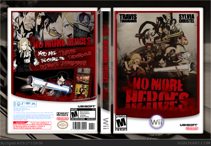
Went back to my "grunge" style just for this one. I really liked the art direction for it, so what the hell right?
Credit to KoopaDasher for the amazing temp.
Hope ya like.
[ Reply ]
needs a better description, not bad other then that.
[ Reply ]
Good box!
I don't understand why people use this template though.
No offence to you Koopa but I think official ones look worlds better.
Edited at 1 decade ago
[ Reply ]
#3 The official was cutting into the box too much, so I went with KD's. And I have to say, I like more than the official :p
[ Reply ]
Why does the front look so familiar?
[ Reply ]
#5 IDK, it's an edited wallpaper, is that why?
[ Reply ]
#6, yeah, probably. I think I used to use the original wallpaper back when the game came out.
[ Reply ]
Not bad at all. The logo is messy, but then again, I had the same problem on mine.
The tagline doesn't read too well. I read it as "You are Travis, Become the Touchdown, Ultimate Assassin"
But the style is nice, looks like a movie box in a way, because you put Travis' and Sylvia's names up top.
I don't like how much Koopa's temp is being used. I think Koopa should have kept it as his unique template.
[ Reply ]
Powerpoint?
[ Reply ]
#8 Thanks, and I will fix the tagline.
#9 Once again...
[ Reply ]