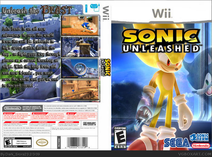
Yeah. #2 Said it all, exept that the Super Sonic at the front is a MASSIVE spoiler. I would place Sonic there. Your back's writing is VERY UNREADABLE. Your temp NEEDS REPLACEMENT or Update, as it is extremely blurred. If you need it updated PM me. If you need a better logo, PM me. Also if you need a new temp. PM me too.
Here's the revised list of all things wrong:
Too big an ESRB sign
ESRB is blurred
ESRB should be E10+
Nintendo logo shouldn't be there
Sonic team emblem is choppy
Temp is JPEG
Back of the Temp is the standard while you've made a custom front
Back writing should be clear and easy to read
It should have the Sega address at the back
Should have a Nunchuck sign at the top of the back instead of the Classic Controller
 Sonic Unleashed Box Cover Comments
Here comes my new Boxart with a new template
[ Reply ]
The temp is AWFUL, the screenshots are really blurred, the logo is streched and your choice of text was terrible, but otherwise, not too bad.
[ Reply ]
Yeah. #2 Said it all, exept that the Super Sonic at the front is a MASSIVE spoiler. I would place Sonic there. Your back's writing is VERY UNREADABLE. Your temp NEEDS REPLACEMENT or Update, as it is extremely blurred. If you need it updated PM me. If you need a better logo, PM me. Also if you need a new temp. PM me too.
Here's the revised list of all things wrong:
Too big an ESRB sign
ESRB is blurred
ESRB should be E10+
Nintendo logo shouldn't be there
Sonic team emblem is choppy
Temp is JPEG
Back of the Temp is the standard while you've made a custom front
Back writing should be clear and easy to read
It should have the Sega address at the back
Should have a Nunchuck sign at the top of the back instead of the Classic Controller
Edited at 1 decade ago
[ Reply ]