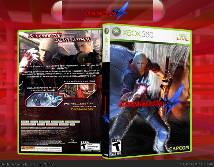
Well, after downloading some much-needed plugins to Paint.NET, I decided to make a new box! This is a comp between me and Lestat the Vampire, so good luck Lestat! The front and spine BG is custom made by me, and was very hard, anyway, hope you all enjoy it!
Credit goes to:
~Silent Oblivion
~Chibi Cloud
~VGBA Simple Needs
~Google
~PlanetRenders
Looks good, and fav for the effort, but the whole thing just looks a bit boring.. doesn't capture the feeling of the game, if you know what I mean, good though :)
The front is OKAY, nothing too impressive but its okay...
The back however is pretty poor in my opinion. The tagline could be bigger and the font doesn't really fit in. In full view, Nero and Dante dont look right together either because of the lighting and blurriness. You also put 'Holyness' when it should be spelt 'Holiness'. You should of added another screenshot down to the bottom to fill up more space OR make your current screenshots bigger. It looks too empty.
Anyway on to the scoring:
Front: 5/10
Back: 3/10
Presentation: 6/10
Total: 14/30
Verdict: This had potential but it seems laziness took over at the final hurdle. Very disappointing.
I think the bottom half of the front is all too plain. And on the back the tagline should move down from the border just a tad. And underneath the snapshots looks really empty. If you could work out those kinks, I'd say 5/5.
Update. Changed the spelling of Holiness, and also changed the tag-line, unfortunately, something went wrong with the front, so I can't update it, also, I've added a printable.
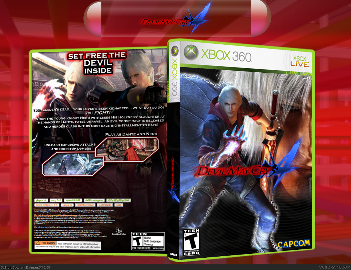
Very nice, but I just think the back is a bit empty. I would suggest a video game review quote between the screenshots and the .. uh.. "bottom back credits".
Hmm. It's pretty good. I mean, it's put together well. I probably wouldn't be able to tell the difference between this and the official one, but the radial rings are a bit typical and don't match the vibe of the box, also, it really doesn't bring anything unique to the table, you know? It isn't memorable.
Big improvement, man. I almost fav'd, but a few things kept me from that...
Well, to start, I love the layout of the back, but the renders look a bit choppy, as well as the tagline. On the front,Dante's face doesn't fit with the style of Nero, and the outline around Nero looks random.
#29, Something went wrong with my comp... now I can't edit the front... DAMN! I really wanted that fav... :( I might be able to to do some stuff on the back though... I don't think the taglines choppy, have you viewed in full?
 Devil May Cry 4 Box Cover Comments
Well, after downloading some much-needed plugins to Paint.NET, I decided to make a new box! This is a comp between me and Lestat the Vampire, so good luck Lestat! The front and spine BG is custom made by me, and was very hard, anyway, hope you all enjoy it!
Credit goes to:
~Silent Oblivion
~Chibi Cloud
~VGBA Simple Needs
~Google
~PlanetRenders
Hope you like it! :)
[ Reply ]
Looks good, and fav for the effort, but the whole thing just looks a bit boring.. doesn't capture the feeling of the game, if you know what I mean, good though :)
[ Reply ]
I FINALY BOUGHT DMC 4!!!!
Now to the box. I like it, very good. Very stylish, you put alot effort into it. So 8.3/10 +fav :)
[ Reply ]
The front is OKAY, nothing too impressive but its okay...
The back however is pretty poor in my opinion. The tagline could be bigger and the font doesn't really fit in. In full view, Nero and Dante dont look right together either because of the lighting and blurriness. You also put 'Holyness' when it should be spelt 'Holiness'. You should of added another screenshot down to the bottom to fill up more space OR make your current screenshots bigger. It looks too empty.
Anyway on to the scoring:
Front: 5/10
Back: 3/10
Presentation: 6/10
Total: 14/30
Verdict: This had potential but it seems laziness took over at the final hurdle. Very disappointing.
Edited at 1 decade ago
[ Reply ]
#3, Thank you very much.
#4, DAMNIT! I was very tired when I did the description... is there any font you would like for the tagline..?
[ Reply ]
Another DMC4 box! xD
I'm liking it, though I do agree with Cerium in some aspects of the box, it looks very similar to other DMC4 boxes.
But its still nice! +fav
[ Reply ]
its not rated T though, its rated M.
[ Reply ]
awesome
[ Reply ]
I think it's your best box, by far.
[ Reply ]
awesome, fav.
[ Reply ]
Hmmm it's got potential but it is quite boring and lacklustre.
[ Reply ]
i love it , fav
[ Reply ]
I really like this one! Fav
[ Reply ]
I like it, BUT:
I think the bottom half of the front is all too plain. And on the back the tagline should move down from the border just a tad. And underneath the snapshots looks really empty. If you could work out those kinks, I'd say 5/5.
[ Reply ]
awsome box dude! 5/5. wheres your comp going on?
Edited at 1 decade ago
[ Reply ]
I like this, but I think that you should add another screenshot down at the bottom, but it looks really good! :)
[ Reply ]
Update. Changed the spelling of Holiness, and also changed the tag-line, unfortunately, something went wrong with the front, so I can't update it, also, I've added a printable.
[ Reply ]
Sorry, but I agree exactly with Cerium
[ Reply ]
Very nice, but I just think the back is a bit empty. I would suggest a video game review quote between the screenshots and the .. uh.. "bottom back credits".
[ Reply ]
#18, Eh, each to their own.
#19, Done it.
#6, Lol, yeah, I'm hooked on it at the moment... I don't know when I'm gonna stop!
[ Reply ]
Good box, though agree with the empty back thing, other than that nice. +fav
[ Reply ]
#21, Well, it's not as empty as before.
[ Reply ]
Hmm. It's pretty good. I mean, it's put together well. I probably wouldn't be able to tell the difference between this and the official one, but the radial rings are a bit typical and don't match the vibe of the box, also, it really doesn't bring anything unique to the table, you know? It isn't memorable.
[ Reply ]
close to the hall!
[ Reply ]
Awesome. :]
[ Reply ]
#24, Is it? How close?
[ Reply ]
I like it :), it looks like you put a lot of effort into it.
[ Reply ]
Nice, top work dude, totally looks official!
[ Reply ]
Big improvement, man. I almost fav'd, but a few things kept me from that...
Well, to start, I love the layout of the back, but the renders look a bit choppy, as well as the tagline. On the front,Dante's face doesn't fit with the style of Nero, and the outline around Nero looks random.
Fix those and I might fav!
[ Reply ]
#29, Something went wrong with my comp... now I can't edit the front... DAMN! I really wanted that fav... :( I might be able to to do some stuff on the back though... I don't think the taglines choppy, have you viewed in full?
[ Reply ]
Your getting way better my friend, KEEP IT UP!
[ Reply ]
It's pretty well made, I like it, but it feels slightly lacking.
(But maybe that's just me)
[ Reply ]
It's simple and effective, and certainly could pass as official. Your abilities are leveling up man. Keep at it!
[ Reply ]
You keep on getting better and better. +fav
[ Reply ]
This fav may make it HOF!
[ Reply ]
WOOOOOOp i got it in the hall!!!!!!!!!!
[ Reply ]
Nice job, congrats on getting into the hall. =D
[ Reply ]
Congrats! :D
[ Reply ]
CONGRATS!!!!!
[ Reply ]
w00t!! 3rd HoF! Thank you to the 37 people who faved!
[ Reply ]
cool +fav
[ Reply ]
it's pretty good, a big improvement, but not Hall of Fame. then again...
[ Reply ]
its got hof
[ Reply ]
#42, Hmm?
[ Reply ]