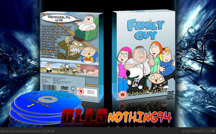
Second collab! Woo! Me and nothing94 made this...
Not my best presentation...
I did the back and the discs
Anna did the front and the temps.
My credit:
~Google
~Planet Renders
~Anna
~Ninty
#6 Then why would the barcode and other legal information be inside on the slipcase?! Surely it should be on the back of the main box so people can read it before buying.
In full view, the back is a bit blurry, particularly the speech bubble, otherwise, I think you guys put together a pretty nice box that looks pretty official. The line in the description that says "Chris Griffin. Stick it in, you know" is coming out a bit to much I think. I might try to get the description text a little more uniform, and justified.
If you guys can fix those two things up, I can easily see myself throwing this one a fav. Nice effort.
Its pretty good, Im not really a fan of FG but its still pretty good, i do agree with drakxx and one more thing! the screen shot on the left is from season 4-episode one (North by North Quahog) and Im not too keen on the discs but I do like the layout, but to fix the 'Floating peret problem, on the @evil monkey' add a rip in the corner and put peter behind it so he doesnt seem out of place
 Family Guy: Season 8 Box Cover Comments
Second collab! Woo! Me and nothing94 made this...
Not my best presentation...
I did the back and the discs
Anna did the front and the temps.
My credit:
~Google
~Planet Renders
~Anna
~Ninty
Enjoy!
[ Reply ]
Great presentation, Olly :) Maybe a next collab sometime...? :D
Damn it, i cant fav it :(
[ Reply ]
nice very nice
[ Reply ]
erm, surely Peter must be taller than Lois and Meg...
[ Reply ]
#4 Well apparently Brian is up to Peter's neck and Lois is bigger than everyone? :s
And the back text description doesn't sound very realistic or professional, even for a Family Guy box.
And why on earth is there an E4 logo on the back?
And yeah, the presentation is pretty poor.
The randomly floating Peter on a chair doesn't look so good.
There is also a couple of grammar mistakes on the back.
Oh and why is the spine blank?
Yeah, I dont think you two should work together again.
Edited at 1 decade ago
[ Reply ]
#5, it looks like DVD Boxsets where you put the DVD's in their individual cases, like many boxset things have. That's what it looks like to me
[ Reply ]
#6 Then why would the barcode and other legal information be inside on the slipcase?! Surely it should be on the back of the main box so people can read it before buying.
[ Reply ]
Not too fond of this one, peter is floating on the back, and the front seems too empty.
[ Reply ]
Some of it seems kinda blurry in full view, but it looks ice.
[ Reply ]
#5, #8, Agreed.
[ Reply ]
In full view, the back is a bit blurry, particularly the speech bubble, otherwise, I think you guys put together a pretty nice box that looks pretty official. The line in the description that says "Chris Griffin. Stick it in, you know" is coming out a bit to much I think. I might try to get the description text a little more uniform, and justified.
If you guys can fix those two things up, I can easily see myself throwing this one a fav. Nice effort.
[ Reply ]
Nice one 8/10
[ Reply ]
Awesome, though I agree with Drakxxx's points.
[ Reply ]
Its pretty good, Im not really a fan of FG but its still pretty good, i do agree with drakxx and one more thing! the screen shot on the left is from season 4-episode one (North by North Quahog) and Im not too keen on the discs but I do like the layout, but to fix the 'Floating peret problem, on the @evil monkey' add a rip in the corner and put peter behind it so he doesnt seem out of place
[ Reply ]
Buh-buh-buh... JG faved it? Wow...
Roza; yeah, I couldn't find any season 8 screens for some reason...
[ Reply ]