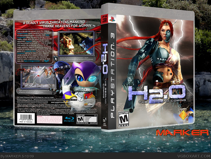
It doesn't seem like a year a go that I made my original Hedgetrimmer box... and I had thought of making a sequel called H2.O but featuring a liquid-form Luigi instead some time a go. However, seeing as there's not that many useful images of Luigi to use, and I thought I'll make the sequel more serious --- opted for a female lead using Nariko of Heavenly Sword (especially as I haven't made a Heavenly Sword box here), as well as some Sega characters, with some heavy editing ;)
Well.. hope you like, and best (?) in full view. Although most people probably preferred if I made a sequel to The King of Boxartist, since a few have asked if I would --- maybe, but it would have to be different, so not any time soon if I do. ;)
Not bad aside from a few sloppy edits here and there. (Yes, I'm being knit-picky, but it's Marker so I hold him to a pretty high standard.) Overall I think the colors are unattractive. For example: on the cover, the logo color doesn't compliment the background, which doesn't compliment the character. Yes, I understand that logo is supposed to suggest water, but then the sky is that dusky red and the robotic parts of the character is mint green and gunmetal. I just get no sense of flow or synergy in the color choices and that makes it feel like a paste-up job rather than single, organic image. I'm probably being too critical, but I don't care much for this one. The concept did make me chuckle though.
 H2.O - The Segand Coming Box Cover Comments
It doesn't seem like a year a go that I made my original Hedgetrimmer box... and I had thought of making a sequel called H2.O but featuring a liquid-form Luigi instead some time a go. However, seeing as there's not that many useful images of Luigi to use, and I thought I'll make the sequel more serious --- opted for a female lead using Nariko of Heavenly Sword (especially as I haven't made a Heavenly Sword box here), as well as some Sega characters, with some heavy editing ;)
Well.. hope you like, and best (?) in full view. Although most people probably preferred if I made a sequel to The King of Boxartist, since a few have asked if I would --- maybe, but it would have to be different, so not any time soon if I do. ;)
[ Reply ]
............
[ Reply ]
Shouldn't it be under satire?
Looks good anyway, though it's definitely not laugh-out-loud funny.
[ Reply ]
From the screen shot, it seems she wouldn't want sonic if he was the last man alive.
[ Reply ]
Michael Myers turned into a woman.
[ Reply ]
Eat me.
[ Reply ]
What I find strange is that on the logo, the only part of the subtitle that's blue... is "Sega"
Perhaps you should change the dev logo :p
[ Reply ]
Your Hedgetrimmer was alot better... I was expecting a really cool sequal box to the other, but it's a little disapointing...
[ Reply ]
#8, link
[ Reply ]
Cool? Yes!, but a little creepy! amazing job on transforming the characters to cyborgs!
[ Reply ]
DAYYYUMMMM.
[ Reply ]
#7 You dont get why SEGA and ND are seperated? O_o
[ Reply ]
Amazing work.
[ Reply ]
See, this is why your one of the VGBA greats. As always, mind blowing work.
[ Reply ]
Awesome your cyborg is way better then mine
Edited at 1 decade ago
[ Reply ]
speechless +fav
[ Reply ]
how are you so fricking awseome?!
[ Reply ]
I think a WOW will suffice this time...
[ Reply ]
Awesome work as always Marker. The idea and presentation is super creative, and the editing you did on those characters is outstanding.
[ Reply ]
Yep
[ Reply ]
Ummm Wow :D
[ Reply ]
Segand? Oh... Segand Coming, Second Coming! I see, a pun! That's real clever.
You really could've came up with a better subtitle instead of coming both the titles, because that's just cheesy.
[ Reply ]
Not bad aside from a few sloppy edits here and there. (Yes, I'm being knit-picky, but it's Marker so I hold him to a pretty high standard.) Overall I think the colors are unattractive. For example: on the cover, the logo color doesn't compliment the background, which doesn't compliment the character. Yes, I understand that logo is supposed to suggest water, but then the sky is that dusky red and the robotic parts of the character is mint green and gunmetal. I just get no sense of flow or synergy in the color choices and that makes it feel like a paste-up job rather than single, organic image. I'm probably being too critical, but I don't care much for this one. The concept did make me chuckle though.
[ Reply ]
I don't get it... Though still, the quality is top notch once again!
8/10
[ Reply ]
O_o holy #@$%
man what a box 10/10
[ Reply ]