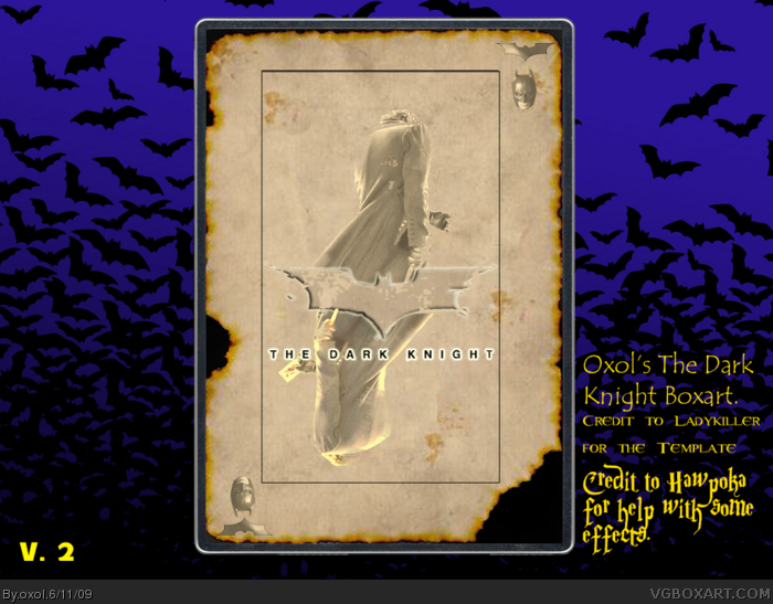
Well, theres not much to say about this.
got the idea a few days ago when seeing a playing card on the ground.
I hope you'll like it, otherwise I'd like to hear how to improve :)
EDIT: yeah, my first movie box.
Not bad! It's kinda nice in a simplistic sort of way.
Only problem is that it seems like you're trying to mix styles a bit. You have the ancient and burnt thing going on, but the logo looks very modern and sleek in design.
#2, thanks, I'll try to change the style of the logo.
I'm looking forward to hear what's missing tho :P
I also thought about using Joker related stuffs where Batmans head is, and make three boxes (Joker, Batman, Harvey) but I'm not sure if it would work well.
I might try later tho.
It certainly has a Killing Joke vibe with the deck card. You might try using a Joker vs. Batman reflection, or making the Bat-logo looking more "vintage" as #2 said, or even burnt, like the edges of the card.
I really like it, but I think it has more of a "book cover" feel. I could see something like this as the cover of an accompanying booklet of a DVD/BD, or even an artbook, illustrated script etc.
Ok, slightly updated, changed the logo a bit.
Could'n change the letters in the logo without making them too hard to read tho.
#2, I desited not to use Batman becouse its overused that way (Vilian/hero on different sides)
Also, about the book thing, it could work, I'll test that, if I comes up with a good idea for the box itself.
OK, I wont post here for a while now, cant have every second post on the box by myself :P
 The Dark Knight Box Cover Comments
Well, theres not much to say about this.
got the idea a few days ago when seeing a playing card on the ground.
I hope you'll like it, otherwise I'd like to hear how to improve :)
EDIT: yeah, my first movie box.
Edited at 1 decade ago
[ Reply ]
Not bad! It's kinda nice in a simplistic sort of way.
Only problem is that it seems like you're trying to mix styles a bit. You have the ancient and burnt thing going on, but the logo looks very modern and sleek in design.
Something does seem missing in the box, though.
Can see you put effort into this! Nice. :)
[ Reply ]
#2, thanks, I'll try to change the style of the logo.
I'm looking forward to hear what's missing tho :P
I also thought about using Joker related stuffs where Batmans head is, and make three boxes (Joker, Batman, Harvey) but I'm not sure if it would work well.
I might try later tho.
[ Reply ]
It certainly has a Killing Joke vibe with the deck card. You might try using a Joker vs. Batman reflection, or making the Bat-logo looking more "vintage" as #2 said, or even burnt, like the edges of the card.
I really like it, but I think it has more of a "book cover" feel. I could see something like this as the cover of an accompanying booklet of a DVD/BD, or even an artbook, illustrated script etc.
Keep it up :)
[ Reply ]
Ok, slightly updated, changed the logo a bit.
Could'n change the letters in the logo without making them too hard to read tho.
#2, I desited not to use Batman becouse its overused that way (Vilian/hero on different sides)
Also, about the book thing, it could work, I'll test that, if I comes up with a good idea for the box itself.
OK, I wont post here for a while now, cant have every second post on the box by myself :P
Edited at 1 decade ago
[ Reply ]
Not bad at all ;)
[ Reply ]