My entry to the VGBACUP competition, also its my first DVD box, as well as my first Criterion AND the last in my Originality series D=
Anyway, lots of work into this one (as normal =P) it was awesomely fun to make, and I hope to get into the second Round of the comp, so I can have a go at more challenges =D
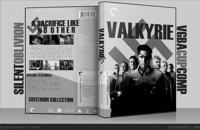
*sigh* I hate to sound like an elitist jerk but I think people should study some actual Criterion boxes before they jump on that template. Criterion releases don't look like the standard Hollywood shelf-fillers with big bold taglines across the back. They hardly (if ever) use little screenshots, opting instead for full-sized artwork or images. Plot summaries are rare on newer releases as Criterion usually highlights the film's background or included special features.
This is a GREAT box design, but I don't think it fits Criterion's style. I'll give you a Fav for the design but I'd rather see it on a non-Criterion template.
#13 - I have looked at other criterion boxes, and thats why I decided to make this one.
I think the plainness, the use of grays, bold logo, and use of the swastika grant this the criterion pass, the original only had 3 screens on, but because of above comments was changed.
But if I do another Criterion box (which I may) then, I'll take these points to mind =)
 Valkyrie Box Cover Comments
OMG 1ST COMMENT!!!1111ONEEKG8489!!!DOKE9R91
[ Reply ]
Blargh.
My entry to the VGBACUP competition, also its my first DVD box, as well as my first Criterion AND the last in my Originality series D=
Anyway, lots of work into this one (as normal =P) it was awesomely fun to make, and I hope to get into the second Round of the comp, so I can have a go at more challenges =D
Enjoy, guys =)
1# - Lolz.
Edited at 1 decade ago
[ Reply ]
Very nice, though I'm not so sure about the lone guy on the back. Otherwise, I'm really digging this design.
[ Reply ]
Ah, the front looks especially awesome, but the back has a small gripe. The guy there looks VERY out of place, 'twould be better if he was removed
[ Reply ]
#4 - Yeah, I just fear that it would be too plain without him, if you get what I mean =/
[ Reply ]
Greatness. in Black and white form.
[ Reply ]
I like this a lot, the color scheme fits very well. Fav
[ Reply ]
Fixed the back dude, now gone =)
[ Reply ]
Looking a lot better now, loving it
[ Reply ]
good luck man!
[ Reply ]
Definetly the best submission in the competition thus far.
Edited at 1 decade ago
[ Reply ]
#11 - Really? Thanks!
Printable up =)
[ Reply ]
*sigh* I hate to sound like an elitist jerk but I think people should study some actual Criterion boxes before they jump on that template. Criterion releases don't look like the standard Hollywood shelf-fillers with big bold taglines across the back. They hardly (if ever) use little screenshots, opting instead for full-sized artwork or images. Plot summaries are rare on newer releases as Criterion usually highlights the film's background or included special features.
This is a GREAT box design, but I don't think it fits Criterion's style. I'll give you a Fav for the design but I'd rather see it on a non-Criterion template.
Also, Valkyrie was a 2008 release, not 2009.
Edited at 1 decade ago
[ Reply ]
#13, 2009 in the UK.
[ Reply ]
#13 - I have looked at other criterion boxes, and thats why I decided to make this one.
I think the plainness, the use of grays, bold logo, and use of the swastika grant this the criterion pass, the original only had 3 screens on, but because of above comments was changed.
But if I do another Criterion box (which I may) then, I'll take these points to mind =)
[ Reply ]
Tom Cruise in the one-eyed scientologist lol. Can't believe I missed this good job man!
[ Reply ]