1vgba09 [ Buy Resident Evil 2 at Amazon ] By Ervo 48 on July 15th, 2009 No Printable Available Resident Evil 2 Box Cover Comments Comment on Ervo's Resident Evil 2 Box Art / Cover. Cancel Reply Ervo 48 [ 1 decade ago ] Arr. Got tired of seeing just desaturated boxes that would look a lot better with colors. EDIT: Credit to sens for the temps! Edited at 1 decade ago [ Reply ] HalfSwiss 43 [ 1 decade ago ] 0________________________0 Edited at 1 decade ago [ Reply ] Mariolee 43 [ 1 decade ago ] The spine ruins the everything. But seriously, this is really good. Damn, I'm not going to win this comp. :( [ Reply ] LEGOslayer 42 [ 1 decade ago ] #2 says it all [ Reply ] KOF 7 [ 1 decade ago ] this box is really nice, not at least because the style is a little simliar to my RE3 heh^^ [ Reply ] Ervo 48 [ 1 decade ago ] #5, haha, true! I hadn't even seen that box before, what a coincidence :) [ Reply ] roza 44 [ 1 decade ago ] OK you win! [ Reply ] eat nade 38 [ 1 decade ago ] Looks great Edited at 1 decade ago [ Reply ] wasa-bi 7 [ 1 decade ago ] nice one... but looks more like a package for logos to me; the game (its art, logo, etc.) is too much in the background ' cause you used just graytones for it and for logos like tha rating plain white. I agree with the desaturated boxes. [ Reply ] Spiner_ 42 [ 1 decade ago ] Really like it. :) [ Reply ] Apollo 41 [ 1 decade ago ] Absolutely amazing [ Reply ] Pan 48 [ 1 decade ago ] Good box, you also succeed in making it different looking from all the others. [ Reply ] Drakxxx 46 [ 1 decade ago ] Great work man. It almost looks like it's embossed or done with raised printing. [ Reply ] lightsamus 39 [ 1 decade ago ] It's well made but the front is from REDC and has Steve Burnside and Jack Krauser on it. Neither of which are in RE2. Still awesome though. Edited at 1 decade ago [ Reply ] wasa-bi 7 [ 1 decade ago ] #14, looks more like birkin and wesker to mw, but I don`t know the DC-pic you are talking about [ Reply ]
 Resident Evil 2 Box Cover Comments
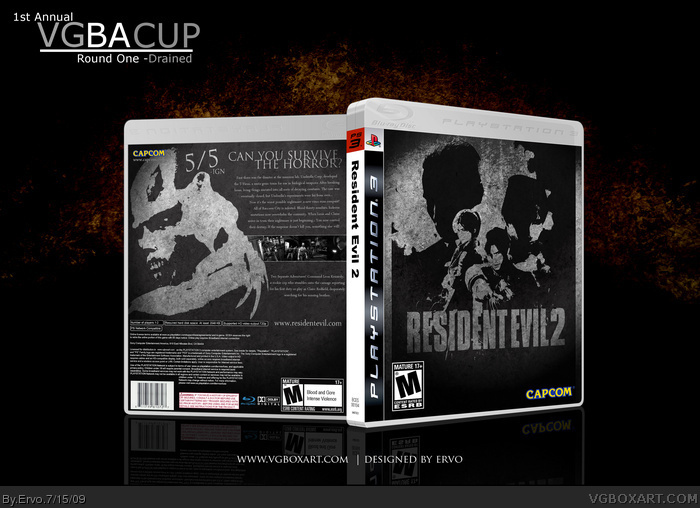
Arr. Got tired of seeing just desaturated boxes that would look a lot better with colors.
EDIT: Credit to sens for the temps!
Edited at 1 decade ago
[ Reply ]
0________________________0
Edited at 1 decade ago
[ Reply ]
The spine ruins the everything. But seriously, this is really good. Damn, I'm not going to win this comp. :(
[ Reply ]
#2 says it all
[ Reply ]
this box is really nice, not at least because the style is a little simliar to my RE3 heh^^
[ Reply ]
#5, haha, true! I hadn't even seen that box before, what a coincidence :)
[ Reply ]
OK you win!
[ Reply ]
Looks great
Edited at 1 decade ago
[ Reply ]
nice one... but looks more like a package for logos to me; the game (its art, logo, etc.) is too much in the background ' cause you used just graytones for it and for logos like tha rating plain white.
I agree with the desaturated boxes.
[ Reply ]
Really like it. :)
[ Reply ]
Absolutely amazing
[ Reply ]
Good box, you also succeed in making it different looking from all the others.
[ Reply ]
Great work man. It almost looks like it's embossed or done with raised printing.
[ Reply ]
It's well made but the front is from REDC and has Steve Burnside and Jack Krauser on it. Neither of which are in RE2. Still awesome though.
Edited at 1 decade ago
[ Reply ]
#14, looks more like birkin and wesker to mw, but I don`t know the DC-pic you are talking about
[ Reply ]