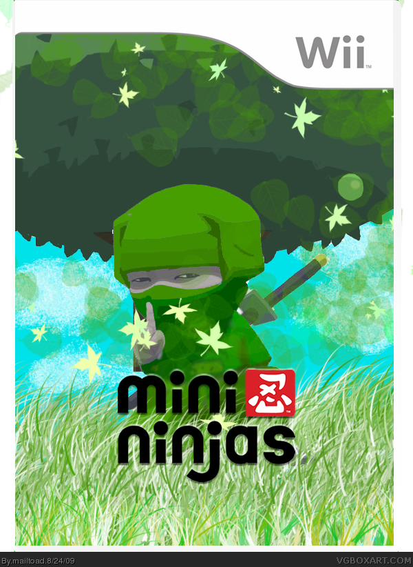
My first box in a while. I've put a lot of work into this box - re-colouring the ninja, creating the grass and leaves. Logo rendered by me. Credit to google for the tree and to CrayonMan for the temp. Hope you like, and comments are welcome!
I like this, like ayron said i'd love a back, i was going to say that i dont like the space at the top of the box but i suppose it makes him seem smaller :p
Oh lol, this makes me think about: the ninja glare, how to be ninja and ninja melk XD
Sorry, got a bit off-topic there. This is good imo but I don't like how the text isn't in a frame (under screenshots).
I like the front as well, but the empty space on the bottom left corner is throwing things off for me. Another render would work, or just reorganizing the screenshots and description perhaps. Nice work regardless though!
#20 - decided to add another render - as you, and others have suggested.
Thanks for all the comments as well everyone! The box got more favs than I was expecting it to!

 Mini Ninjas Box Cover Comments
My first box in a while. I've put a lot of work into this box - re-colouring the ninja, creating the grass and leaves. Logo rendered by me. Credit to google for the tree and to CrayonMan for the temp. Hope you like, and comments are welcome!
[ Reply ]
Your best by a longshot.
+fav
[ Reply ]
Thanks #2
[ Reply ]
Did you really make that background(grass & leaves)? Really? Because, well, it's AWESOME! A good rendering and recolour as well, so a fav from me!
Edited at 1 decade ago
[ Reply ]
Love it. But I notice a little green coming from the top left corner of the box. You may want to get rid of that,
Edited at 1 decade ago
[ Reply ]
Thanks No.5. I had't noticed that. Updated.
[ Reply ]
It looks surprisingly well.
I'd love a back, but don't feel put under pressure.
[ Reply ]
I like this, like ayron said i'd love a back, i was going to say that i dont like the space at the top of the box but i suppose it makes him seem smaller :p
+fav
[ Reply ]
I like it but I don't quite understand why its green lol
[ Reply ]
Not bad, but it needs back cover.
[ Reply ]
I like it. I'd love to see a back cover, but don't worry about it.
+Fav
[ Reply ]
Edited at 1 decade ago
[ Reply ]
Updated with back. To bigwillystyle - it's green because it fits in with the nature theme.
[ Reply ]
Back is a bit lacking. But that front deserves a fav.
Well done.
P.S. When I look at the ninja on the front I immediately think he's sticking his middle finger up xD.
[ Reply ]
#13, OK, I think it would be better if you kept Hiro the original grey and black colour but whatever lol
[ Reply ]
Thanks for all the favs guys!
[ Reply ]
there is a big empty space on the back that needs a render put there.
[ Reply ]
Oh lol, this makes me think about: the ninja glare, how to be ninja and ninja melk XD
Sorry, got a bit off-topic there. This is good imo but I don't like how the text isn't in a frame (under screenshots).
[ Reply ]
Front is OK, but the back is too plain and text is hard to read.
[ Reply ]
I like the front as well, but the empty space on the bottom left corner is throwing things off for me. Another render would work, or just reorganizing the screenshots and description perhaps. Nice work regardless though!
[ Reply ]
#20 - decided to add another render - as you, and others have suggested.
Thanks for all the comments as well everyone! The box got more favs than I was expecting it to!
[ Reply ]
Now we're talkin', nice update.
[ Reply ]
good update! it looks alot better now.
[ Reply ]