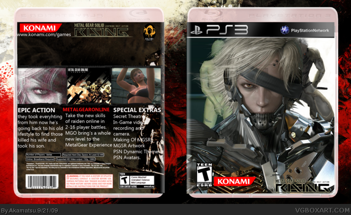
Render is perfectly cut, may I ask where you got it?
- Should me rated M
- Rising logo should be placed differently
- Overly used render
- The images behind Raiden don't look good there.
- don't like the synopsis
- also brings doesn't need an apostrophe. ^_^
- I like the back though, don't like the huge blank space below the logo though.
I say 3.5/5 not too bad. Also hi, you're from the PSU right?
 Metal Gear Solid Rising Box Cover Comments
Render is perfectly cut, may I ask where you got it?
- Should me rated M
- Rising logo should be placed differently
- Overly used render
- The images behind Raiden don't look good there.
- don't like the synopsis
- also brings doesn't need an apostrophe. ^_^
- I like the back though, don't like the huge blank space below the logo though.
I say 3.5/5 not too bad. Also hi, you're from the PSU right?
Edited at 1 decade ago
[ Reply ]
One More thing fix the logo I didn't even notice it until I looked a 4th time.
Edited at 1 decade ago
[ Reply ]
#1, He got it from my render thread.
[ Reply ]