This is my next collab, and I have many to do, so expect some great cobbles from tmrd!
This is my latest, and a collab with the wonderful GameRoomProductions.
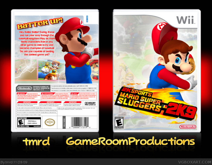
This box was obviously inspired by the 2K9 Baseball games, and we got the idea for this.
I made the back. GRP made the front. I made the logos and he did presentation.
Credit goes to GRP for the logo, and Jevan for the template. Silent oblivion's electric borders were recoloured and used as electricity for the back.
If you like GameRoomProduction's work, I urge you to check out his page, and have a look at his work. link
This is really nice, but the backgrounds are a little too invisible if you ask me. I would like the backgrounds' visibility brought up a tad. But overall great collab.
That front is just amazing. The back is meh, pretty good. But it needs a better font, more character artwork, and maybe some more screenshots. The logo is also probably my favorite Mario Sports logo too. This is great!
Idea:3/5(a bit to original)
Front:5/5
Back:4/5
Overall:4.5/5
#6, Thanksssyou :D
#7, Ok. I'll talk to GRP about updating.
#8, Thankyou. I'm not great at simplistic-ness. Lol
#9, Thanks ;)
#10, Exactly.
#11, Thankyou ;D
#12, Ok, thanks for the suggestions! :)
FROM A DISTANCE THIS LOOKS LIKE LITTLE WORK WAS PUT INTO IT, BUT IF I PRESS MY FACE UP TO THE SCREEN I CAN SEE THE BEUSTIFUL BACKGROUND, WHAT IM SAYING IS TO MAKE THE BG MORE VISIBLE
(sorry, caps was on and im too lasy to fix it.)
I upped the opacity on my front's background, and it is not as good looking as it is now. I honestly don't plan on updating, unless tmrd really convinces me.
 Mario Super Sluggers 2K9 Box Cover Comments
This is my next collab, and I have many to do, so expect some great cobbles from tmrd!
This is my latest, and a collab with the wonderful GameRoomProductions.
This box was obviously inspired by the 2K9 Baseball games, and we got the idea for this.
I made the back. GRP made the front. I made the logos and he did presentation.
Credit goes to GRP for the logo, and Jevan for the template. Silent oblivion's electric borders were recoloured and used as electricity for the back.
If you like GameRoomProduction's work, I urge you to check out his page, and have a look at his work.
link
Edited at 1 decade ago
[ Reply ]
This is really nice, but the backgrounds are a little too invisible if you ask me. I would like the backgrounds' visibility brought up a tad. But overall great collab.
[ Reply ]
Sleek design fellows.
[ Reply ]
i think its to plain for my style
[ Reply ]
#2, Ok. If anyone else mentions it we'll update.
#3, We are officially "fellows"? WOOT!
#4, Sugestions?
Edited at 1 decade ago
[ Reply ]
really sleek, as #3 says.
[ Reply ]
Well done guys but as like 2 says the backgrounds should be a bit bore visible, fav still :)
[ Reply ]
Wow, this is pretty nice. I don't like the back a lot, seems to different from everything else, but this box is good. 4/5
[ Reply ]
Wow, very appealing to the eye! :D
[ Reply ]
Thanks everyone ;)
[ Reply ]
looks good
FAV
[ Reply ]
That front is just amazing. The back is meh, pretty good. But it needs a better font, more character artwork, and maybe some more screenshots. The logo is also probably my favorite Mario Sports logo too. This is great!
Idea:3/5(a bit to original)
Front:5/5
Back:4/5
Overall:4.5/5
[ Reply ]
#6, Thanksssyou :D
#7, Ok. I'll talk to GRP about updating.
#8, Thankyou. I'm not great at simplistic-ness. Lol
#9, Thanks ;)
#10, Exactly.
#11, Thankyou ;D
#12, Ok, thanks for the suggestions! :)
[ Reply ]
FROM A DISTANCE THIS LOOKS LIKE LITTLE WORK WAS PUT INTO IT, BUT IF I PRESS MY FACE UP TO THE SCREEN I CAN SEE THE BEUSTIFUL BACKGROUND, WHAT IM SAYING IS TO MAKE THE BG MORE VISIBLE
(sorry, caps was on and im too lasy to fix it.)
[ Reply ]
#14, Woah, you scared me for a minute! xD
Thanks anyway ;)
[ Reply ]
Yeah like what everyone else said, turn the visibility up and then I'll come back and critique it.
[ Reply ]
#16, OK. I'll talk to GRP.
[ Reply ]
Awesome!
[ Reply ]
Awesome!
[ Reply ]
Nice, but I agree with everyone else you need to change the background to a bit more visible.
[ Reply ]
good man. like always haha
[ Reply ]
Nice, I like the front ! =D
[ Reply ]
Very nice, both the back and the front sync with each other well.
[ Reply ]
Very sleek and professianl! One thing, i would make the background screens less transparentm, you can hardly see it, otherwise this is great :)
[ Reply ]
The background is way too bright for me.
[ Reply ]
I agree, too transparent, and the fonts on the back are not to my liking. Still, pretty good.
[ Reply ]
That front is fantastic and professional.
The back is bland and boring.
The front gets the fav.
[ Reply ]
It's good, it's look like NBA 2K9, NHL 2K9. Thanks and fave.
[ Reply ]
I have tried turning down the backgrounds and it looks really shocking tbh.
[ Reply ]
outstanding box
[ Reply ]
I upped the opacity on my front's background, and it is not as good looking as it is now. I honestly don't plan on updating, unless tmrd really convinces me.
[ Reply ]
#31, lol, I was thinking the exact same thing when I did mine. Thats why I wasnt very pursuasive :P
[ Reply ]