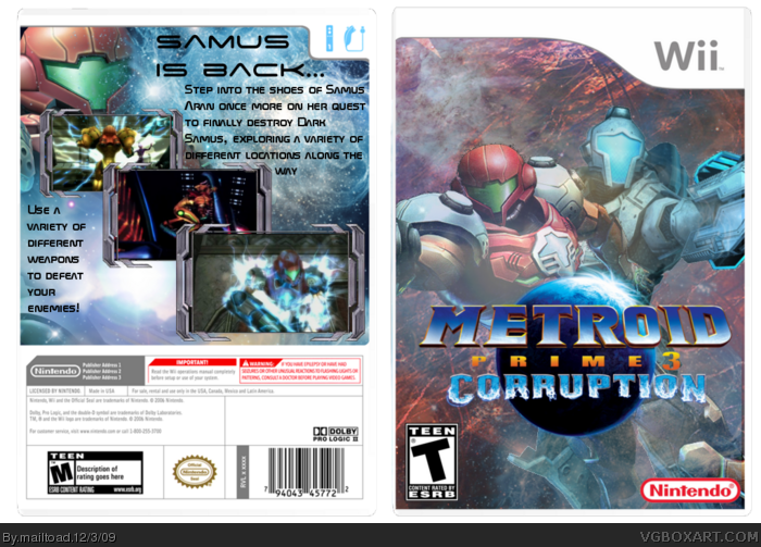
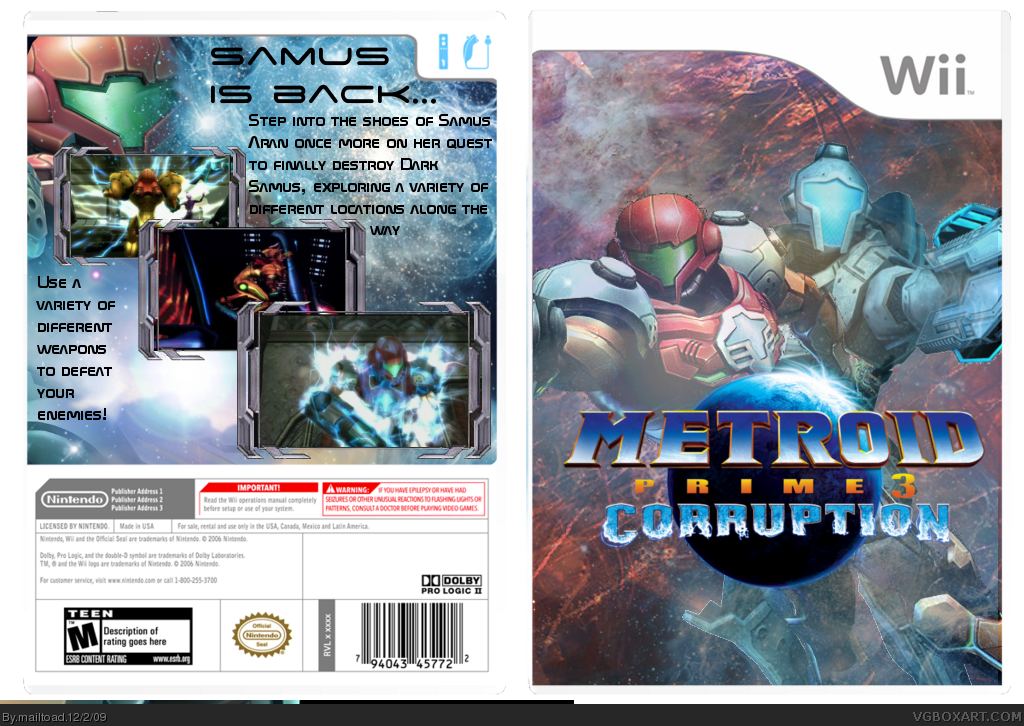
So yeah, this took me a while to do. As you can see - there are loads of different things going on in this, so I'll kind of just explain my inspiration. I've always found the MP1 and MP3 boxes boring, so recently I made myself a printable for MP1. Whilst looking at some of the artwork for my printable, I stumbled across some interesting artwork from MP3. Since I found the box to be boring anyway, I decided to create my own version, showing off a more interplanetary view of MP3. I didn't like the action packed boxes that have appeared a lot on the site so far - the Metroid Prime series strikes me as more of a solitary adventure - hence there only being two characters on the front. This want for a nicer looking box culminated in this - my favourite box so far. Comments and critiques are more than welcome!
The screenshot choices for the back are well made, but at the same time it feels empty because of the text placement. I like the front cover, it fits the theme well. It's missing the rating on the front, though. Overall, well made box.
 Metroid Prime 3: Corruption Box Cover Comments
So yeah, this took me a while to do. As you can see - there are loads of different things going on in this, so I'll kind of just explain my inspiration. I've always found the MP1 and MP3 boxes boring, so recently I made myself a printable for MP1. Whilst looking at some of the artwork for my printable, I stumbled across some interesting artwork from MP3. Since I found the box to be boring anyway, I decided to create my own version, showing off a more interplanetary view of MP3. I didn't like the action packed boxes that have appeared a lot on the site so far - the Metroid Prime series strikes me as more of a solitary adventure - hence there only being two characters on the front. This want for a nicer looking box culminated in this - my favourite box so far. Comments and critiques are more than welcome!
mailtoad
[ Reply ]
The screenshot choices for the back are well made, but at the same time it feels empty because of the text placement. I like the front cover, it fits the theme well. It's missing the rating on the front, though. Overall, well made box.
[ Reply ]
Yeah, I decided to leave out the esrb and dev logos for deign purposes - they stood out like a sore thumb and I hated them.
[ Reply ]
I think you need the rating and dev logos otherwise you might miss out on a lot of favs, although this is a well made box, fav :)
[ Reply ]
Updated with dev and esrb logos. I hope you like it!
[ Reply ]
yeah thats better :)
[ Reply ]