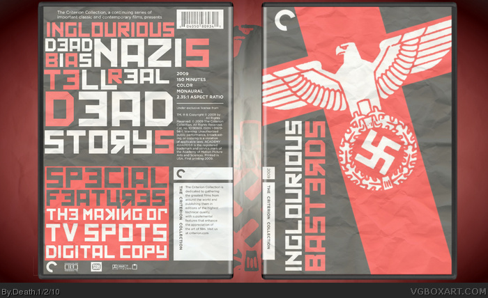
I'm sorry, but this doesn't work. Not for me, it just doesn't work at all. The movie is about a behind-enemy-lines mission in Germany. It has nothing to do with Russia whatsoever, and this box primarily features Soviet typography.
I really like the box, but I'd have to agree with qwerty on the saturation of the colours. I believe that more rich colours would make the box more appealing overall.
I don't much like the Cyrillic/Soviet style typography. There wasn't a single mention of the Russians in the film, as it was an examination of Nazi occupation from a French perspective.
 Inglourious Basterds Box Cover Comments
Bassed on an old propaganda poster. Ok movie lol. Tell me what you think.
Indexnos for the temp
[ Reply ]
Great looking box.
[ Reply ]
Very creative, I really like the Soviet typography.
The only thing I would change is the contrast--it looks too washed out IMO.
[ Reply ]
Woah, really nice one here.
[ Reply ]
I'm sorry, but this doesn't work. Not for me, it just doesn't work at all. The movie is about a behind-enemy-lines mission in Germany. It has nothing to do with Russia whatsoever, and this box primarily features Soviet typography.
[ Reply ]
#5, Agreed. The typography is a little much, making it hard to read.
[ Reply ]
Epic :)
[ Reply ]
Nice. You're great with these paper effects, Death.
[ Reply ]
#5, It's set in France, but whatever :P
I really like the box, but I'd have to agree with qwerty on the saturation of the colours. I believe that more rich colours would make the box more appealing overall.
[ Reply ]
Muy buenos!
[ Reply ]
Thanks everyone! And el crazy, I get what you mean. Like I said I was going for propaganda poster and the Russian font just worked the best
[ Reply ]
I don't much like the Cyrillic/Soviet style typography. There wasn't a single mention of the Russians in the film, as it was an examination of Nazi occupation from a French perspective.
[ Reply ]
#12, use your eyes...
meaning read post #11 thank you
[ Reply ]
#13, Yeah you can go for a Propaganda poster all you want but it still has nothing to do with the movie and the themes of it.
[ Reply ]
#9, Ooops, my bad. :P
[ Reply ]
#14, i realise that and i explain why i did it in #11, i realise it has nothing to do with the movie, i did it for effect not relavence
[ Reply ]
#16, I see what you mean, but this is a Criterion box, and the boxes are always designed to be relevant to the movie.
[ Reply ]
#17, i understand thats why looking back i dont know if i should have made this Criterion...but whats done is done
[ Reply ]
Good job Death.
[ Reply ]
YES!! This totally deserves to be in HoF.
CONGRATS!
[ Reply ]
"Inglourious dead bias nazis tell real dead storys?" What?
[ Reply ]
What this made hall? Dope.
[ Reply ]