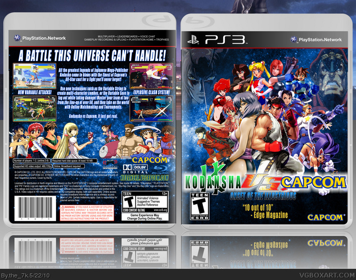
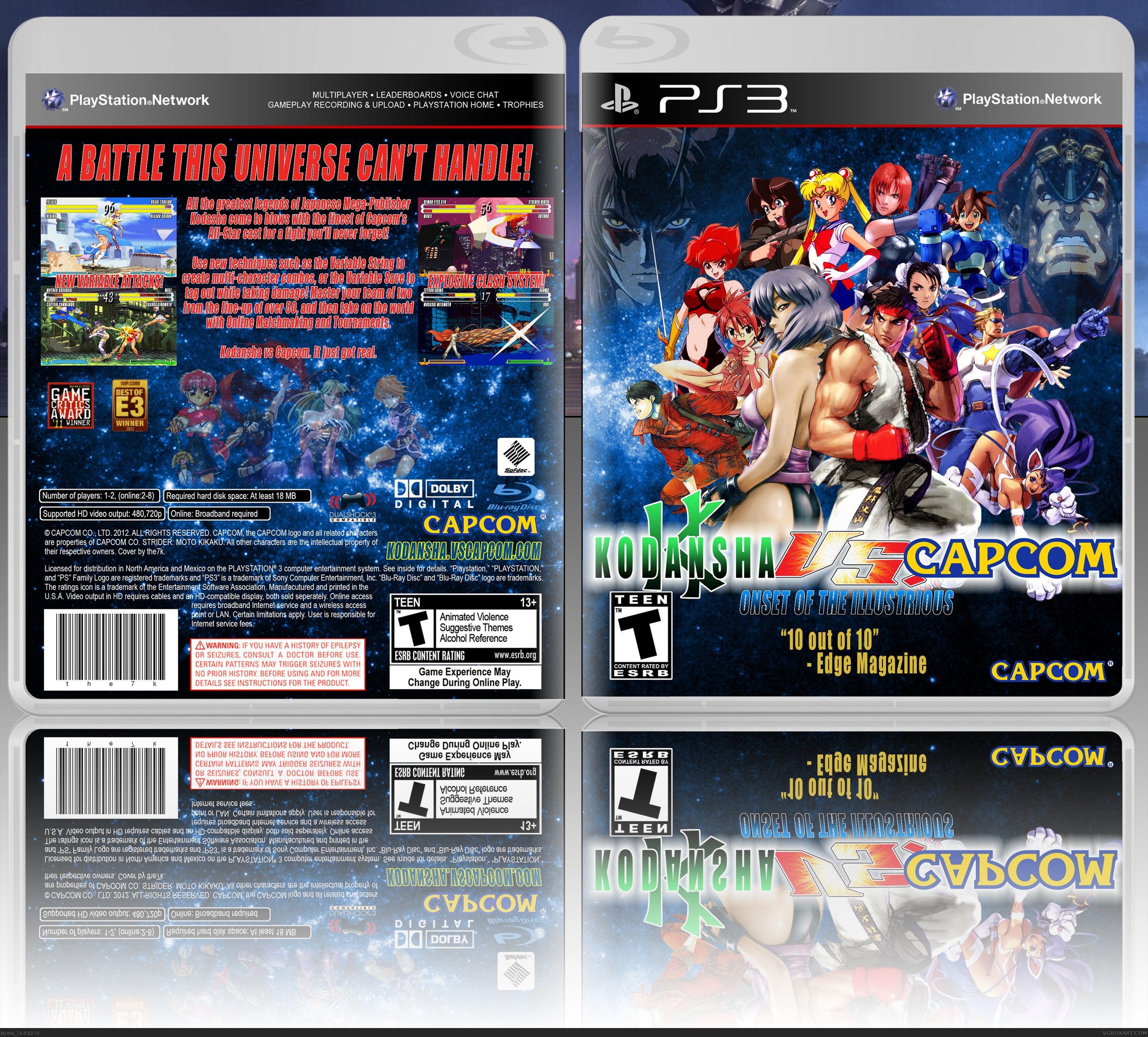
Plastic Case by Silent Oblivion
Motoko Kusanagi (Front) by LB
Kaneda Shoutarou (Front) by Karuta Shiki
Rally Vincent (Front) by Omar Dogan
Motoko and Tetsuo sprites by myself (albeit, edits of Elena and K9999)
I think that covers everything. Anywho...
I remember back when Capcom was asking the community what "Vs Capcom" game they wanted to see next, it got me thinking. The one that I thought would be really great was Kodansha. Sure, few people outside of Japan have heard of it, but they have a lot more recognizable titles under their belt that Tatsunoko. Ghost in the Shell, Akira, Sailor Moon, Cutie Honey, Mazinger Z, GT Onizuka... I mean, this game would sell out day one!
Anyway, I just wanted to get the idea out of my head. Just my dream game.
a lot of work on this one, at least it seems for the characters positionning on the front,it's well done but still misses something, especially for the back, i like the way you had transform your screenshots, but the background and fade pics are not fiting it. the text is also comon.
i guess i'll check your work, i like it somehow
It's not terrible. It's pretty good, actually. I think the reflection is too big though, and the back seems kinda rushed. I don't like how the test from the description is overlapping the the screenshiots. Plus the screenshots should have borders, and the faded characters on the back seem kind of awkward there, but it's not bad. 3.4/5
#8
Actually, I made all these screenshots myself, using WinKawaks and the Shot Factory. Thanks for the fav!
#6
Kodansha is a massive Japanese publisher. Think Shonen Jump, except instead of owning just one magazine aimed at one demographic, they own about a dozen aimed at girls (Nakayoshi), boys (Weekly Shonen Magazine), adult women (Kiss) and adult men (Young Magazine).
That front is REALLY cool! The back could use some work, look at these things:
-Take off the transparency on the characters (on the back)
Try to use another font colour, maybe white? The blue of the sky and the red of the text contrast a LOT.
-Try adding some borders to the screenshots.
Thats all. Fix these three things and I will fave it.
 Kodansha vs Capcom Box Cover Comments
Plastic Case by Silent Oblivion
Motoko Kusanagi (Front) by LB
Kaneda Shoutarou (Front) by Karuta Shiki
Rally Vincent (Front) by Omar Dogan
Motoko and Tetsuo sprites by myself (albeit, edits of Elena and K9999)
I think that covers everything. Anywho...
I remember back when Capcom was asking the community what "Vs Capcom" game they wanted to see next, it got me thinking. The one that I thought would be really great was Kodansha. Sure, few people outside of Japan have heard of it, but they have a lot more recognizable titles under their belt that Tatsunoko. Ghost in the Shell, Akira, Sailor Moon, Cutie Honey, Mazinger Z, GT Onizuka... I mean, this game would sell out day one!
Anyway, I just wanted to get the idea out of my head. Just my dream game.
[ Reply ]
a lot of work on this one, at least it seems for the characters positionning on the front,it's well done but still misses something, especially for the back, i like the way you had transform your screenshots, but the background and fade pics are not fiting it. the text is also comon.
i guess i'll check your work, i like it somehow
[ Reply ]
It's not terrible. It's pretty good, actually. I think the reflection is too big though, and the back seems kinda rushed. I don't like how the test from the description is overlapping the the screenshiots. Plus the screenshots should have borders, and the faded characters on the back seem kind of awkward there, but it's not bad. 3.4/5
[ Reply ]
Awesome Idea!
[ Reply ]
#4
Thanks - and I appreciate the fav as well.
#2,3
When you say the text is common, do you mean the font? The description itself? Just wanting to know.
Guess I'll try to do something else for the back.
[ Reply ]
What is Kodansha?
[ Reply ]
#6, Awesome in a bottle.
[ Reply ]
I love this! Great idea using M.U.G.E.N. screenshots lol. +fav
[ Reply ]
#8
Actually, I made all these screenshots myself, using WinKawaks and the Shot Factory. Thanks for the fav!
#6
Kodansha is a massive Japanese publisher. Think Shonen Jump, except instead of owning just one magazine aimed at one demographic, they own about a dozen aimed at girls (Nakayoshi), boys (Weekly Shonen Magazine), adult women (Kiss) and adult men (Young Magazine).
Edited at 1 decade ago
[ Reply ]
#9, gotcha.
[ Reply ]
Ah I'm sorry. They look so real I thought they were M.U.G.E.N.. Wow Awesome! I think it's funny when you say "adult men (Young Magazine) lol.
[ Reply ]
That front is REALLY cool! The back could use some work, look at these things:
-Take off the transparency on the characters (on the back)
Try to use another font colour, maybe white? The blue of the sky and the red of the text contrast a LOT.
-Try adding some borders to the screenshots.
Thats all. Fix these three things and I will fave it.
[ Reply ]
Updated. Hopefully I fixed more problems than I brought up.
Also just realized that Gundam is Kodansha. That's pretty huge. Hop to it, Capcom.
Edited at 1 decade ago
[ Reply ]
i raider go with Shonen Jump vs Capcom
[ Reply ]
#14
Only if Kenshin, Yusuke, Jotaro and Kenshiro are in it. Otherwise, no dice.
[ Reply ]
nice
[ Reply ]