it's ok not the best in the world it's just 2 wallpapers not much here it's cool but the shading is oud and did u start to cut out the logo and then u just stoped y, and there r no screen shoots
Looks awesome, I have have a few things to point out:
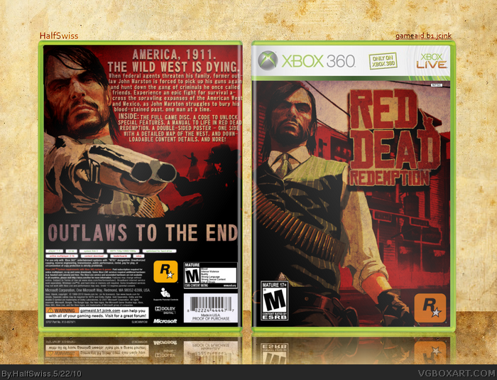
1) The text on the back is a bit too close to the edge of the box, and not all of the text is wrapped properly.
2)Drop shadow on the logo seems a tad strong.
Other than that, awesome work dude! The slipcase it great, and I must say this is your best work yet.
#12, it is o i idk that sorry then guess i just did not c it on the really box sorry dude, if u add screen shots then i will fav but it just does not look dune with out them that and the text needs to be put more to the left if u can it looks a bit funny but other then that it's awesome good job.
 Red Dead Redemption Box Cover Comments
Version 1: Box w/ Limited Edition Slipcase
Version 2: Regular Box
Please view in full for both versions and view the printable for a extra high-quality version of the regular box.
Xbox 360 Regular Temp by ElCrazy
Logo on Regular Box by hesit8
Printable Temp by Scorpion Soldier
Aaaaand I think that's it.
Edited at 1 decade ago
[ Reply ]
Really nice!
[ Reply ]
#2, thanks man, worked pretty hard on this.
[ Reply ]
I think it is pretty plain, nothing superbly new, but still clean.
[ Reply ]
it's ok not the best in the world it's just 2 wallpapers not much here it's cool but the shading is oud and did u start to cut out the logo and then u just stoped y, and there r no screen shoots
Edited at 1 decade ago
[ Reply ]
Looks awesome, I have have a few things to point out:
1) The text on the back is a bit too close to the edge of the box, and not all of the text is wrapped properly.
2)Drop shadow on the logo seems a tad strong.
Other than that, awesome work dude! The slipcase it great, and I must say this is your best work yet.
[ Reply ]
#5, It's a lot more than two logos... and stopped cutting out the logo, what?
Thanks guys!
[ Reply ]
This box is sweet! Even if it is just 2 wallpapers, he made it look good. +fav
[ Reply ]
#8, it's not just 2 wallpapers......
[ Reply ]
nothing to say ==> PERFECT +Fav
[ Reply ]
#10, Thanks man.
[ Reply ]
#7, I think he meant that the inner parts of 'D' 'R' and 'A' aren't cut out, but that's in the style of the official logo.
[ Reply ]
#12, it is o i idk that sorry then guess i just did not c it on the really box sorry dude, if u add screen shots then i will fav but it just does not look dune with out them that and the text needs to be put more to the left if u can it looks a bit funny but other then that it's awesome good job.
Edited at 1 decade ago
[ Reply ]
#7, two logos what r u saying? i never seed anything about two logos
[ Reply ]
#14, He probably meant 2 wallpapers, just a mistake.
[ Reply ]