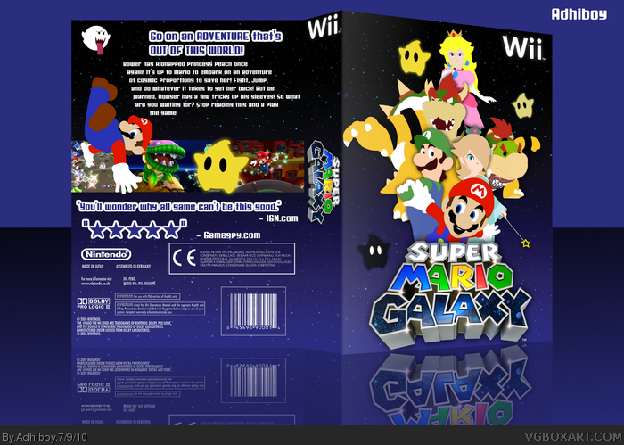
My first custom! All renders were done by me. Not really much to say here :P.
Credit to Sarashi for the template,
Credit to everyone who helped in the WIP,
Credit to Jevangod, who I sorta copied with the template (I know he hates when people do that),
I wanted to do this after I saw Bearded Walrus's box, so credit to him.
Comment please.
Not bad, even if Galaxy boxes have been overdone to death. The front arrangement is pretty good, though the back seems bare. And Luigi's eyes...they frighten me.
#2, yeah, I was sorta iffy about the back, but I've had the front hanging around for awhile now and I really wanted to post it, but I couldn't think of any good ideas for a back.
The main problem I see with the art is that the poses already exist, and the box probably would have looked better if you had just used the original art, considering that the custom art is so simple and doesn't really fit the game at all. Maybe Paper Mario, but not Galaxy. Also, the title is Super Mario Galaxy, and yet your Mario image is the smallest one on the front, besides the star guys. Overall, if I knew nothing about Mario, if I looked at this box, I would not know what to expect, especially from the front. Oh, and it's generally a good idea not to use the same colors/tones in your presentation that you use on the box... makes it all run together.
I agree with KoopaDasher. The poses of the renders already exist, and It doesn't really fit the game very well. To be honest, it's not really custom artwork at all. It looks like you just painted over the official artwork to make it 2 dimensional, which doesn't make it custom art. And sorry, but the design isn't that great either.
Spypilot, it has come to my understanding that everyone at VGBA is crazy. I get told as long as a box looks good, it is good. Isn't that all that should matter (besides putting effort into it, and it actually belongs you)?
I see that you've put effort into flattening the renders, but I really feel that it'd look better in 3D, and the logo is far to close to the edge, which looks sort-of unofficial.
 Super Mario Galaxy Box Cover Comments
My first custom! All renders were done by me. Not really much to say here :P.
Credit to Sarashi for the template,
Credit to everyone who helped in the WIP,
Credit to Jevangod, who I sorta copied with the template (I know he hates when people do that),
I wanted to do this after I saw Bearded Walrus's box, so credit to him.
Comment please.
[ Reply ]
Not bad, even if Galaxy boxes have been overdone to death. The front arrangement is pretty good, though the back seems bare. And Luigi's eyes...they frighten me.
[ Reply ]
#2, yeah, I was sorta iffy about the back, but I've had the front hanging around for awhile now and I really wanted to post it, but I couldn't think of any good ideas for a back.
[ Reply ]
I like it a lot :) very well done!
[ Reply ]
Thanks
[ Reply ]
#2, link
Nice, but you maybe could've done some shading on them and added some more spacey things in the background. And the back feels boring.
Edited at 1 decade ago
[ Reply ]
The main problem I see with the art is that the poses already exist, and the box probably would have looked better if you had just used the original art, considering that the custom art is so simple and doesn't really fit the game at all. Maybe Paper Mario, but not Galaxy. Also, the title is Super Mario Galaxy, and yet your Mario image is the smallest one on the front, besides the star guys. Overall, if I knew nothing about Mario, if I looked at this box, I would not know what to expect, especially from the front. Oh, and it's generally a good idea not to use the same colors/tones in your presentation that you use on the box... makes it all run together.
[ Reply ]
#6,7, thanks for the criticism.
[ Reply ]
I'm not following the art, but it looks freaking sweet. Fav!
[ Reply ]
Would anyone like a printable?
[ Reply ]
Wow, this is freaking good! I love the 2D look.
8.8/10 +fav +author fav
[ Reply ]
I agree with KoopaDasher. The poses of the renders already exist, and It doesn't really fit the game very well. To be honest, it's not really custom artwork at all. It looks like you just painted over the official artwork to make it 2 dimensional, which doesn't make it custom art. And sorry, but the design isn't that great either.
Edited at 1 decade ago
[ Reply ]
Thats it, on my favorite artists list you go!!
[ Reply ]
"You'll wonder why all game can't be this good." - IGN
Look at this sentence.
[ Reply ]
#14, He just forgot one letter...
[ Reply ]
Man, I love the front! I can see alot of work behind this.
[ Reply ]
what is teh point of all these pointless ca covers?
[ Reply ]
Spypilot, it has come to my understanding that everyone at VGBA is crazy. I get told as long as a box looks good, it is good. Isn't that all that should matter (besides putting effort into it, and it actually belongs you)?
[ Reply ]
I see that you've put effort into flattening the renders, but I really feel that it'd look better in 3D, and the logo is far to close to the edge, which looks sort-of unofficial.
[ Reply ]