Awesome job dude, but this may not have been the best time to post it. With two other great boxes out there, this wont get the attention it deserves, which is HoF btw.
#12, Oh, geez, first of all, it's an essence box. I don't know if these were added after you left or not, but they are supposed to be simple. And second, what box isn't too simple for you? You say that on all boxes. I think it's really good and captures the feel of the game. Not telling you what to think, just stating my opinion.
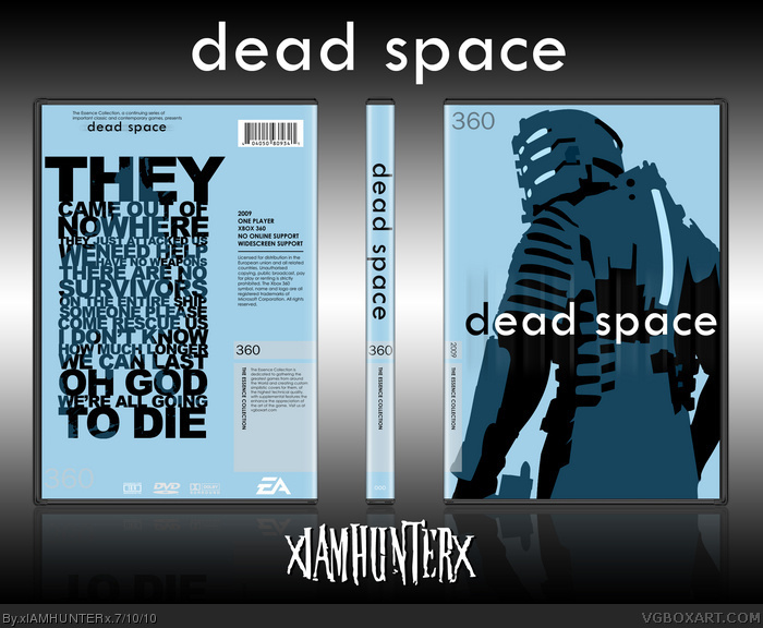
Sorry, but I strongly dislike it, and I resent the fact that this got Hall of Fame. It goes against the whole idea of an Essence box, and it's pretty much a summary of everything I hate about supposed "artistic" boxes like this. It has absolutely zero percent to do with Dead Space. Baby-blue background? Absolutely no "dead" or "space" in sight? To me, this looks like it's trying to be minimalistic for the sake of being pretentious and artsy-fartsy. As a box for a game, specifically a box that it supposed to convey the feeling of the game, it does the exact opposite of that. The front artwork looks very Andy Warhol-ish, and that's all fine and dandy but not for a box, especially not for an Essence box.
If I didn't already know what the game was about, and if it weren't for the title, I'd think it was come kind of art-based puzzle game of some sort. It doesn't do the game justice in any way, shape or form, and it doesn't even look that appealing, if you ask me.
It's not a bad box it just doesn't fit the game. It's well put together but if you're making a satirical box put it in the humor section cause I was sitting here thinking what point you were trying to make as well.
 Dead Space Box Cover Comments
amidoinitrite
[ Reply ]
Garbage.
[ Reply ]
#2, u
[ Reply ]
not bad.
[ Reply ]
Neat typography used here, good job dude.
[ Reply ]
Awesome job dude, but this may not have been the best time to post it. With two other great boxes out there, this wont get the attention it deserves, which is HoF btw.
[ Reply ]
OH GOD
WE'RE ALL GOING
TO DIE
amidoinitrite
P.S. Your box sucks by the way.
P.P.S. Hi how are ya?
Edited at 1 decade ago
[ Reply ]
That's cool shit right there.
[ Reply ]
No, you aren't
[ Reply ]
Thanks broahss
[ Reply ]
Wow, I'm in love with the back typography!
[ Reply ]
sorry, but i dont like it^^ it is too simple for me.
[ Reply ]
#12, Oh, geez, first of all, it's an essence box. I don't know if these were added after you left or not, but they are supposed to be simple. And second, what box isn't too simple for you? You say that on all boxes. I think it's really good and captures the feel of the game. Not telling you what to think, just stating my opinion.
[ Reply ]
Ryan you have earned A author favorite.
[ Reply ]
#13 i certainly do not xD
[ Reply ]
NO RYAN.
Dead Space Essence is my job.
[ Reply ]
Very nice job. I like it. 8.5/10 + fav
[ Reply ]
#13, Actually, Essence boxes are supposed to capture the essence of a game, hence the name "Essence", they are NOT meant to be minimalistic.
That said, this is still very nice, Ryan.
[ Reply ]
Hahaha, thank you guys. ^__^
[ Reply ]
69 boxes... yum.
[ Reply ]
The typography on the back is very well done, and the color scheme looks great.
[ Reply ]
This is hella sick, greatone dude
[ Reply ]
Amazing work again, congrats.
Now to get your Leviathan box in the HoF >_>
[ Reply ]
Sorry, but I strongly dislike it, and I resent the fact that this got Hall of Fame. It goes against the whole idea of an Essence box, and it's pretty much a summary of everything I hate about supposed "artistic" boxes like this. It has absolutely zero percent to do with Dead Space. Baby-blue background? Absolutely no "dead" or "space" in sight? To me, this looks like it's trying to be minimalistic for the sake of being pretentious and artsy-fartsy. As a box for a game, specifically a box that it supposed to convey the feeling of the game, it does the exact opposite of that. The front artwork looks very Andy Warhol-ish, and that's all fine and dandy but not for a box, especially not for an Essence box.
If I didn't already know what the game was about, and if it weren't for the title, I'd think it was come kind of art-based puzzle game of some sort. It doesn't do the game justice in any way, shape or form, and it doesn't even look that appealing, if you ask me.
Sorry, but I was expecting a lot better.
[ Reply ]
#24, I thought this was supposed to be satirical for those reasons.
[ Reply ]
I agree with Vengeance. Sorry.
[ Reply ]
agree with vengeance 100%
If this was made by someone with low rank. People would have gone on and said it was to simple and didn't convey the essence of the box.
[ Reply ]
Yeah I agree with Vengeance. A Dead Space box should have an extremely dark feel. This is way to bright. And it is very simple.
But on the good side everything is put together very well it looks like a real box I just do not like the way the box itself looks.
[ Reply ]
#25, Bravo sir. Bravo. I was wondering when someone was going to figure it out.
Edited at 1 decade ago
[ Reply ]
#29, Then you probably should've posted this in the Humor section. If you were trying to make a joke.
[ Reply ]
#30, But it's not funny.
[ Reply ]
#31, I laughed at how bad this box is, does that count? :D
[ Reply ]
It's not a bad box it just doesn't fit the game. It's well put together but if you're making a satirical box put it in the humor section cause I was sitting here thinking what point you were trying to make as well.
[ Reply ]
I like it.
[ Reply ]
Nice! (faved)
How did you styilize Isaac?
[ Reply ]
so cool
[ Reply ]