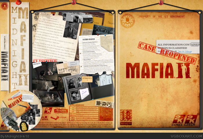
So Mafia 2....
As you can easily understand I have put a lot of work on this one and in my eyes it turned out great.Many of the elements put were created from scratch,like the newspaper cuts,story overview,Vito's portofolio etc..
Full view is absolutely necessary.
A big thank to InsomniumX who gave some great ideas in the forums and Indexenos for the amazing template.
ps.I also added a some kind of an easter egg..
I like this a lot, except the only problem I got with this is that the differences between quality in this one. Such as the back, the font is bold and strong, as the other bits of the font is blurry. Also some parts such as the paper and notes are blurry as some aren't. Try to keep your quality high at all times.
#5 You found it
#7 Adding one now....
#8 Yeah I know...I was just too tired from adding shadosws to almost all objects and got bored to match them right.This one took me way too more time than any other I made.I've printed it out and it is not notable at all.Anyways lesson taught.
Thanks to all for commenting and favin'
Thanks for bumping man. :)
I really had high hopes with this one.
I don't know if it's me or because it's mine but I think it deserved more.Anyways,what you gonna do..
My covers always exceed the 7.5 MB limitation.For example this one was almost twice the size it is now.I had to shrink it down and save in .jpeg cause in .png it was around 30 MB.
 Mafia 2 Box Cover Comments
So Mafia 2....
As you can easily understand I have put a lot of work on this one and in my eyes it turned out great.Many of the elements put were created from scratch,like the newspaper cuts,story overview,Vito's portofolio etc..
Full view is absolutely necessary.
A big thank to InsomniumX who gave some great ideas in the forums and Indexenos for the amazing template.
ps.I also added a some kind of an easter egg..
[ Reply ]
Dude, this is amazing...
[ Reply ]
Damn,I like it! Especially the "case reopned", it gives it that "MAFIA'S BACK!" feeling:)
Great job
[ Reply ]
Love the idea, the detail and detective like feel.
+Fav
+Author Fav
You're getting much better.
[ Reply ]
I like the little John Dillinger easter egg ;)
[ Reply ]
Love the style of this excellent work!
[ Reply ]
fantastic box, please add printable ver.
[ Reply ]
I like this a lot, except the only problem I got with this is that the differences between quality in this one. Such as the back, the font is bold and strong, as the other bits of the font is blurry. Also some parts such as the paper and notes are blurry as some aren't. Try to keep your quality high at all times.
Overall great box! I love the "MOB" feel to this.
[ Reply ]
#5 You found it
#7 Adding one now....
#8 Yeah I know...I was just too tired from adding shadosws to almost all objects and got bored to match them right.This one took me way too more time than any other I made.I've printed it out and it is not notable at all.Anyways lesson taught.
Thanks to all for commenting and favin'
[ Reply ]
This is excellent. I just love the detective feel to it, the front is just great. I just love the design of this box, truly excellent.
+fav +author fav
[ Reply ]
#3 Yeah.that was the point.
#10 Thank you for these kind words.
[ Reply ]
Thanks forprintable :) Amazing work!
[ Reply ]
Bumpp :)
[ Reply ]
Thanks for bumping man. :)
I really had high hopes with this one.
I don't know if it's me or because it's mine but I think it deserved more.Anyways,what you gonna do..
[ Reply ]
#14, If this cover was posted 2 years before now you would have gotten Hall of Fame in five seconds.
[ Reply ]
#15 I know.I've seen some early HoFs,but I can't blame "progress" about it. :)
[ Reply ]
Time for a Author Fave
[ Reply ]
Man, that is seriously stylish! Love the look of it, and i can tell a lot of work went into it! +Fav well earned! :)
[ Reply ]
Aaaand...bump.
It's a damn shame I can't author fav you...
[ Reply ]
A bit like a corkboard, except it's paper :)
[ Reply ]
Really good, I love the back layout, +FaV!
[ Reply ]
#19 Thanks for the support buddy.
#20 You almost hurt my feelings.That smiley made it up. :)
#18 19 21 Thanks
[ Reply ]
Nicely done dude!! Fav+
[ Reply ]
Why don't you save it as .png?
[ Reply ]
My covers always exceed the 7.5 MB limitation.For example this one was almost twice the size it is now.I had to shrink it down and save in .jpeg cause in .png it was around 30 MB.
[ Reply ]
#25, All you need to do is shrink down the entire PNG image in paint by 50%.
[ Reply ]
#26 Won"t it lose in quality?
[ Reply ]
I just tried it and it doesn't.Thanks for the tip.
[ Reply ]
#28, How much smaller was the file size when you tried it?
[ Reply ]
I tried it the front which was 2300x3280 and 16 MB and shrunk it to half the resolution which was in size 3.9 MB.
[ Reply ]
Do this.
Save the entire image, in full size, as a .PNG file.
Open it in Paint, and shrink it by 50%, what is the final file size?
[ Reply ]
About 7 Mb without the presentation.
[ Reply ]
#32, Upload the entire cover with the presentation, the full 30 MB file, and send it to me, I gotta try somethin'.
[ Reply ]
I'll do that tomorrow at work cause I don't have internet at home.I'm browsing through my cell now.
[ Reply ]
#34, Roger, copy.
[ Reply ]
Nice boxart I must say, But think the back it TOO busy, I mean no-ones desk is that messy.
[ Reply ]
#37 It's not someone's desk.It more like the contents of the folder.
[ Reply ]
It seems pretty weird with a front so simple and a back so complex. mabye you should make the back less crowded.
[ Reply ]
It seems pretty weird with a front so simple and a back so complex. mabye you should make the back less crowded.
[ Reply ]
#38 See #37
[ Reply ]
This box is freakin' amazing dude!
[ Reply ]
Yeah, I bumped.
[ Reply ]
Lol nice one 5/5
[ Reply ]
please make this a downloadable one i really wan't it so bad
[ Reply ]