Fantastic box.One thing though,you should remove "evil" from the forces of darkness part of text, it seems unnecessary.I mean they ARE forces of DARKNESS:).
I think the back beats the front. Which emotion do you choose?
What really disturbes me is that you used a legal information from an ubisoft game. And btw why did you get so much points, that's no good omen for the competition ;). Faved.
#16, Really? The front really feels like sorrow to me...maybe if it were blue tones and added some rain effects...but yeah, I can see sorrow on the front.
And shame on you ADFD, using inaccurate legal text! :P
I love the old storybook feel to this, especially the back.
To me, sorrow is clearly shown throughout the front design, and I particularly like the desaturated image of Gabriel, whether or not you did that yourself. Wonderful job blending images as well, and like tleeart mentioned the borders and textures give this an old storybook feel. Possibly my favorite entry of Round 1.
Amazing work sir as to be expected. I get the strong emotion of sorrow just from the contrast you put on the character on the front. Gorgeously epic design.
Congrats on hall, but I gotta agree with Jevan, the logo is the only thing that I don't really like about this. Maybe try another effect to make it more noticeable, or change the color to make it stand out more.
The shadows on the front seem distracting. you should add some light reflections to it, in case you tried to make a embossment-look.
The other stuff is kinda okay, but just as the game there's some missing Castlevania-feeling to it. It's just not enough to take some guy named Belmont with a whip, a clocktower and demons/vampires and put the title "Castlevania" on it. Its not your fault, but... Nah, no Castlevania for me.
 Castlevania: Lords of Shadow Box Cover Comments
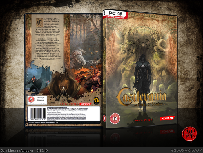
Here's my Octoberfest round 1 box.
[ Reply ]
Good.
[ Reply ]
You did a really great job on this.
[ Reply ]
This is good, makes me want your photoshop brushes.
[ Reply ]
Fantastic box.One thing though,you should remove "evil" from the forces of darkness part of text, it seems unnecessary.I mean they ARE forces of DARKNESS:).
[ Reply ]
omg!!! this is great, printable ver. nedded asap:D please:)
[ Reply ]
Holy...
[ Reply ]
I think the back beats the front. Which emotion do you choose?
What really disturbes me is that you used a legal information from an ubisoft game. And btw why did you get so much points, that's no good omen for the competition ;). Faved.
[ Reply ]
It represents sorrow. That's generic PC info I use, iknow it's ubisoft but....meh.
[ Reply ]
Very nice. I feel that the inner shadow on the logo is unnecessary though.
[ Reply ]
Edited at 1 decade ago
[ Reply ]
#8, I'm only first because Drakxxx dropped out :P
#10, I tried it without and it was barely readable to me.
[ Reply ]
Arrgh!! What's with the edit function. it keeps saying: The file(s) uploaded were too large to process.
[ Reply ]
Another great box from ADFD!
[ Reply ]
As much as I love every box you make, I really can't see the sorrow in this. A great box none the less, but I don't see the sorrow.
[ Reply ]
Honestly, it looks more angry than anything else.
[ Reply ]
#16, Really? The front really feels like sorrow to me...maybe if it were blue tones and added some rain effects...but yeah, I can see sorrow on the front.
And shame on you ADFD, using inaccurate legal text! :P
I love the old storybook feel to this, especially the back.
[ Reply ]
I get sorrow from the font too. Everything is very well put together, and the colors look great.
[ Reply ]
*front
[ Reply ]
To me, sorrow is clearly shown throughout the front design, and I particularly like the desaturated image of Gabriel, whether or not you did that yourself. Wonderful job blending images as well, and like tleeart mentioned the borders and textures give this an old storybook feel. Possibly my favorite entry of Round 1.
[ Reply ]
#17, Really I don't see sorrow. It looks more like regret or reflection.
[ Reply ]
Amazing work sir as to be expected. I get the strong emotion of sorrow just from the contrast you put on the character on the front. Gorgeously epic design.
[ Reply ]
#13, You should try a drop shadow.
[ Reply ]
Congrats on hall, but I gotta agree with Jevan, the logo is the only thing that I don't really like about this. Maybe try another effect to make it more noticeable, or change the color to make it stand out more.
[ Reply ]
Jaw-dropping.
[ Reply ]
The shadows on the front seem distracting. you should add some light reflections to it, in case you tried to make a embossment-look.
The other stuff is kinda okay, but just as the game there's some missing Castlevania-feeling to it. It's just not enough to take some guy named Belmont with a whip, a clocktower and demons/vampires and put the title "Castlevania" on it. Its not your fault, but... Nah, no Castlevania for me.
[ Reply ]
its nice cover
[ Reply ]
Amazing Work
[ Reply ]