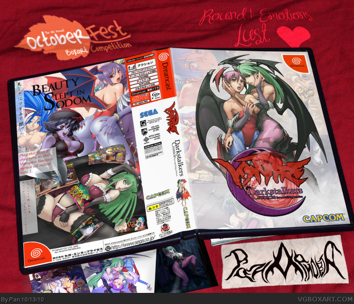
My entry for Octoberfest Round 1. Please, no immature comments.
The biggest challenge for putting this together was trying to make the various fan art styles blend together, it's not the best job, but I think I did ok. I chose this game and emotion because it just seemed perfect to me, and I needed a printable cover for this game anyway.
Speaking of making covers for pornographic movies, I remember several users said they were thinking about doing it. This is the only one to really touch on that.
(In before "IT'S NOT PORNO HURR" Yeah, I know. But it might as well be.)
#14, This game was only released in Japan, and I think it was a promotional release, not a commercial one. This is also the same game that was ported to, and updated on the PS2 and PSP.
If you can get your hands on a dreamcast, do it, it's really a great platform for collecting gems.
#15, I see. I've been wanting to get a Dreamcast, but I still have a lot of modern games I've yet to collect, without going backward, lol. I just hope that they will keep porting the good ones to PSN (and XBLA) so I can collect them that way.
You seem to have picked the perfect game for such an emotion. Good job mixing the different art styles, it's hard to tell they weren't matched to begin with. Very creative use of screenshots too, and also fits nicely with the theme of the box.
Overall, probably the best box from Round 1. While I enjoyed Spiderpig's, I feel like this box captured the theme better than any other box, and I wish it had landed higher than it did in the rankings.
#19, Thanks. Darkstalkers really has my 2nd favorite cast in a fighting game, next to Guilty Gear, the gameplay is nothing compared to todays fighters, but I'm really hoping for a revival.
Also I forgot to mention that the logo is custom made, you can tell by the misspelling. : P Also the presentation templete was a PS2 game I took a picture of on my bed.
In all seriousness, I think you could have emphasized lust in a more subtle way without just using softcore hentai pictures. It's very well put together, but I'm just put off by the content.
#21, True, I could have made it more subtle, and it would have probably had a better end result, but I had a LOT of artwork to choose from, and honestly I wanted to see how far I could push it without REALLY pushing it.
I made the back first, took a few hours to get everything looking right, the front I wanted to look more tame so it would look official, but I couldn't edit the art as much since the picture was already set up like that and worked. Overall though I was satisfied at how it came out as a whole.
I really liked that you used a photograph as the base. You just edited the photograph to have your new cover, right? You didn't print it out and photograph it?
Either way, very nice presentation. It always look so unnatural to have the 3D images everyone uses around here. Not that I'm not guilty of it, but we all know that's now how cases look in that kind of position.
I really like the front, Morrigan is pretty much the definition of video-game hawtness. Though, the logo is maybe a bit to much with Morrigan there again the spiderweb and an even less legible "Vampire"-part. It doesn't really distract from other aspects of it though.
The back on the other hand is really not my cup of tea, there is way to much going on, the warping of the screenshots looks really weird and I don't think it looks really balanced with all the text on the left like that.
On another note, how much of that is official artwork?
#25, The picture on the spine, and I believe the front pic of Morgan and Lilith are official. The picture on the back of Lilith is from a doujin, and the rest of the art is other fan art.
 Darkstalkers Cronicle Box Cover Comments
My entry for Octoberfest Round 1. Please, no immature comments.
The biggest challenge for putting this together was trying to make the various fan art styles blend together, it's not the best job, but I think I did ok. I chose this game and emotion because it just seemed perfect to me, and I needed a printable cover for this game anyway.
[ Reply ]
Can't go wrong with a CoF tagline
[ Reply ]
cronicle or chronicle, that's the question? :)
[ Reply ]
Faptastic :D
[ Reply ]
Dreamcastic :D
[ Reply ]
Edited at 1 decade ago
[ Reply ]
Speaking of making covers for pornographic movies, I remember several users said they were thinking about doing it. This is the only one to really touch on that.
(In before "IT'S NOT PORNO HURR" Yeah, I know. But it might as well be.)
[ Reply ]
#3, I could have swore that the game itself said Cronicle and NOT Chronicle, guess I was wrong.
link
[ Reply ]
#8 So it's kinda unique ;).
[ Reply ]
Insta Fave
[ Reply ]
Kinkeh..
[ Reply ]
mmmmmmmm, yeahhhhhhhh,......
FAV :)
[ Reply ]
I see the lust in this but all immature comments I can think of aside, it's very well put together. This first round is shaping up to be quite good.
[ Reply ]
I didn't know this game existed...i missed out on Dreamcast...
Anyway, you definitely picked a great game for your theme, and I just love the way you did the screenshots...that is very creative.
The presentation is also excellent. Great job with that.
For the most part you did a pretty good job of blending the art styles, I know how hard that can be.
[ Reply ]
#14, This game was only released in Japan, and I think it was a promotional release, not a commercial one. This is also the same game that was ported to, and updated on the PS2 and PSP.
If you can get your hands on a dreamcast, do it, it's really a great platform for collecting gems.
[ Reply ]
#15, I see. I've been wanting to get a Dreamcast, but I still have a lot of modern games I've yet to collect, without going backward, lol. I just hope that they will keep porting the good ones to PSN (and XBLA) so I can collect them that way.
[ Reply ]
You seem to have picked the perfect game for such an emotion. Good job mixing the different art styles, it's hard to tell they weren't matched to begin with. Very creative use of screenshots too, and also fits nicely with the theme of the box.
[ Reply ]
Overall, probably the best box from Round 1. While I enjoyed Spiderpig's, I feel like this box captured the theme better than any other box, and I wish it had landed higher than it did in the rankings.
[ Reply ]
From the small detail pic on the main page, I knew what emotion this one was going for, which really says all that needs to be said.
The design collectively looks really sharp and official as well.
[ Reply ]
#18, I'll try and top it the next round. : )
#19, Thanks. Darkstalkers really has my 2nd favorite cast in a fighting game, next to Guilty Gear, the gameplay is nothing compared to todays fighters, but I'm really hoping for a revival.
Also I forgot to mention that the logo is custom made, you can tell by the misspelling. : P Also the presentation templete was a PS2 game I took a picture of on my bed.
[ Reply ]
In all seriousness, I think you could have emphasized lust in a more subtle way without just using softcore hentai pictures. It's very well put together, but I'm just put off by the content.
[ Reply ]
#21, True, I could have made it more subtle, and it would have probably had a better end result, but I had a LOT of artwork to choose from, and honestly I wanted to see how far I could push it without REALLY pushing it.
I made the back first, took a few hours to get everything looking right, the front I wanted to look more tame so it would look official, but I couldn't edit the art as much since the picture was already set up like that and worked. Overall though I was satisfied at how it came out as a whole.
[ Reply ]
I really liked that you used a photograph as the base. You just edited the photograph to have your new cover, right? You didn't print it out and photograph it?
Either way, very nice presentation. It always look so unnatural to have the 3D images everyone uses around here. Not that I'm not guilty of it, but we all know that's now how cases look in that kind of position.
[ Reply ]
I really like the front, Morrigan is pretty much the definition of video-game hawtness. Though, the logo is maybe a bit to much with Morrigan there again the spiderweb and an even less legible "Vampire"-part. It doesn't really distract from other aspects of it though.
The back on the other hand is really not my cup of tea, there is way to much going on, the warping of the screenshots looks really weird and I don't think it looks really balanced with all the text on the left like that.
On another note, how much of that is official artwork?
[ Reply ]
I think the small picture on the spine is official. I'd guess that the cover might be official.
I'm confident all of the back is fan art, though. Am I right, Pan?
[ Reply ]
#25, The picture on the spine, and I believe the front pic of Morgan and Lilith are official. The picture on the back of Lilith is from a doujin, and the rest of the art is other fan art.
[ Reply ]
Amazing back! XD
[ Reply ]
So.... this ISN'T a porno?
Hey, I got this into the Hall! Congrats :3
Edited at 1 decade ago
[ Reply ]
Right on, another HOF
[ Reply ]
I actually quite like how over the top this is with the whole sex appeal, and the positioning of the renders is really well done too. Good job.
[ Reply ]
I would love to see an English 'Darkstalkers Resurrection' cover...or at least an English translated version of the Japanese retail release. :D
[ Reply ]