#6, The NTSC logo was part of the template and I did not take the time to modify, but thanks for pointing that out.
#7, I wanted the front to have the similar color tones throughout and original blue color SEGA logo would have broken that continuos.
Thanks for leaving a comment, I really appreciate it.
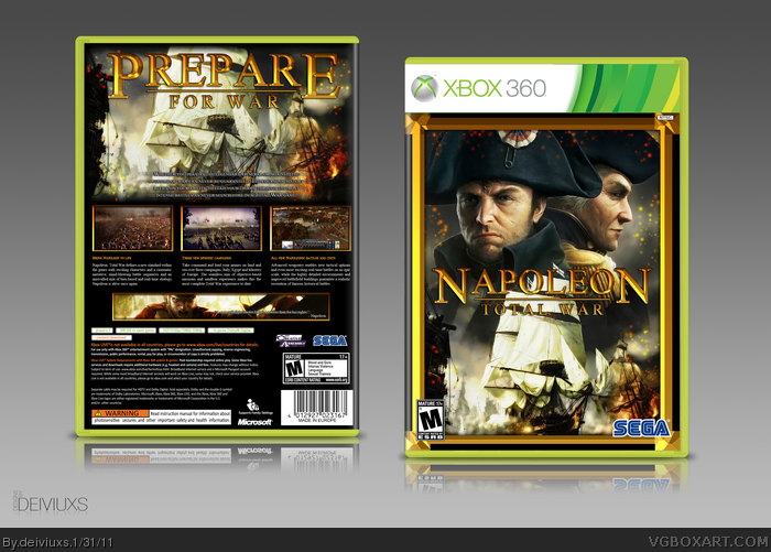
The setup for everything is perfect, i just really dislike it. The front looks overly drab, the orange just doesn't feel right, its almost as if you made a wallpaper black and white, blended an orange layer over it, than just started randomly erasing. I'm not a fan, but your back impresses me so much that i have to favorite this cover.
This box has a lot of potential. However, few highly noted issues should be addressed. I have to agree with #12, the orange overlay thingy looks to much like an overlay. There are so many options on how to better blend this overlay that I cannot suggest any particular one at the moment. mostly because I am not sure what the overlay is representing.
Also, the text portion about the screenshots on the back could use some breathing room. My suggestion is to space the lines a bit more and bring the whole affair a bit higher. This will allow the text to be more viewable, as it would bring it away from the lower darker ares of the background imagery.
Now, I know that a lot of folks here at VGBA do not care so much about image quality so much as the theme, layout and color scheme. If you want your hard work to really stand out in the crowd, you have to put in the time to get image quality the best it can be. And my direct issue here is the front cover image quality. The logos are fine, but the picture is not. There are too many artifacts and pixelation is very high. I have a method of reducing these effects while maintaining the clarity and overall feel of the image.
Copy the image layer. Go to Filters and select Noise>Reduce Noise. Set the options to:
Strength 10, Preserve Details 0, Reduce Color noise 100, Sharpen Details 0.
Next, go to Filters, and the to Blur>Surface Blur. Set your options to: Radius 3, Threshold 9.
At this point, your image will look a bit dull compared to the original. You will want to go back to Filters, then select Other>High Pass. Select your radius to be 5 pixels. Hit enter and then go to Shift/Control/F. This invokes the Fade option. Set Opacity to 50 and Mode to Hard Light. Hit Enter.
At this point, you just need a bit more of the original detail, which you can get back by copying the original layer to be above your modified layer, set it to a Lighten layer blend, and then set the layer opacity and fill to 50%.
Merge the top two layers together, and then use Smart Sharpen filter set to Basic, Amount 50%, Radius to 0.5 pixels, and Remove Gaussian blur. Then, you can toggle that new merged layer off and on to compare with the original layer. From there, you can make some tweaks, or you can scrap that and start all over using alternate settings to the ones I supplied.
#10, I tried putting the same SEGA logo on the back as it is on the front but it did not look good. The original blue color fits better and stands out more as a dev logo.
#12, Glad you liked the back, as far as the front goes, I myself are not 100% satisfied with it and I will work more on the front and update the box in the near future.
#13, Damn, Crotale, thanks for such an in-depth comment. I really appreciate your critique and I will definitely update the box based on that.
#14, Of course it is not necessary, but I just felt like using the same image. Sorry if that bothers you that much.
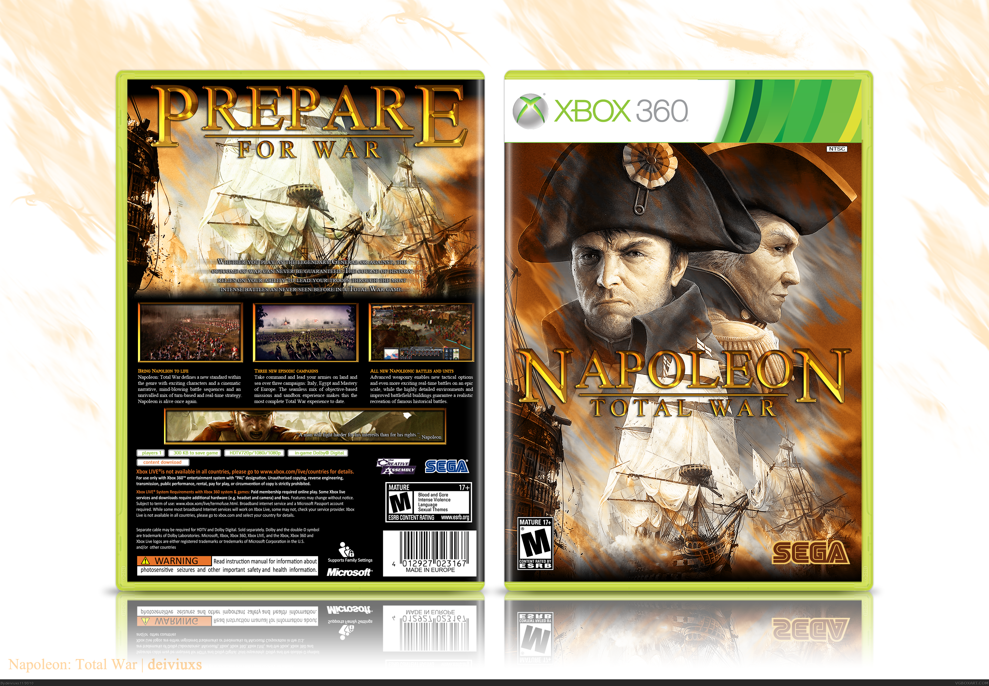
Alright, as I mentioned before, I have updated this cover. I won't go into details of what has been changed (it's kinda obvious just by looking at it), but I just want to thank again to those who left a comment and helped me to improve this cover (especially you Crotale).
If anyone has any more suggestions/tips/changes/etc. then p;ease don't be shy and let me know.
Again, please view full size in order to see all the details.
Hm...I think the text effects are a tad strong (the shininess clashes with the dark and dingy look of the artwork,) but the composition on the front is great.
 Napoleon: Total War Box Cover Comments
Just passing by...
...oh, view full size.
[ Reply ]
Excellent work, Deiviuxs!
[ Reply ]
Oh my gawd this is pretty.
[ Reply ]
Looks very nice and clean. Really like the layout on the back.
[ Reply ]
OMFG, excellent
[ Reply ]
I really like the back setup.
The NTSC logo on the front could be moved a little more to the right, however.
[ Reply ]
This is great, my only complaint is the color of the Sega logo on the front.
[ Reply ]
#6, The NTSC logo was part of the template and I did not take the time to modify, but thanks for pointing that out.
#7, I wanted the front to have the similar color tones throughout and original blue color SEGA logo would have broken that continuos.
Thanks for leaving a comment, I really appreciate it.
[ Reply ]
Looks like the real deal, great high resolution too.
[ Reply ]
#7, Keeping the SEGA logo blue would have threw off the entire design, however I think the SEGA logo on the back should match.
[ Reply ]
<3 This is incredible, I love everything about it.
[ Reply ]
The setup for everything is perfect, i just really dislike it. The front looks overly drab, the orange just doesn't feel right, its almost as if you made a wallpaper black and white, blended an orange layer over it, than just started randomly erasing. I'm not a fan, but your back impresses me so much that i have to favorite this cover.
[ Reply ]
This box has a lot of potential. However, few highly noted issues should be addressed. I have to agree with #12, the orange overlay thingy looks to much like an overlay. There are so many options on how to better blend this overlay that I cannot suggest any particular one at the moment. mostly because I am not sure what the overlay is representing.
Also, the text portion about the screenshots on the back could use some breathing room. My suggestion is to space the lines a bit more and bring the whole affair a bit higher. This will allow the text to be more viewable, as it would bring it away from the lower darker ares of the background imagery.
Now, I know that a lot of folks here at VGBA do not care so much about image quality so much as the theme, layout and color scheme. If you want your hard work to really stand out in the crowd, you have to put in the time to get image quality the best it can be. And my direct issue here is the front cover image quality. The logos are fine, but the picture is not. There are too many artifacts and pixelation is very high. I have a method of reducing these effects while maintaining the clarity and overall feel of the image.
Copy the image layer. Go to Filters and select Noise>Reduce Noise. Set the options to:
Strength 10, Preserve Details 0, Reduce Color noise 100, Sharpen Details 0.
Next, go to Filters, and the to Blur>Surface Blur. Set your options to: Radius 3, Threshold 9.
At this point, your image will look a bit dull compared to the original. You will want to go back to Filters, then select Other>High Pass. Select your radius to be 5 pixels. Hit enter and then go to Shift/Control/F. This invokes the Fade option. Set Opacity to 50 and Mode to Hard Light. Hit Enter.
At this point, you just need a bit more of the original detail, which you can get back by copying the original layer to be above your modified layer, set it to a Lighten layer blend, and then set the layer opacity and fill to 50%.
Merge the top two layers together, and then use Smart Sharpen filter set to Basic, Amount 50%, Radius to 0.5 pixels, and Remove Gaussian blur. Then, you can toggle that new merged layer off and on to compare with the original layer. From there, you can make some tweaks, or you can scrap that and start all over using alternate settings to the ones I supplied.
Here is the modified image I ended up with. link
[ Reply ]
Love the layout! However, is it necessary to use the same group of ships twice?
[ Reply ]
#10, I tried putting the same SEGA logo on the back as it is on the front but it did not look good. The original blue color fits better and stands out more as a dev logo.
#12, Glad you liked the back, as far as the front goes, I myself are not 100% satisfied with it and I will work more on the front and update the box in the near future.
#13, Damn, Crotale, thanks for such an in-depth comment. I really appreciate your critique and I will definitely update the box based on that.
#14, Of course it is not necessary, but I just felt like using the same image. Sorry if that bothers you that much.
[ Reply ]
Alright, as I mentioned before, I have updated this cover. I won't go into details of what has been changed (it's kinda obvious just by looking at it), but I just want to thank again to those who left a comment and helped me to improve this cover (especially you Crotale).
If anyone has any more suggestions/tips/changes/etc. then p;ease don't be shy and let me know.
Again, please view full size in order to see all the details.
[ Reply ]
That looks MUCH better. +Fav.
[ Reply ]
#17, I completely agree. Way better, nothing to complain about. Good work!
[ Reply ]
Nice.
[ Reply ]
Very crisp and very clean. Nice job man. Though I would have preffered if the front border was more realistic.
[ Reply ]
The logo, which was created by me, has been added to the resources section.
[ Reply ]
Hm...I think the text effects are a tad strong (the shininess clashes with the dark and dingy look of the artwork,) but the composition on the front is great.
[ Reply ]
#22, Hm...I see what you are saying, but I kinda wanted it to clash. I wanted the cover to have a strong contrast. Thanks for your feedback though.
[ Reply ]
The update didn't bump this enough, so here I am.
[ Reply ]
The frame on the front don't need. IMO
[ Reply ]