Thanks you lot :D
#5 i've worked on those bonds and came with this, the first Bond (George Lazenby) was already in this contrast to start with, but still tried my best :)
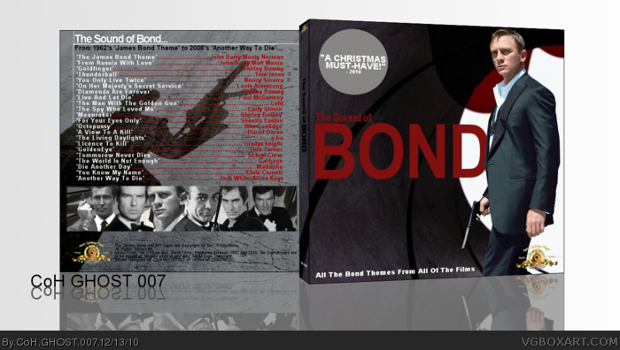
Not bad, quite nice actually but some of the images are quite low-res and blurry. I like your choice of colours; black and white with red is a nice effect, I would have liked to see it on the front aswell. You could have experimented with fonts a bit more.
 007: The Sound of Bond Cover Comments
Great Work!
[ Reply ]
#1 - Oh Wow thanks :D
I took a look through all of my previous boxes comments and worked on them and came out with this, i love it to be honest :D
[ Reply ]
Nice job, I like the cover.
[ Reply ]
Thanks Guys, this was my third atttempt at it, cos Gimp kept crashing!!! :/
[ Reply ]
the two bonds on the right of the back seem to have a red tinge and the first ones contrast could be more fitting to the other photos. but it's good.
[ Reply ]
I like the front, but the red text on the back ruins it for me. I do see the effort you put into this, and you're improving, so that'l warrent a fav.
[ Reply ]
Thanks you lot :D
#5 i've worked on those bonds and came with this, the first Bond (George Lazenby) was already in this contrast to start with, but still tried my best :)
[ Reply ]
Not bad, quite nice actually but some of the images are quite low-res and blurry. I like your choice of colours; black and white with red is a nice effect, I would have liked to see it on the front aswell. You could have experimented with fonts a bit more.
[ Reply ]
Front is pretty nice, back however, could have used some more polish.
[ Reply ]
Yeh, thanks guys for taking your time to look closely at this box :)
[ Reply ]
Interesting design. I don't really like the back, but it's ok.
[ Reply ]