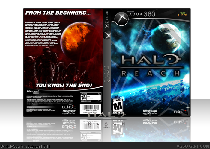
First box in a relatively long time. I'm pretty damn proud of this one.
The back is (minus Noble Team and the template) 100% custom made, including the planet... and even though the front and the back are two completely different color schemes... I think they flow pretty nicely.
The front isn't just a wallpaper + render + logo btw. I did quite a lot of editing on two seperate wallpapers before adding an edited render.
#2, I'm not so sure. While I get that a lot of designers prefer using standard templates, I rather enjoy custom ones more. It isn't like we are legally bound to use official looking templates or anything.
#1, not too bad. It does seem a bit too dark with a bit much contrast, but it does look decent.
#3 I understand that. I just think the standard white template would of complemented the cover more. Like you said, it does seem a bit too dark, a bit of white could of balanced it out.
#7, The text'll be fixed in my next update, it was the only thing I rushed in the box as I was in a major hurry.
On the template front; I tried a traditional 360 temp, along with an inverted version of the current to make it white, but nothing worked as well as this one did.
While I do think your custom box header looks great, it somehow makes the whole thing look more like a PC package than an Xbox 360 one. That's probably due to the lack of the standard white and green color theme that is part of every Xbox 360 packaging. Particularly jarring is the lack of the rectangles on the back that let you know standard details (number of players, online features...).
Like #7 pointed out, the text needs some work (full is misspelled "ful"). Also, many of the sentences are fragments.
Everything else is great. Your description of the elements you had to combine to make the front art make me appreciate it all the more. It all looks like it was meant to go together.
#9, Thanks Prong. As I said, the text will be improved... I know it's terrible - my grammar is NEVER that bad... I was hoping that this could be seen more like a slip-cover? Anyway; thanks, my man. =)
Well it's pretty nice, but i don't like how much the colours change from the front to the spine to the back, fronts nice, but the text on the back isn't placed very nicely, except for those, i ike it ;D
 Halo: Reach Box Cover Comments
First box in a relatively long time. I'm pretty damn proud of this one.
The back is (minus Noble Team and the template) 100% custom made, including the planet... and even though the front and the back are two completely different color schemes... I think they flow pretty nicely.
The front isn't just a wallpaper + render + logo btw. I did quite a lot of editing on two seperate wallpapers before adding an edited render.
Anyway, enjoy guys! =)
[ Reply ]
Might of been nice if you would of used the official template.
[ Reply ]
#2, I'm not so sure. While I get that a lot of designers prefer using standard templates, I rather enjoy custom ones more. It isn't like we are legally bound to use official looking templates or anything.
#1, not too bad. It does seem a bit too dark with a bit much contrast, but it does look decent.
[ Reply ]
#3 I understand that. I just think the standard white template would of complemented the cover more. Like you said, it does seem a bit too dark, a bit of white could of balanced it out.
[ Reply ]
#3, I like custom templates too, but I really feel like this template detracts from the box.
[ Reply ]
I dunno why, i just don't think the exclamation mark fits on the end of "you know the end" Otherwise nice box man +fav
[ Reply ]
I like the contrast between front and back, but the text on the back could use some work.
[ Reply ]
#7, The text'll be fixed in my next update, it was the only thing I rushed in the box as I was in a major hurry.
On the template front; I tried a traditional 360 temp, along with an inverted version of the current to make it white, but nothing worked as well as this one did.
[ Reply ]
While I do think your custom box header looks great, it somehow makes the whole thing look more like a PC package than an Xbox 360 one. That's probably due to the lack of the standard white and green color theme that is part of every Xbox 360 packaging. Particularly jarring is the lack of the rectangles on the back that let you know standard details (number of players, online features...).
Like #7 pointed out, the text needs some work (full is misspelled "ful"). Also, many of the sentences are fragments.
Everything else is great. Your description of the elements you had to combine to make the front art make me appreciate it all the more. It all looks like it was meant to go together.
[ Reply ]
#9, Thanks Prong. As I said, the text will be improved... I know it's terrible - my grammar is NEVER that bad... I was hoping that this could be seen more like a slip-cover? Anyway; thanks, my man. =)
[ Reply ]
nice, i like how you used different colors for the front and back.
[ Reply ]
I love that template! It goes great with the overall feel of the box. You should upload the template to the Resources :)
[ Reply ]
#11, Thank you :)
#12, Not mine. YoshiStar's.
[ Reply ]
Not bad at all... I think that it would be alot better if the color scheme stayed the same.
[ Reply ]
Well it's pretty nice, but i don't like how much the colours change from the front to the spine to the back, fronts nice, but the text on the back isn't placed very nicely, except for those, i ike it ;D
[ Reply ]
awsome, and quite unique box if i do say so
[ Reply ]