Temp is a little weird and has a very DS feel to it and looks very crushed. Overall the design is very plain and boring. Its well done (the front) but is just too generic. The back has a little too much text on it and well...still generic. Tagline good have been placed a little better. For a first its very well put together though. Good job.
 Assassin's Creed: Brotherhood Box Cover Comments
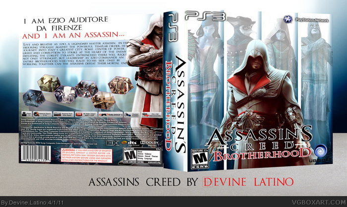
I'm not gonna really say anything about this box except for the credits
leegion - template
soundwave - front render of Ezio
Please critique, fave and comment on this box honeslty guys
[ Reply ]
Temp is a little weird and has a very DS feel to it and looks very crushed. Overall the design is very plain and boring. Its well done (the front) but is just too generic. The back has a little too much text on it and well...still generic. Tagline good have been placed a little better. For a first its very well put together though. Good job.
[ Reply ]
One of the best firsts I've seen for a while!
It looks a bit stretched, though.
Anyways, +FAV.
[ Reply ]
#3, Thanks man, that means a lot to me right now
and back at ya on the best first box you've ever seen
[ Reply ]
I agree with #2 and #3 but FAV. Alright first.
[ Reply ]