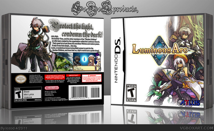
hello its me again :D
and this is my newest box
PLEASE WATCH IN FULL SIZE!
its my new project i think it came out nice,
i got some help from the WIP section
and now...
I like it. I know im new here and I probably shouldn't critique anything but...Looks a little simple and the back text is really hard to read. Love the front though!
 Luminous Arc Box Cover Comments
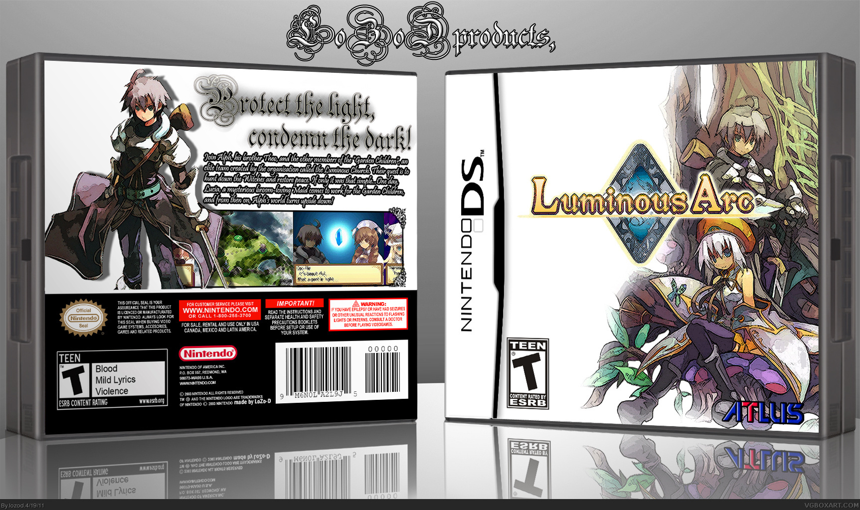
hello its me again :D
and this is my newest box
PLEASE WATCH IN FULL SIZE!
its my new project i think it came out nice,
i got some help from the WIP section
and now...
tell me wath you think :D
[ Reply ]
I like it. I know im new here and I probably shouldn't critique anything but...Looks a little simple and the back text is really hard to read. Love the front though!
[ Reply ]
#2, thats why i asked to watch it in full mode :D
[ Reply ]
ADDED Printable,
and P.S.
no comments? D:
i realy want some advice or something
[ Reply ]
If the front is Simple like that, then at least make the back more unique.
[ Reply ]
#5, i know but i was out of solutions for the back of this box :P
i will try to make my next box better ;D
[ Reply ]
Try making the back text Arial or Helvetica Narrow so that it's easy to read.
[ Reply ]
Why not just make the font on the back black instead of making it white and putting a black stroke around it.
[ Reply ]
#7, & #8,
UPDATE ;D
[ Reply ]
Thanks. :D +FAV
[ Reply ]