I was going to comment on this in the critique forums but I see you already posted it. I think it looks fantastic. The colors all look great and don't clash too much, and what you did with the screenshots looks very nice. I feel like the yellow words on the back would have fit better if they were blue, but it doesn't take away from the box to me at all. Very nice job on this!
If this gets to 35 faves, I'll certainly add a printable. I just want to know that people are looking for it, and 35 seems like a good enough number to do that.
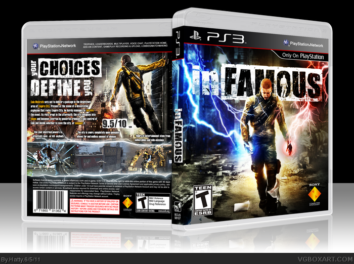
Cover looks good but it's nothing special for InFamous box. Same old lighting effects, which fit the game, but have been overdone. Back also reminds me of one cover already posted to this site (too lazy to find it).
All in all, it's a nice quality box but it does not set itself apart from the rest of inFamous covers.
Granted, many inFAMOUS boxes are arranged in a similar fashion...but I've scrolled through the rest, and yours is definitely one of the best on the site!
Where everyone tried to hit this design correctly, you've struck it clear on the head. The theme of duality and moral choice is well-preserved on the front of the box art. And the back...holy hell, what you've done with that tagline! You made into the logo's style, and it's just, it's absolutely superb :D!
Wonderful box! I'm almost upset I wasn't around to see it posted :).
 inFAMOUS Box Cover Comments
Ok, so here's my latest box.
I think it's probably my best, I think I really executed my idea well, got good help in the forums, and in my opinion, It looks plain awesome.
Hope you guys enjoy. I'll be uploading a printable soon, so remember to comment, fave, and if you want to see what next, author fave me.
Thanks,
Hatty
[ Reply ]
I was going to comment on this in the critique forums but I see you already posted it. I think it looks fantastic. The colors all look great and don't clash too much, and what you did with the screenshots looks very nice. I feel like the yellow words on the back would have fit better if they were blue, but it doesn't take away from the box to me at all. Very nice job on this!
[ Reply ]
I'm not sure if I like the yellow words on the back, but this is still a fantastic box.
[ Reply ]
Thanks guys! Keep the comments coming!
[ Reply ]
A perfect box to a perfect game. 10/10
[ Reply ]
One of your best boxes. This is freaking sexy.
+fav
[ Reply ]
Thanks guys, if you can, spread the word! I'd like to get this as much exposure as I can.
[ Reply ]
#7, I sigged it, very large.
[ Reply ]
#8, And it was because of you that I saw it. I love this. Fav.
[ Reply ]
A little generic as far as inFAMOUS boxes go, but still looking goood.
[ Reply ]
Electrifying.
The only way to describe it.
[ Reply ]
my only problem is the blue lightning on the front. It is very blurry.
[ Reply ]
#12, haha, the blue lightning was actually on the original photo!
Thanks everyone for the kind words and faves!
[ Reply ]
You need to add more red glow around the circle around the hand, and on his waist area.
[ Reply ]
This is amazing. Can we get a printable on this?
Edited at 1 decade ago
[ Reply ]
If this gets to 35 faves, I'll certainly add a printable. I just want to know that people are looking for it, and 35 seems like a good enough number to do that.
[ Reply ]
Very solid box Hatty. The "in" in inFamous on the front is kinda hard to read but The rest is damn near awesome. Fav.
[ Reply ]
Cover looks good but it's nothing special for InFamous box. Same old lighting effects, which fit the game, but have been overdone. Back also reminds me of one cover already posted to this site (too lazy to find it).
All in all, it's a nice quality box but it does not set itself apart from the rest of inFamous covers.
[ Reply ]
I like colors on the front quite a bit. The back is also really well done.
[ Reply ]
Great cover, though the "you" on the tagline is hard to read.
[ Reply ]
i love the tagline and the fronts nothin new but cool
[ Reply ]
Nice , I like it , but the "In" on the front looks a little Odd Loll
[ Reply ]
Hatty does it again! :D
[ Reply ]
Thanks guys!
[ Reply ]
This deserves HoF. Bump.
[ Reply ]
Fav'd printable please!
[ Reply ]
Nice.
[ Reply ]
Nice! Looks very official!
[ Reply ]
Granted, many inFAMOUS boxes are arranged in a similar fashion...but I've scrolled through the rest, and yours is definitely one of the best on the site!
Where everyone tried to hit this design correctly, you've struck it clear on the head. The theme of duality and moral choice is well-preserved on the front of the box art. And the back...holy hell, what you've done with that tagline! You made into the logo's style, and it's just, it's absolutely superb :D!
Wonderful box! I'm almost upset I wasn't around to see it posted :).
[ Reply ]
Thanks, that comment means a lot, and I really appreciate the awesome critique!
[ Reply ]
Why isn't this already in the HOF? it's dropdead gorgeous!
completely agree with the comment of #29, this is the best of all the InFAMOUS boxes on the site.
It stands out from the rest by it's unique design, especially the back of the box.
Edited at 1 decade ago
[ Reply ]
This is Pretty Awesome :) I Like the Back alot but the front looks a little "cliche" Haha , but nonetheless it's pretty Amazing :D
[ Reply ]
so... where's printable?
Edited at 1 decade ago
[ Reply ]
I really like this. There isn't anything that different about it to make it stand out from other inFAMOUS boxes, however you executed the design well.
[ Reply ]
Man, this looks great and official! you get a fav from me.
[ Reply ]
AWESOME!
I loved this game, and your box does it justice +fav
If you have time you should definitely make a printable version for this, I would love to have this as my cover.
[ Reply ]
This is awesome! I love the concept of it, especially the back. I'm surprised this isn't in the Hall of Fame yet.
[ Reply ]
Another box neglected the hall status it deserves. Too many of those around here.
[ Reply ]
AWWWWWWWWWWWEEEEEEEEEEEEEEEESSSSSSSSSSSSSSSSSSOOOOOOOOOOOOOOOOOOMMMMMMMMMMMMMMMMMMMMEEEEEEEEEEEEEEEEEEEEEEEEEEEEEEE
[ Reply ]
It's not all that I read from the quotes
[ Reply ]
Really? Why not?
[ Reply ]