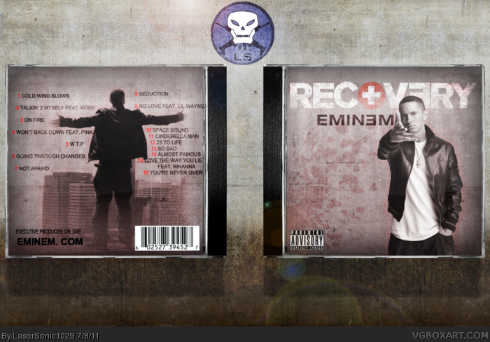
This isn't bad at all. The front looks pretty good and official, but I have a few problems with the back. One is the image that you have in the middle. The gradient used to fade it into the background looks odd, and it cut off his hands and part of his head. I think it would have looked a lot better if you rendered out the image and tweaked it to fit into the background. I also dislike how you just used an overlay filter on him on the front of the box. I think it would have looked better if you took the time to render him out. The red numbers on the back are also difficult to read, and could use either a different color or a stroke. Not bad, but it could use some more work.
I think what I'd love to see on the back is some serious typography work for the song names, rather than keeping them all in the usual bunch. Have a play with it, and feel free to message me if anything changes, and I'll head on back on give my opinion again.
 Eminem: Recovery Cover Comments
I'm an Asian guy who loves rap
So I decided to make an Eminem box
Enjoy~~~~
[ Reply ]
This isn't bad at all. The front looks pretty good and official, but I have a few problems with the back. One is the image that you have in the middle. The gradient used to fade it into the background looks odd, and it cut off his hands and part of his head. I think it would have looked a lot better if you rendered out the image and tweaked it to fit into the background. I also dislike how you just used an overlay filter on him on the front of the box. I think it would have looked better if you took the time to render him out. The red numbers on the back are also difficult to read, and could use either a different color or a stroke. Not bad, but it could use some more work.
[ Reply ]
#2, Thanks for the good tips
I'll see what I can do, the front render was already rendered out
I should take off the overlay, it's actually multiply
[ Reply ]
Updated!!!
[ Reply ]
nice.
[ Reply ]
I think what I'd love to see on the back is some serious typography work for the song names, rather than keeping them all in the usual bunch. Have a play with it, and feel free to message me if anything changes, and I'll head on back on give my opinion again.
[ Reply ]
#6, Thanks for the suggestions, I'll updated it now
[ Reply ]
This is pretty good, i agree with #1, but it is sorta empty. But altogether, its actually quite good. Good job.
[ Reply ]
Nice update :)
[ Reply ]
Thanks!
[ Reply ]
Looks great! There is a ton too much gloss on the template though. Not a big fan of the font choice for the track names, either.
Edited at 1 decade ago
[ Reply ]
#11, I'll take the gloss off the template
The back I chose a simple font, that's what I wanted though
[ Reply ]
I really like this! :D
However, on the left side on the back the spaced out song names don't match the right where they're all clumped.
[ Reply ]
#13, There was a technical difficulty.
[ Reply ]